Owen R. Dailey Week 2
Template
User Page
Assignments
Individual Journals
The D614G Research Group Week 12
The D614G Research Group Week 14
Class Journals
Purpose
The purpose of this assignment is to gain a fundamental comprehension of the S.I.R. (susceptible, infected, recovered) model and its relation to the spread of diseases such as the current COVID-19 pandemic. Additionally, this assignment will illustrate the different types of models and their role in modern science.
Methods/Results
S.I.R. Video
- I watched the video: The role of applied math in real-time pandemic response: How basic disease models work and came up with two questions regarding the S.I.R. model:
- How does the model account for people who have have been asymptomatic and recovered from the disease without their knowledge?
- How much of a difference does the incidence rate of a disease change the graph of an S.I.R. model?
S.I.R. Article
- I read the information on this website, and I understand these fundamental concepts:
- If initial I=0, no one in the studied population is infected with the disease; thus, the disease is unable to spread.
- If the red line (infected line) increases rapidly, many people are becoming infected by the disease in a short period of time; thus, the disease is very contagious. The steeper the slope of the infected line, the more contagious the disease.
- If the green line (recovered line) also rises rapidly, but not as rapidly, people are recovering from the disease quickly but not as quickly as they became infected.
- If the green line (recovered line) reaches nearly 1,000, the mortality rate of the disease is low because most infected individuals were able to recover.
S.I.R. Interactive Model
- I navigated to an interactive SIR model Epidemix, and clicked the"Start" button in the middle of the page to start the model.
- I then chose to use the Stochastic Metapopulation COMP model (options located on the left-hand side f the screen)
- I chose to use this model because found it interesting that this model would allow me to analyze the effect a disease has on the susceptible, infected, and recovered individuals of multiple populations.
- After analyzing the initial S.I.R. model, I modified the parameters of the model and observed the effects each parameter had:
Initial S.I.R.
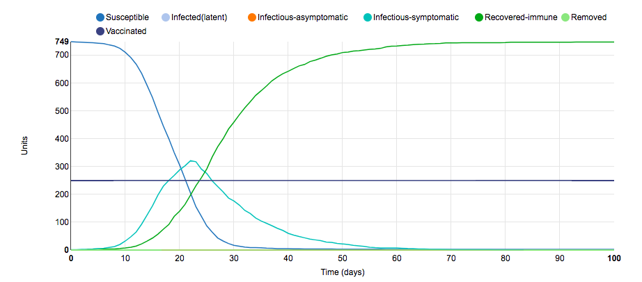
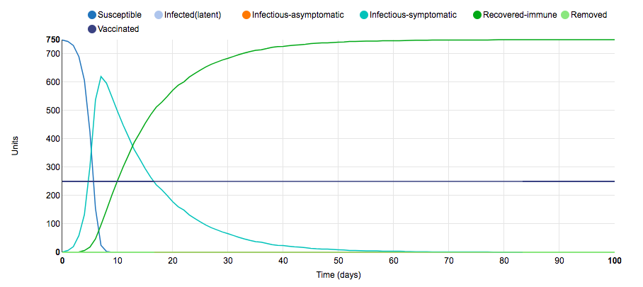
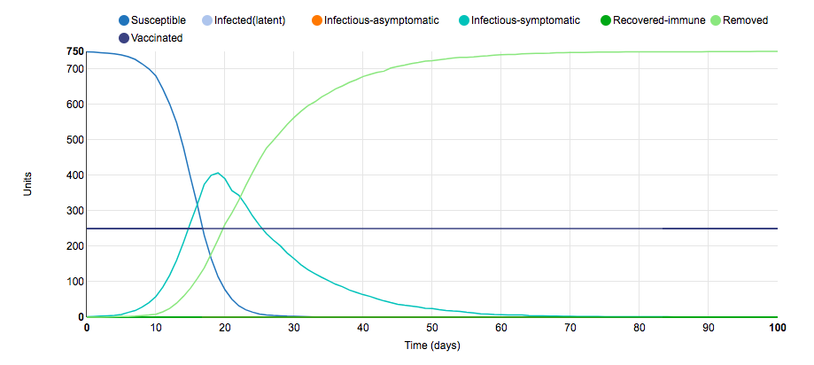
This is the initial S.I.R. graph for the stochastic metapopulation COMP model. In this model, there are 10 populations with 100 units in each population; thus, there are a total of 1,000 units in total. There are 250 units between these populations that are vaccinated; therefore, there are only 750 susceptible units in total. The model takes the form of a typical S.I.R. graph: As the number of infectious-symptomatic units rapidly rises, the number of susceptible units rapidly decreases and the number of recovered-immune units increases at a slightly slower rate. This relative simplicity is due to the fact that there are not any asymptomatic carriers for this disease, everyone who recovers from the disease confers life-long immunity, and the populations are closed. Below: I analyzed the effect that one parameter change had on the S.I.R. model.
Parameter Change #1
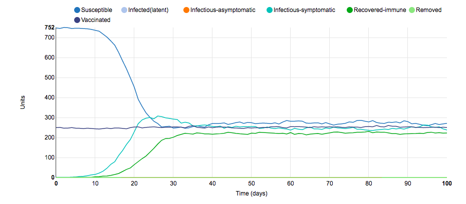
To obtain this graph of the S.I.R model, I changed the populations from being closed to being open. Due to the fact that there would be more migratory flow in and out of the population, I hypothesized that the number of infected-symptomatic units would never decrease. As shown in the model, this hypothesis was correct. Because the populations were open, a steady stream of susceptible units entered the population while a steady stream of recovered-immune units left the population; thus, the disease was able to maintain a fairly constant rate of infection because the number of susceptible units never decreased. Another difference between this graph and the initial graph is that this graph's lines are squiggly instead of smooth. This is most likely due to a different number of susceptible, infected-symptomatic, and recovered-immune units entering/leaving the population every day. This S.I.R. model illustrates why travel restrictions were placed on hotspot states such as New York and Texas in the middle of the COVID-19 pandemic.
Parameter Change #2
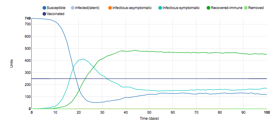
To obtain this graph of the S.I.R model, I changed the parameters surrounding the conferred immunity after recovery. In the initial graph, after an infected unit recovered from the disease, the unit remained immune from the disease for life; however, for this graph after an infected unit recovered from the disease, the unit only remained immune from the disease for 30 days. Due to the fact that after 40 days (10 days of infection and 30 days of immunity), previously recovered-immune units would become susceptible units again, the lines for susceptible, infected-symptomatic, and recovered-immune remained at a consistent number past day 50. Changing the duration of immunity to the disease had a similar effect to opening up the population because there was a steady stream of susceptible units entered the population while a steady stream of recovered-immune units left the population; thus, the disease was able to maintain a fairly constant rate of infection because the number of susceptible units never decreased. This S.I.R. parameter models a disease such as the flu because immunity to one strain of the flu does not confer immunity to a different strain of the flu. For this reason, receiving yearly flu vaccinations is crucial.
Parameter Change #3
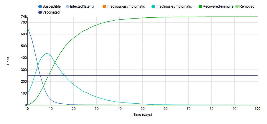
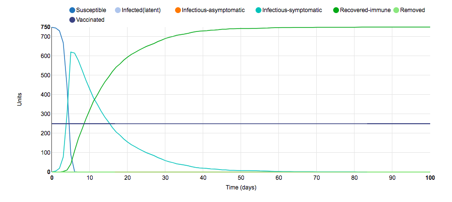
To obtain this graph of the S.I.R model, I changed the number of infected units at the beginning of the disease study. In the initial graph, the model started with one infected unit; however, for this graph, the model started with 50 infected units. Due to the fact that 50 infected units were in the population on day 0, more susceptible units came in to contact with infected-symptomatic units at the start. This had the effect of shifting the graph to the left when compared to the initial graph. The reason for the leftward skew was because the magnitude of the slope of susceptible units and infected-symptomatic units increased; thus, the peak of the infected-symptomatic units line occurred earlier. This small S.I.R. parameter change illustrates why flattening the curve is so important: In less than days, more than 400 units became infected (a stat that can overwhelm a healthcare system).
Parameter Change #4
To obtain this graph of the S.I.R model, I changed the parameters surrounding the amount of interaction each unit had within their population. In the initial graph, susceptible units made an average of 0.4 effective contacts per day with other units from the same population; however, for this graph, susceptible units made an average of 5 effective contacts per day with other units from the same population. This increase in the number of interactions with other units in the same population effectively increased the chance that a susceptible unit would interact with an infected-symptomatic unit and become infected as well. This had the effect of shifting the graph to the left when compared to the initial graph. The reason for the leftward skew was because the magnitude of the slope of susceptible units and infected-symptomatic units increased; thus, the peak of the infected-symptomatic units line occurred earlier. This small S.I.R. parameter change illustrates the need for quarantine and social distancing measures: The more interaction susceptible units have, the higher chance they will become infected, and the harder it will be to flatten the curve.
Parameter Change #5
To obtain this graph of the S.I.R model, I changed the parameters surrounding the amount of interaction each unit had with units outside of its population. In the initial graph, susceptible units made an average of 0.4 effective contacts per day with units outside of its population; however, for this graph, susceptible units made an average of 5 effective contacts per day with units outside of its population. This increase in the number of interactions with other units in the other populations effectively increased the chance that a susceptible unit would interact with an infected-symptomatic unit and become infected as well. This had the effect of shifting the graph to the left when compared to the initial graph. The reason for the leftward skew was because the magnitude of the slope of susceptible units and infected-symptomatic units increased; thus, the peak of the infected-symptomatic units line occurred earlier. This parameter change had the same effect of changing the number of effective contacts each unit had in the same population. This small S.I.R. parameter change illustrates the need for quarantine and social distancing measures: The more interaction susceptible units have, the higher chance they will become infected, and the harder it will be to flatten the curve.
Parameter Change #6
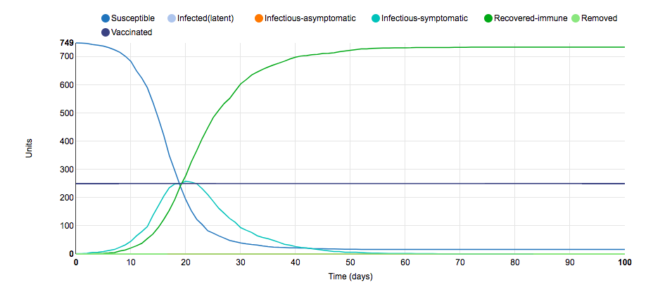
To obtain this graph of the S.I.R model, I changed the parameters surrounding the number of symptomatic infectious days of the disease. In the initial graph, infectious-symptomatic units were infectious for 10 days; however, for this graph, infectious-symptomatic units were only infectious for 6 days. It was hypothesized that the decrease in the number of days where infected units could infect susceptible units would lead to a flatter curve. This hypothesis ended up being correct because the magnitude of the slope of susceptible units and infected-symptomatic units decreased; thus, the peak of the infected-symptomatic units line occurred later and included fewer infect units. This small S.I.R. parameter change illustrates that diseases with shorter contagious periods are easier to contain than diseases with longer contagious periods.
Parameter Change #7
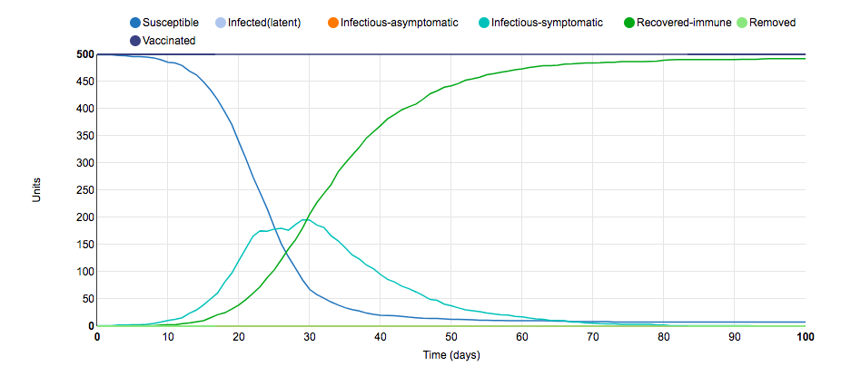
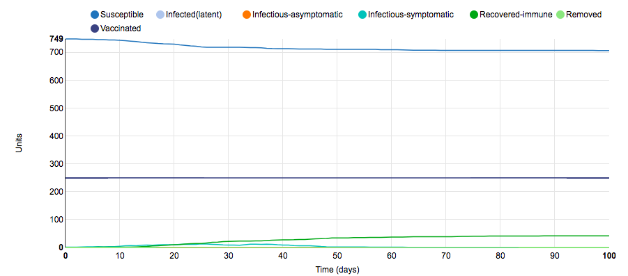
To obtain this graph of the S.I.R model, I changed the parameters surrounding the number of units vaccinated. In the initial graph, 5/10 of the populations were vaccinated and half of the units in the vaccinated populations received the vaccinations (250 total units were vaccinated); however, in this graph, 10/10 of the populations were vaccinated and half of the units in the vaccinated populations received the vaccinations (500 total units were vaccinated). It was hypothesized that the increase in the number of vaccinations would dramatically decrease the number of infections due to a conferred herd immunity. This hypothesis ended up being incorrect. Although the magnitude of the slope of susceptible units and infected-symptomatic units decreased and the curve was flattened, there was still ~200 infected units. Thus, the increase in vaccinations did not make as much of a change as expected. This small S.I.R. parameter change illustrates the need for a high percentage of the population to be vaccinated to confer herd immunity.
Parameter Change #8
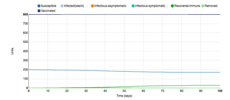
To obtain this graph of the S.I.R model, I changed the parameters surrounding the number of units vaccinated. In the initial graph, 5/10 of the populations were vaccinated and half of the units in the vaccinated populations received the vaccinations (250 total units were vaccinated); however, in this graph, 10/10 of the populations were vaccinated and 80% of the units in the vaccinated populations received the vaccinations (800 total units were vaccinated). It was hypothesized that the increase in the number of vaccinations would dramatically decrease the number of infections due to a conferred herd immunity. This hypothesis ended up being correct. Approximately 30 infections occurred over the 100-day period. Thus, the increase in vaccinations made a large difference. Because 80% of the total number of units started out with immunity, the infection rate was stifled. This small S.I.R. parameter change illustrates the need for a high percentage of the population to be vaccinated to stop diseases such as the flu and COVID-19.
Parameter Change #9
To obtain this graph of the S.I.R model, I changed the parameters surrounding the amount of interaction each unit had with units outside of its population. In the initial graph, susceptible units made an average of 0.4 effective contacts per day with units outside of its population; however, for this graph, susceptible units made an average of 0 effective contacts per day with units outside of its population. I chose to edit this parameter to illustrate the effectiveness of social distancing: I believe a big reason as to why the USA has struggled to minimize coronavirus cases is because of the population's refusal to minimize effective interactions. The graph of this model illustrates the importance of social distancing because there are fewer than 50 infections in the graph of this model. Because every unit socially distanced themselves from others, the infection rate was stifled. This small S.I.R. parameter change illustrates the need for social distancing and quarantining.
Parameter Change #10
To obtain this graph of the S.I.R model, I changed the parameters surrounding culling. In the initial graph, culling was not performed; however, in this graph, culling was performed. This had the effect of shifting the graph to the left when compared to the initial graph. The reason for the leftward skew was because the magnitude of the slope of susceptible units and infected-symptomatic units increased; however, I do not understand why the rate of infection increased. This model would suggest that it is better to not perform culling.
Giordano COVID-19 Article
- I read the article by Giordano et al. and analyzed Figure 1 of the Giordano et al. (2020) article.
- The authors added many more "states of disease" in order to account for the features of the COVID-19 pandemic: Instead of simply categorizing units as susceptible, infected, or recovered, Giordano et al.'s model categorizes units as susceptible, infected, diagnosed, recognized, ailing, threatened, exinct, and healed. This complexity better characterizes the states of disease that coronavirus patients can experience.
- Giordano et. al's results illustrate the need for lockdowns, especially at the beginning of pandemics. Figure 3 emphasizes a lockdown's ability to decrease the magnitude of the slope of the infected units of a given population (Giordano et. al). This S.I.R. model seems to suggest the necessity for lockdowns in pandemic scenarios.
Comic
- I viewed this comic: https://xkcd.com/2355/. I found this comic funny because it poked fun at the kind of people who create models.
Conclusion
S.I.R. models are schematic models that can be used to predict the course of a disease by analyzing the number of susceptible, infected, and recover units in a given population. S.I.R. models can give scientists an idea of the curve of pandemics such as the current COVID-19 pandemic, and they can also illustrate the importance of social-distancing, lockdown, and quarantine protocols. When using the phrase "flattening the curve," we are essentially speaking about the "I" line in an S.I.R. model.
Aknowledgements
- I contacted my homework partner, Anna Horvath, via text to discuss adding data files and how to properly cite.
- I copied and modified the procedures shown on the Week 2 Page.
- I used this website to create S.I.R. graphs shown in the methods/results section.
- I copied and modified wiki syntax on formatting a photo from the Media Wiki Help Page.
- Except for what is noted above, this individual journal entry was completed by me and not copied from another source.
References
- Epidemix. (2020). Retrieved 12 September 2020, from https://www.epidemix.app/#
- Epstein, J., 2008. Why Model?. [online] Jasss.soc.surrey.ac.uk. Retreived September 16, 2020, from http://jasss.soc.surrey.ac.uk/11/4/12.html.bak
- Giordano, G., Blanchini, F., Bruno, R., Colaneri, P., Di Filippo, A., Di Matteo, A., & Colaneri, M. (2020). Modelling the COVID-19 epidemic and implementation of population-wide interventions in Italy. Nature Medicine, 1-6.
- MediaWiki. (2020). Help:Images. Retreived Septmeber 10, 2020, from https://www.mediawiki.org/wiki/Help:Images.
- OpenWetWare. (2020). BIOL368/F20:Week 2. Retrieved September 10, 2020, from https://openwetware.org/wiki/BIOL368/F20:Week_2
- SIR Model. (2020). Retrieved September 10, 2020, from http://www.pandemsim.com/beta/SIRmodel.html
- University COVID Model. (2020). Retrieved September 10, 2020, from https://xkcd.com/2355/
- Youtube. 2020. The Role Of Applied Math In Real-Time Pandemic Response: How Basic Disease Models Work [Video]. Retrieved September 10, 2020, from https://www.youtube.com/watch?v=Ewuo_2pzNNw&feature=youtu.be&ab_channel=NIMBioS
