Alison S King Week 7
Purpose
The purpose of the Week 7 assignment is to take last week's model and interpret its results in an understandable way. We want to look at how the resulting graphics can be used to show a pattern in the data or provide us insight into the regulation of transcription factors/genes during cold response. We also want to come up with ideas for how to tweak the experiment to get more interesting or different results.
Methods/Workflow
Analyzing Results of First Model Run
Here is what you need to consider when analyzing the results of your model.
- What is the overall least squares error (LSE) for your model?
- You will find this on the "optimization_diagnostics" worksheet of your output workbook.
- Since the input data are noisy, the model can only minimize the error so far. It is more "fair" to look at the ratio of the least squares error to the minimum theoretical least squares error that the model could have achieved given the data. We call this the LSE:minLSE ratio. You should be able to compute it with the values given on the "optimization_diagnostics" worksheet.
- We will compare the LSE:minLSE ratios for the ten models run by everyone in the class.
- You need to look at the individual fits for each of the genes in your model. Which genes are modeled well? Which genes are not modeled well?
- Look at the individual expression plots to see if the line that represents the simulated model data is a good fit to the individual data points.
- Upload your output Excel spreadsheet to GRNsight. Use the dropdown menu on the left to choose the data you will display on the nodes (boxes). Compare the actual data for a strain with the simulated data from the same strain. If the model fits the data well, the color heatmap superimposed on the node will match top and bottom. If the fit is less good, the colors will not match.
- What explains the goodness of fit to the model?
- How many arrows are incoming to the node?
- What is the ANOVA Benjamini & Hochberg corrected p value for the gene?
- Is the gene changing its expression a lot or is the log2 fold change mostly near zero?
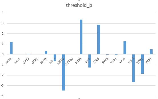
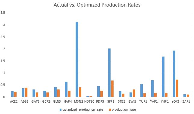
- Make bar charts for the b and P parameters.
- Is there something about these parameters that explains the goodness of fit for the individual genes?
Tweaking the Model and Analyzing the Results
We will carry out an additional in silico experiment with our model. We will report out our results in a research presentation in Week 9.
- For our initial runs, we estimated all three parameters w, P, and b. We want to see:
- How do the modeling results change if b is fixed and w and P are estimated?
- This might be interesting because the current b values vary so much between each gene. I think that fixing b will create very different model results.
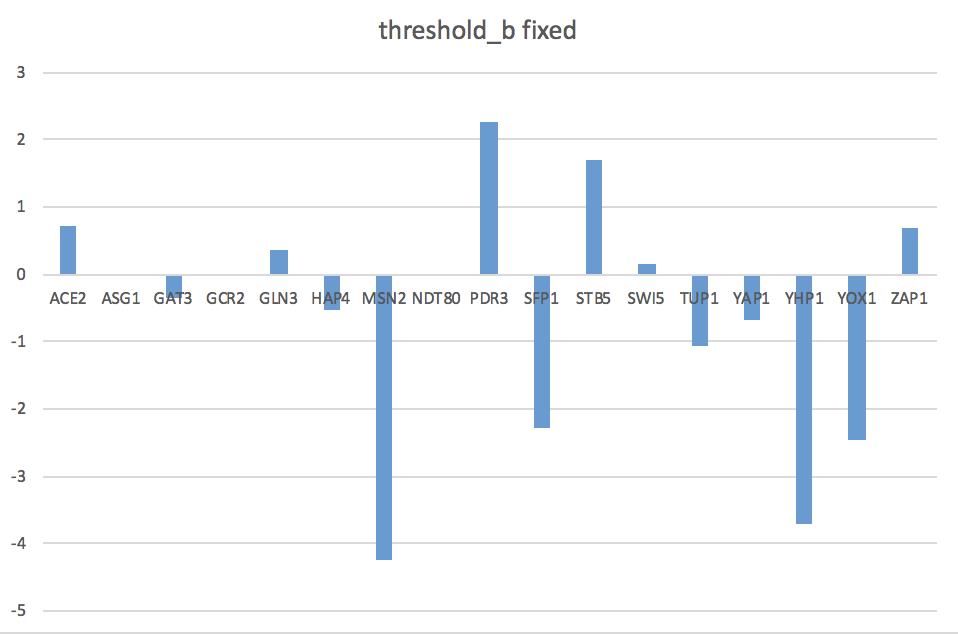
- To choose our fixed b values, we are going to sum up the weights of the controllers of each gene and use that value as b.
- Do this by summing up the rows in the network_optimized_weights sheet of this spreadsheet.
Results
Initial Run
- Least Squares Error
- LSE: 0.64796
- LSE:minLSE ratio: 1.44
- Individual Fits of GRNsight Models
- wild type
- In GRNsight model, HAP4 has opposite expression, ZAP1 shows no change in simulated data but activation in actual data.
- dgln3
- In GRNsight model, both YOX1 and ACE2 show activation in actual data but not simulated data, ZAP1 shows slight repression in actual data but not simulated.
- dhap4
- All nodes in GRNsight model look relatively the same between actual and simulated data.
- dzap1
- Most GRNsight nodes look similar, except for ZAP1 shows more repression in the actual data.
- wild type
- Comparing individual expression plots
- The ZAP1 model for dzap1 does not fit the individual data points very well.
- YAP1 dhap4 data points seem to be slightly under the model line.
- Most of the model lines seem to fit the data relatively well, especially since we don't have a ton of data for each gene.
- Bar charts can be found on the last two pages of my Excel spreadsheet in Box.
- The goodness of fit of the model can be explained by how closely the bars for the optimal production rate match the productions rates from our actual data.
- In my model, there are about five bars that are much lower than the optimal rates.
- The goodness of fit of the model can be explained by how closely the bars for the optimal production rate match the productions rates from our actual data.
Second Run After Fixing b
- Least Squares Error
- LSE: 0.654450058
- LSE:minLSE ratio: 1.45924
- Individual Fits of GRNsight Models
- wild type
- The model fits fairly well. There is a slight difference in GCR2 expression.
- dgln3
- ACE2, STB5, YOX1 show activation in actual data but repression in model. Opposite for ZAP1.
- dhap4
- Model fits well, except for ZAP1.
- dzap1
- Model fits well.
- wild type
- Comparing individual expression plots
- YHP4 dzap1 model line is slightly above the actual dataset.
- SFP1 dhap4 model line slightly above data points.
- Overall, models seem to fit the actual data fairly well.
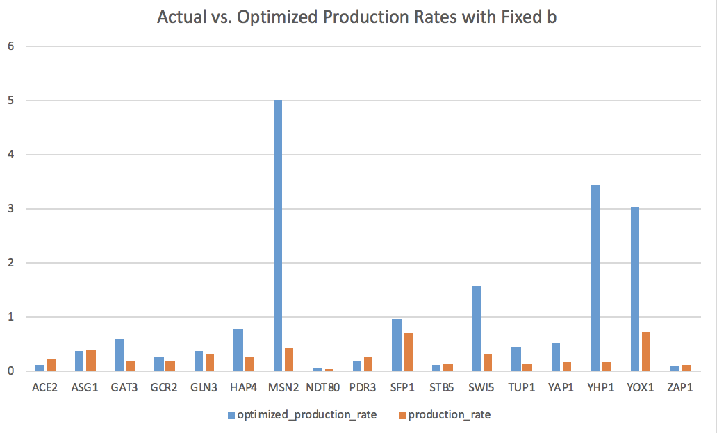
- Bar charts can be found on the last two pages of my Excel spreadsheet in Box.
- The goodness of fit of the model can be explained by how closely the bars for the optimal production rate match the productions rates from our actual data.
- The optimized production rates are consistently higher than the actual rates, suggesting that this fixed b model may not be the best fit.
- The goodness of fit of the model can be explained by how closely the bars for the optimal production rate match the productions rates from our actual data.
Scientific Conclusion
Looking at the GRNsight model and individual expression plots and comparing the optimized expressions versus the actual expressions, it seems that my model is a fairly good predictor. With a LSE:minLSE ratio of 1.44, the fit of the model also seems to be fairly good. There are a few differences in specific genes between the optimized and actual values, so it would be interesting to tweak the model and see how the results may change. We chose to fix the threshold b values to be the sum of the weights of the controllers for each gene to see how this may affect expression. After fixing b and rerunning the model, we found that it did not change the results of the model significantly.
Presentation
The powerpoint made by Edward and I can be found in Box at this link.
Acknowledgements
- The workflow instructions were copied from the BIOL388/S19:Week 7 assignment page and personalized by me.
- My partner, Edward, and I worked together in class to interpret our modeling results. We also texted a few times about deadlines and results.
- Except for what is noted above, this individual journal entry was completed by me and not copied from another source.
Alison S King (talk) 10:19, 7 March 2019 (PST)
References
- Loyola Marymount University (5 March 2019) BIOL388/S19:Week 7. Retrieved from https://openwetware.org/wiki/BIOL388/S19:Week_7 on 5 March 2019.
- Loyola Marymount University (2018) GRNsight. Retrieved from http://dondi.github.io/GRNsight/ on 5 March 2019.
Links
Class Page: BIOL388/S19
Assignment Pages:
Shared Journals:
- Class Journal Week 1
- Class Journal Week 2
- Class Journal Week 3
- Class Journal Week 4
- Class Journal Week 5
- Class Journal Week 6
- Class Journal Week 7
- Class Journal Week 8
- Class Journal Week 9
- Class Journal Week 10
- Class Journal Week 11
- Class Journal Week 12
- Class Journal Week 14/15
Individual Journals:


