Lkelly9 Week 2
From OpenWetWare
Jump to navigationJump to search
Navigation Links
- Lauren M. Kelly
- Assignment Page
- Individual Journal Entry
- Shared Journal Page
Electronic Lab Notebook
Purpose
The scientific purpose of my investigations was to plot two vectors, u and v, on a graph and to model the logistical growth for four different rates on one plot.
Workflow/Methods
Part I: Create a script that includes the following elements
- Define a vector u containing the elements 1,2,3,4,5,6,7,8,9,10 using the colon operation
- u = [1:10]
- Define another vector v containing elements that are the square of the vector
- v = u.^2
- Plot v versus u (make sure you know what that sentence means!!) using circles on the points that are connected with dashed lines
- plot(u,v)
- Add title: title('V vs. U')
- X-axis label: xlabel('u')
- Y-axis label: ylabel('v')
- Save your plot as a TIFF file
- Save your data into an excel spreadsheet using the MATLAB command xlswrite
- Declare the file name: filename='insertfilenamehere'
- Put u and v together in a vector: A=[u;v]
- Save into an excel sheet: xlswrite('insertfilenamehere',A)
- Define a vector u containing the elements 1,2,3,4,5,6,7,8,9,10 using the colon operation
Part II: Create a script to compare logistic growth curves
- Define a vector t starting at 0, ending at 1, in steps of 0.01.
- t = [0:0.01:1]
- Define K = 10 and x0 = 2 for carrying capacity and initial population size.
- Plot logistic growth curves for growth rates 0.5,1.0,1.5, and 2.0.
- For r=0.5: y1=(x0*K)./(K*exp(-0.5*t)-x0*exp(-0.5*t)+x0)
- For r=1.0: y2=(x0*K)./(K*exp(-1.0*t)-x0*exp(-1.0*t)+x0)
- For r=1.5: y3=(x0*K)./(K*exp(-1.5*t)-x0*exp(-1.5*t)+x0)
- For r=2.0: y4=(x0*K)./(K*exp(-2.0*t)-x0*exp(-2.0*t)+x0)
- Plot these four curves together in one figure, and add appropriate labels, title, and legend.
- plot(t,y1,'m',t,y2,'r',t,y3,'b',t,y4,'k')
- Save your plot as a TIFF file
- Define a vector t starting at 0, ending at 1, in steps of 0.01.
Results
Data and Files
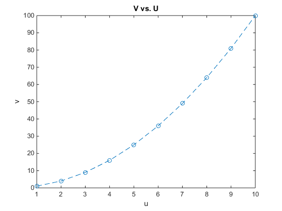
- Figure 1. This plot displays the relationship between vectors u and v. Please refer to the workflow above to see how this plot was created.
- Vector u and v Data
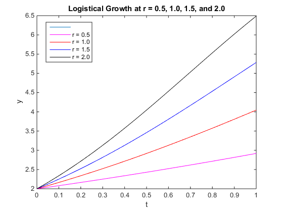
- Figure 2. This plot displays the logistic growth curves for r = 0.5, 1.0, 1.5, and 2.0. Please refer to the workflow above to see how this plot was created.
Conclusion
My main finding for today's project was that MATLAB can be manipulated in a variety of ways to model data. Furthermore, the logistic growth curves, assuming I executed them correctly, were fairly linear and they did not level off at any point. I accomplished my purpose of plotting vectors u and v and plotting four different logistic growth curves in the same figure.
Acknowledgements
- I worked with my homework partner Cameron M. Rehmani Seraji face-to-face in the computer lab outside of class. We worked on the MATLAB portion of the assignment together.
- I worked with Margaret J. ONeil and Nika Vafadari face-to-face in the computer lab outside of class. We worked on the logistic growth curve together.
- I worked with Ben G. Fitzpatrick through email one time. He helped me with the logistic growth curve.
- Except for what is noted above, this individual journal entry was completed by me and not copied from another source
- Lauren M. Kelly 01:22, 26 January 2017 (EST)
References
Dahlquist, Kam D. (2017) BIOL398-05/S17:Week 2. Retrieved from http://www.openwetware.org/wiki/BIOL398-05/S17:Week_2 on 25 January 2017.
