Nika Vafadari Week 2
Electronic Lab Notebook Week 2
Purpose
To explore the functions and use of Matlab in creating models and modeling through the execution of two tasks, creating a graph of two vectors and plotting and comparing the growth curves of four various growth rates.
Methods
- Part I: Create a script that includes the following elements
- Define a vector u containing the elements 1,2,3,4,5,6,7,8,9,10 using the colon operation
- u=1:10
- Define another vector v containing elements that are the square of the vector x
- v=u.^2 Note: include . (dot) when applying arithmetic to a vector
- Plot v versus u using circles on the points that are connected with dashed lines
- figure
- plot(u,v,'--o')
- Save your plot as a TIFF file
- Save your data into an excel spreadsheet using the MATLAB command xlswrite
- filename='name of file.xlsx'
- A=[u;v] Note: need to define A with data set in order to save work to excel sheet
- xlswrite('name of file.xsls',A)
- Define a vector u containing the elements 1,2,3,4,5,6,7,8,9,10 using the colon operation
- Part II: Create a script to compare logistic growth curves
- Define a vector t starting at 0, ending at 1, in steps of 0.01.
- t=[0:0.01:1]
- Define K = 10 and x0 = 2 for carrying capacity and initial population size.
- Plot logistic growth curves for growth rates 0.5,1.0,1.5, and 2.0.
- A1=(x0*K)./(K*exp(-0.5*t)-x0*exp(-0.5*t)+x0)
- A2=(x0*K)./(K*exp(-1*t)-x0*exp(-1*t)+x0)
- A3=(x0*K)./(K*exp(-1.5*t)-x0*exp(-1.5*t)+x0)
- A4=(x0*K)./(K*exp(-2*t)-x0*exp(-2*t)+x0)
- Plot these four curves together in one figure, and add appropriate labels, title, and legend.
- figure
- hold on
- plot(t,A1,'color1',t,A2,'color2',t,A3,'color3',t,A4,'color4')
- xlabel('x axis name')
- ylabel('y axis name')
- title('title of graph')
- Note: legend can be created and edited directly on figure
- Save your plot as a TIFF file
- Define a vector t starting at 0, ending at 1, in steps of 0.01.
Results
Data and Files
Graph 1: V vs U
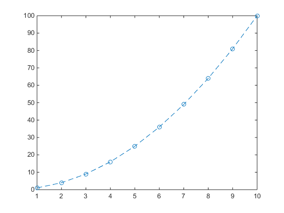
- Figure 1. The figure above displays a plot of vector v versus vector u.
Graph 2: Logistic Growth Curves
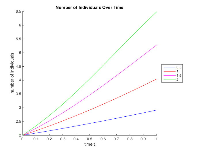
- Figure 2. The graph above displays the logistic growth curves for four different growth rates with the values r=0.5, 1, 1.5, 2 as color coded and displayed in the legend.
Conclusion
Through the execution of the two part Matlab exercise, I was able to understand some of the basic functions necessary for creating models on Matlab, thus fulfilling the purpose of the lab. By plotting the two vectors and creating a graphical representation of the four logistic growth curves I was able to engage in the process of modeling by moving observations of a relationship found in the real world, such as the relationship between the number of individuals in a population and the growth rate of that population, into the form of model that acts as a simplified representation of that relationship.
Acknowledgments
- I worked with my homework partner Margaret J. O'Neil Wednesday night face-to-face in the computer lab to work on parts I and II of the assignment on Matlab.
- In addition, we were joined by Lauren M. Kelly, who worked with us on Part II, creating the graph of the four growth curves.
- Furthermore, Dr. Dahlquist helped me add the BIOL398-05/S17 category to my template and update the links found on my template, which was invoked on this page.
- Methods section is copied and pasted directly from Week 2 Assignment page referenced below.
- Except for what is noted above, this individual journal entry was completed by me and not copied from another source.
- Nika Vafadari 00:04, 26 January 2017 (EST):
References
Dahlquist, Kam D. (2017) BIOL398-05/S17:Week 2. Retrieved from http://www.openwetware.org/wiki/BIOL398-05/S17:Week_2 on 25 January 2017.
Useful Links
- Nika Vafadari
- Course Home Page
- Weekly Journal Entries
- Shared Journal Pages
- Assignment Pages
- Template:Nika Vafadari
