BISC 111/113:Statistics and Graphing
Adding JMP to a personal computer
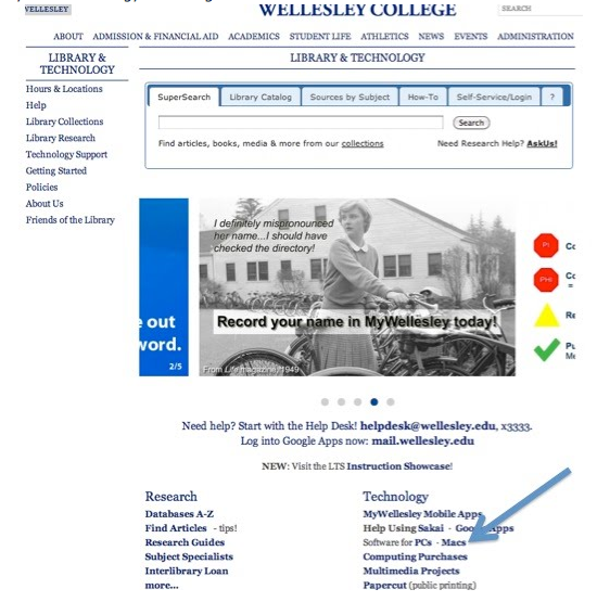
To put key access and JMP on your personal lap top or table top computer, you need to get to the Library Home page
& Use either Chrome or FireFox not Safari as your browser.

Click on Library Tab

Click on the Library and Technology page
Click on Software for PC : MACs
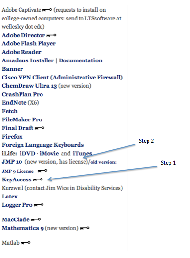
Step 1:
Scroll alphabetically until you see KEY ACCESS
Follow the instructions for installing Key Access on your Mac or PC
Download the KEY ACCESS file and restart your computer.

Step 2:
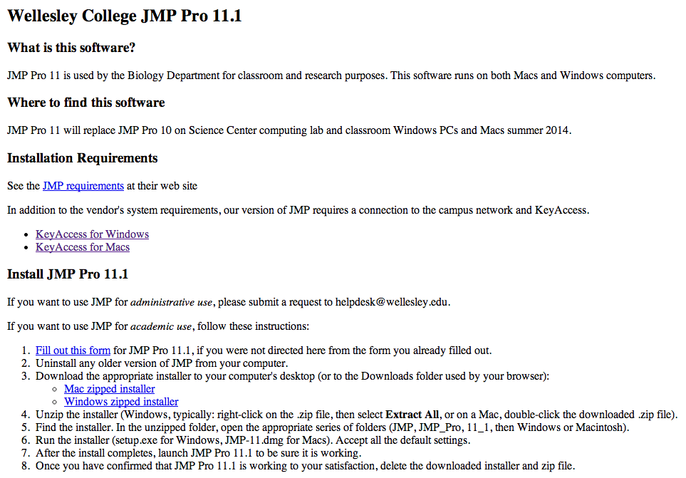
Download JMP 11.1
You will need to fill our a request for JMP. Identify yourself as a taking a Biology course.
Follow the instructions for downloading JMP11.1 2014-2015
Mac Excel 2008: Summarizing, and Comparing Means
These directions are for students working with Excel 2008 on a Mac. If you have Excel 2004, and don’t know how to use it, please let us know. If you have Vista (PC Excel 2007), see the Vista tutorial.
Saving Files
As soon as you open a new file to work with, go to ‘File’ and select ‘Save As’ from the menu. Be sure to select the following file suffix for all Word, Excel, or Powerpoint files: .doc, .xls, or .ppt, respectively. Do not save in the default setting of .docx, .xlsx, or .pptx as older versions of the software cannot open these files.
Graphing Means +/-SD in Excel 2008
1) Download either a pre-formatted class spreadsheet or create your own table in Excel to organize your experimental data. You will want to include columns for each experimental condition and numbered rows corresponding to each subject. For example, if you are collecting heart rate data under 3 conditions (rest, running, and walking) your table might look like this:

[Note: When adding the data to the spreadsheet, be sure all data in the same row corresponds to only that subject; this will be especially important for the statistical analysis.]
2) Once you have entered all your raw data, make a new summary table (as shown below) for ease of graphing. Create one row for the mean values and the next row for the standard deviation values (SD’s) that will be represented as the error bars.

3) Calculate the means and variability (SD) of each group (rest, running, walking) using the Σ AutoSum function on the toolbar.
a. In the summary table, click on the empty cell in which you want the first calculated mean to be displayed. Then select “average” from the Σ AutoSum drop down menu.
b. Next, highlight a single column of raw data to be averaged and hit return. The mean should now be displayed in your summary table.
c. To calculate its corresponding SD, highlight the blank cell in the SD row directly below your calculated mean. Go to the Σ menu and select ‘More Functions’ which opens the Formula Builder in a window to the right.
d. Type in ‘STDEV’ and double click on it. Then highlight the same raw data column you used to calculate your mean and click ‘Enter’. This inputs the SD into the blank cell you selected.
e. Repeat these steps to calculate your remaining means +/- SD.
4) To begin graphing, first highlight only the first 2 rows of your summary table including column titles (rest, running, walking) and the row with means. (Do not highlight the SD row, as we will add the SD as error bars later.) Next, click on the ‘Charts’ tab below the main toolbar. Then select the Column graph tab.
5) Your graph should automatically appear, but you will need to add your SD values as error bars corresponding to their respective means.
a. Double click on one of your columns on the graph and a Format Data Series window will pop up.
b. From the menu on the left, select ‘Error Bars’ and then select Display ‘Both’ and add ‘Cap’ for the End Style.
c. Under error amount, select ‘Custom’ and then click on ‘Specify Value’. This will open a new window for Custom Error Bars. In the ‘Positive Error Value’, clear the window, then highlight the entire row of SD values in your summary table. Do the same for the ‘Negative Error Bar’ and then click ‘Okay’. You should now have both +/- SD as error bars for each mean.
6) Edit the finalized graph to edit the axes, remove the title, etc. for a properly formatted graph:
a. Open the ‘Toolbox’ on the main toolbar. In the Toolbox window, click on the ‘Formatting Palette’ icon on the far left (it has a capital A).
b. Under ‘Chart Options’, you can label the axes. Just drop down the menu to select from Title, Horizontal, and Vertical axis and enter/edit the text on the graph. You can also highlight the default title and click delete to remove it.
c. Once you are happy with the graph, highlight it, then copy and paste into Word where you’ll finish it off with an appropriate caption.
Mac Excel 2011 (version 14.1.0): Summarizing and comparing means
These directions are for students working with Excel 2011 on a Mac. If you have Excel 2008, please look for the 2008 tutorial posted under Stats & Graphing. If you have Vista (PC Excel 2007 or later), see the Vista tutorial.
Saving Files
As soon as you open a new file to work with, go to ‘File’ and select ‘Save As’ from the menu. Be sure to select the following file suffix for all Word, Excel, or Powerpoint files: .doc, .xls, or .ppt, respectively. Do not save in the default setting of .docx, .xlsx, or .pptx as older versions of the software cannot open these files.
Graphing Means +/-SD in Excel 2011
1) Download either a pre-formatted class spreadsheet or create your own table in Excel to organize your experimental data. You will want to include columns for each experimental condition and numbered rows corresponding to each subject. For example, if you are collecting heart rate data under 3 conditions (rest, running, and walking) your table might look like this:

[Note: When adding the data to the spreadsheet, be sure all data in the same row corresponds to only that subject; this will be especially important for the statistical analysis.]
2) Once you have entered all your raw data, make a new summary table (as shown below) for ease of graphing. Create one row for the x-axis headings, one row for the means and the next row for the standard deviation values (SD’s) that will be represented as the error bars.

3) Calculate the means and variability (SD) of each group (rest, running, walking) using the Σ AutoSum function along the top toolbar.

a. In the summary table, first click on the empty cell in which you want the calculated mean to be displayed. Then select “average” from the Σ AutoSum drop down menu.
b. Next, highlight a single column of raw data to be averaged and hit return. The mean should now be displayed in your summary table.
c. To calculate its corresponding SD, highlight the blank cell directly below your calculated mean in the SD row. Go to the Σ menu and select ‘More Functions’ which opens the Formula Builder in a window to the right.
d. Type in ‘STDEV’ and double click on it. Then highlight the same raw data column you used to calculate your mean and click ‘Enter’. This inputs the SD into the blank cell you selected.
e. Repeat these steps to calculate your remaining means +/- SD. OR highlight the cells in which your calculated the means and SD AND all remaining cells and select FILL>right (or down or up depending on how you set up your table. All the cells will auto fill with the correct formulas. You can check that the correct data is in each cell by double clicking on the cell.
cells
4) To begin graphing, first highlight only the first 2 rows of your summary table including column titles (rest, running, walking) and the row with means. (Do not highlight the SD row, as we will add the SD as error bars later.) Next, click on the ‘Charts’ tab below the main toolbar. Then select the Column graph tab.
5) Your graph should automatically appear, but you will need to add your SD values as error bars corresponding to their respective means.
a. Double click on any one of your columns on the graph and a Format Data Series window will pop up.
b. From the menu on the left, select ‘Error Bars’ and then select Display ‘Both’ and add ‘Cap’ for the End Style.
c. Under error amount, select ‘Custom’ and then click on ‘Specify Value’. This will open a new window for Custom Error Bars. In the ‘Positive Error Value’, clear the window, then highlight the entire row of SD values in your summary table. Do the same for the ‘Negative Error Bar’ and then click ‘Okay’. You should now have both +/- SD as error bars for each mean.
6) Edit the finalized graph to edit the axes, remove the title, etc. for a properly formatted graph:
a. Click on your graph, which selects the green “Chart” tab. Under the green chart tab, click on the purple tab labeled “Chart Layout”.

b. Under “Chart Layout”, you can select from a wide range of dropdown menus to add or change y or x-axis titles, add a legend, format the axes, etc.
c. At this point, you can also clean up the graph by highlighting the default title and click delete to remove it.
d. Once you are happy with the graph, highlight it, then copy and paste into Word where you’ll finish it off with an appropriate caption.
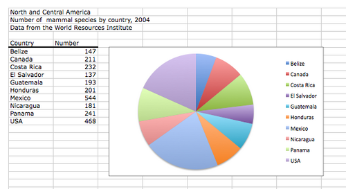
Making a Pie Chart in Excel 2008
- Open a new workbook page in Excel 2008.
- Enter your Category and Number data in Column A and Column B, respectively.
- Highlight both category and number data, but not the column labels. To generate a graph, chose "Charts" and then "Pie" from the Menu bar directly above the workbook. Then select the pie chart format you prefer. The farthest left option is both simple and clear, and generates both the chart and its legend, as in the image below.
Making a Column Graph in Excel 2007 (Windows Vista)
1) Once you have a spreadsheet of raw data, make a new summary table in the Excel sheet (as shown below) for ease of graphing. Create one row with heading titles, a second row for the means, and a third row for the SD calculations.

2) Calculate the mean of each group (Data Set A and B) using the AutoSum function located under the “Home” tab on the right-hand side.
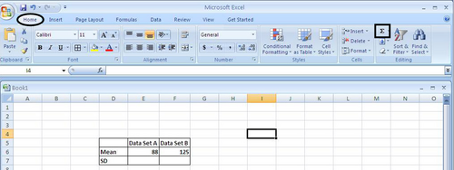
a. In the summary table, click on the empty cell in which you want the first calculated mean to be displayed. Then select “average” from the AutoSum drop down menu.
b. Next, highlight a single column of raw data to be averaged and hit return. The mean should now be displayed in your summary table.
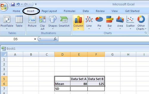
3) To begin graphing, click on the “Insert” tab at the top of the toolbar. Then highlight the first two rows of your summary table including column titles and the row with means. Next, click on the image of the “Column” graph under the ‘Charts’ box below the main toolbar. Then choose the 2D column graph image.
4) Your graph should automatically appear, but you will need to edit the finalized graph in the following ways:
a. Add error bars representing SD (Standard Deviation) b. Label both axes (include proper units) c. Remove the title from the top d. Remove the grayscale background e. If needed, choose patterns for each column so it is easy to read the legend (i.e., different colors all look grey on a printout)
5) To make these changes, highlight your graph by clicking on it. This should display the Chart Tools Layout tab under which you will see the following options:
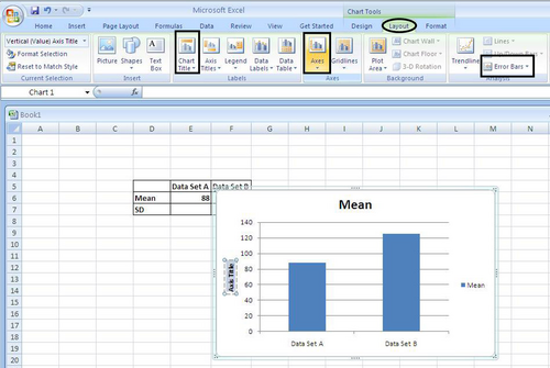
a. Go to the Analysis section of tools on the right and select ‘Error Bars’. Scroll down to ‘More Error Bar Options’, then select ‘Both’ under Display Direction, End Style as ‘Cap’, and ‘Custom’ for Error Amount.
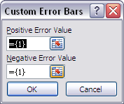
b. Click on the ‘Specify Amount’ button, and a window pops up with an entry for both positive and negative error values (see below). In each entry window, go and highlight the row of SD values, and click ‘OK’. Your SD values should now correspond with their respective means as error bars.
c. Next, click on ‘Chart Title’ in the ‘Labels’ box and select ‘None’. This will remove the default title. You do not want any title printed on the graph itself.
d. Under ‘Axis Titles’, you can label the axes. Just drop down the menu to select from Title, Horizontal, and Vertical axis and enter/edit the text on the graph. Remember to include units where appropriate.
e. Once you are happy with the graph, highlight it, then copy and paste into Word where you’ll finish it off with an appropriate caption below.
The caption should summarize the data in the figure and verbally describe only “what” is shown in the figure, but not “why” you may be seeing a particular pattern. Any interpretation of the data is saved for the discussion section of a report.
Making a Column Graph in Excel 2008 (Mac)
1) Once you have calculated your means and standard deviations (SD) in JMP (see JMP tutorial for instructions), open up a new Excel spreadsheet and save it to the desktop.
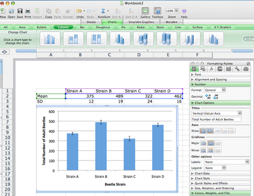
2) First, create a summary table of the data you want to graph. One row will contain the column headings for each experimental group of data. Create one row for the mean values and the next row for the standard deviation values (SD’s) that will be represented as the error bars.

3) To begin graphing, first highlight only the first 2 rows of your summary table including column titles (Strain A, Strain B, Strain C, and Strain D) and the row with means. (Do not highlight the SD row, as we will add the SD as error bars later.)

4) Next, click on the ‘Charts’ tab below the main toolbar. Then select the Column graph tab.
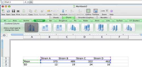
5) Your graph should automatically appear:
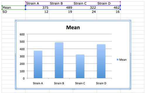
6) Next, you will need to add your SD values as error bars corresponding to their respective means.
a. Double click on one of your columns on the graph and a ‘Format Data Series’ window will pop up.
b. From the menu on the left, select ‘Error Bars’ and then select Display ‘Both’ and add ‘Cap’ for the End Style.
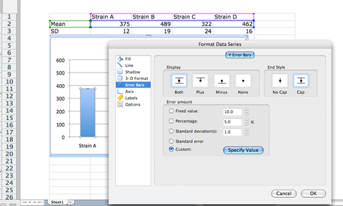
c. Under error amount, select ‘Custom’ and then click on ‘Specify Value’. This will open a new window for Custom Error Bars. In the ‘Positive Error Value’, clear the window, then highlight the entire row of SD values in your summary table. Do the same for the ‘Negative Error Bar’ and then click ‘Okay’.

d. You should now have both +/- SD as error bars for each mean.

7) Edit the finalized graph to label the axes, remove the default title, etc. to meet the standards for a properly formatted graph. (See the Science Writing section for guidelines.)
a. Open the ‘Toolbox’ on the main toolbar. In the Toolbox window, click on the ‘Formatting Palette’ icon on the far left (it has a capital A).
b. Under ‘Chart Options’, you can label the axes. Just drop down the menu to select from Title, Horizontal, and Vertical axis and enter/edit the text on the graph. You can also highlight the default title and click delete to remove it.
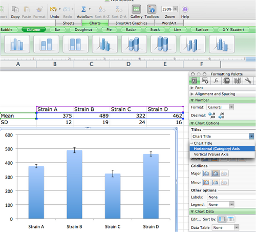
c. Colors: Please note that assignments are handed in as black and white printouts. Thus, color differences alone will not illustrate different groups represented on one graph. If you have mutiple groups that are not individually labeled on the y-axis (as shown here), be sure to add a legend and choose fill patterns that will differentiate between the columns.
d. Once you are happy with the graph, highlight the blue edge of the graph, then copy (Command + C) and paste (Command + V) into Word where you’ll finish it off with an appropriate caption.
Making a Column Graph in JMP
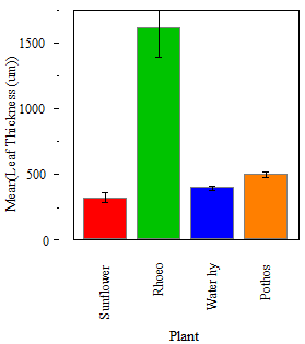
1) Go to Graph > Chart > Select your categorical variable as your X level, and any of the continuous variables as your Statistics > pull down the Statistics menu.
2) Select Mean > OK.
3) Under Chart menu (pull down the red arrow) on your new graph, select Y options > Std Error Bars.
4) You can clean it up by fixing axis labels and removing non-essential legends.
5) To copy into Word, use the white cross in the JMP menu to highlight what you want > copy and Paste. It may be easier to add your caption in Word since you can change the font, use italics etc.
Making a Linear Regression in Excel
1) Create a summary table with each variable you would like to graph in its own column. In this case, we are looking at time vs. plant weight (g).
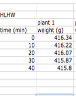
2) Highlight the cells you want to graph (time on the x axis). Select the Chart tab from the menu, and select ‘XY Scatter'.
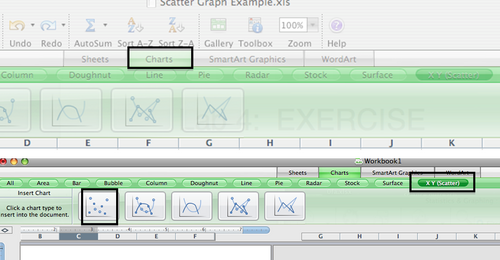
3) This should display a scatter graph.

4) Next you will add a trendline. Select Chart: Add trendline.

a. In this window click Options and check display equation on chart and display R2 value on chart.

b. This gives you the line equation including the slope and a measure of how well the data fit the line (R2).

Use the absolute value of the slope for your calculation.
TO ADD A SECOND SERIES OF DATA TO THE SAME GRAPH
5) If you need to add another series of data to the same graph, in the Select Data Source window, click on the ‘Add’ button which adds a new series of data to your graph then select the new data set in the y-values window.
Making an XY Scatter Graph in Excel
1) Create a summary table with each variable you would like to graph in its own column. In this case, we are looking at time vs. VO2 (L/min).
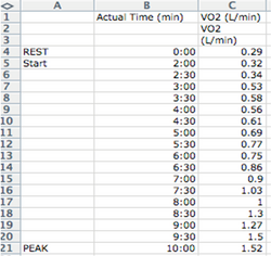
2) Highlight the dependent variable you want displayed on the y-axis. In this case, VO2 (L/min). Then select the Chart tab from the menu, and select ‘XY Scatter’ and then ‘Straight Marked Scatter’ (the line connected with dots).

3) This should display a scatter graph with the correct units on the y-axis but an incorrect default x-axis. 4) Now you must specify the x-axis values, in this case, time (minutes). First, highlight the graph so the border shows up in blue. Then go up to the very top menu bar and select ‘Chart’ then select ‘Source Data’ from the drop down menu.

5) Here you can see the data series for your y-axis is already entered. Click on the window for the X values, then go back to your data and highlight all the values in your time (min). Then click on OK in the Select Data Source Window. Your graph should now show the correct scale for both your x and y-axes. 6) Now you can properly label your axes and edit your graph.
TO ADD A SECOND SERIES OF DATA TO THE SAME GRAPH
7) If you need to add another series of data to the same graph, (e.g., a plot of VO2 values for a second subject, in the Select Data Source window, click on the ‘Add’ button which adds a new series of data to your graph. Then you must specify both x and y-values like you did for the first scatter plot.
TO ADD A SECONDARY AXIS TO A GRAPH
When the values in a 2-D chart vary widely from data series to data series in a 2-D chart, or when you have mixed types of data (such as price and volume), you can plot one or more data series on a secondary value (y) axis. The scale of the secondary axis reflects the values for the associated data series.
On a chart sheet or in an embedded chart, click the data series that you want to plot along a secondary value axis.
On the Format menu, click Selected Data Series.
On the Axis tab, click Secondary axis.
TIP : After you add a secondary value axis to a chart, you can also add a secondary category (x) axis, which may be useful in an xy (scatter) chart. Select a chart that displays the secondary value axis, and then click Chart Options on the Chart menu. On the Axes tab, select the Category (X) axis check box.
Image Processing in iPhoto and Photoshop
Processing Images in iPhoto
Photos taken with a digital camera need to be reduced to kb size to use in your Word docs. Changing image size and/or cropping your image can accomplish this. The minimal steps included in this document should produce a good quality image but for more extensive help please refer to the Wellesley College Computing website. Here you will find directions for downloading software, such as Photoshop, as well as directions for using it to edit your digital photos. The link for PCs (search under P for Photoshop after getting to the page) is [1] and for Mac OS operating systems it's [2].
If working in iPhoto: 1) Open the image in iPhoto by double clicking on it.
2) Go to Photos: Photo info and note the current size of your picture. You need to reduce the image to kb size to avoid filling mailboxes with their quota when you try to email your photos or your documents.
Below the image is the edit icon. ![]()
3) Click on edit: Notice your picture will reframe with new icons.

4) Click on Crop and cut out the section of the picture you want.
5) Check Photos: photo info – if you are now in kb (not Mb), you can use this photo.
6) Click on effects or any of the other options to try to improve the clarity of your image.
7) If you are satisfied with the photo: export it to the desktop and use this version.
8) If the image is still too large, use the icons on the lower right. Clicking email will open this window:
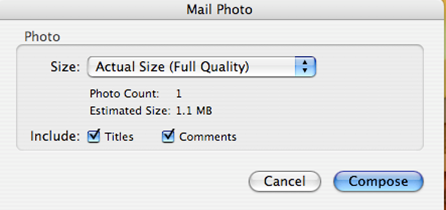
9) Use the drop down menu and select small.
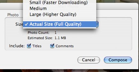
10) Select small and save the picture.
Processing Images in Photoshop
Photoshop provides more options for improving your photo and it is on the lab computers. After downloading to iPhoto on the macs in the lab, select the images you wish to modify and drag them to a desktop or to a folder with your initials. Be sure to trash your photos after you select and email the final version to the conference.
1) Open Photoshop and within Photoshop use File: Open. Browse for your image.

2) Go to Image: Image size: and notice the size and resolution of the image.
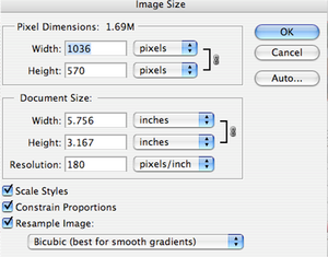
3) This picture is still too large. Notice it is 1.69M. You can change the size of your picture in several ways, but crop it first. Be sure the rectangle tool is highlighted. 
4) Outline the area you wish to keep and select Image: Crop.
5) Once you have the area you wish to keep, click on Image: Adjustments: Auto color to see if the computer can enhance the image for you. You can also adjust color on your own Image: Adjustment: levels. Once you are happy with the area and color save the image
6) Recheck the image size, most likely it will still be too large.
7) To reduce the size, start by changing the image width and height, this will provide you with a way to keep images similar in size. The shape of each cropped image is important; similarly sized images will make a more attractive figure.
8) If your image is still too large, you can change the resolution. Usually a resolution of about 100 will bring a cropped image to a reasonable size (kb).

Making a Multi-Panel Figure

In a scientific paper composite figures provide pictorial information on the organisms studied, the methods and equipment used, and the results summarized in graphs. For example, the figure above illustrates an experiment on photosynthesis performed in different plant species using a Qubit CO2 gas analyzer.
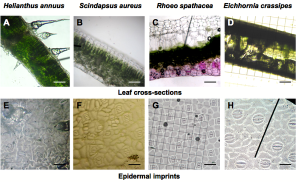
In lab you will take photomicrographs of leaves and organize them in a multi-panel figure. The example above is just one of the ways you can arrange the photographs.
A simple way to produce a figure with multiple panels is to use PowerPoint. The guidelines below outline the main steps. These apply to various operating systems of PCs and Macs and to various versions of PowerPoint. To find out specific information do not hesitate to Google a query such as “Resize pictures in PowerPoint Windows”. Note that you do not need to use Photoshop to change image size if you perform step 4 below.
1. Save the drawings, photographs or graphs you wish to incorporate in your multi-panel figure on your desktop or in a folder.
2. Open a PowerPoint slide.
3. Go to Insert > Picture > From file, and select the first picture you want to add. You can also paste pictures.
4. Resize. You can specify image size in all versions of PowerPoint. In Microsoft PowerPoint 2004 for Mac, double click on the picture. A window opens entitled “Format Picture”. You need to click on the arrows on the right of "Height" or "Width" (see below) to adjust the size. Make sure that “Lock aspect ratio” is selected. A resized, smaller picture might disappear from view but will be found on the screen in the upper left corner. Drag it back on the slide. In PowerPoint 2008 for Mac, double click on the picture to display a window entitled "Format Picture" with "Size" in the left column menu. In PowerPoint 2010 for Windows7 Enterprise, right click to open window showing "Size and Position".
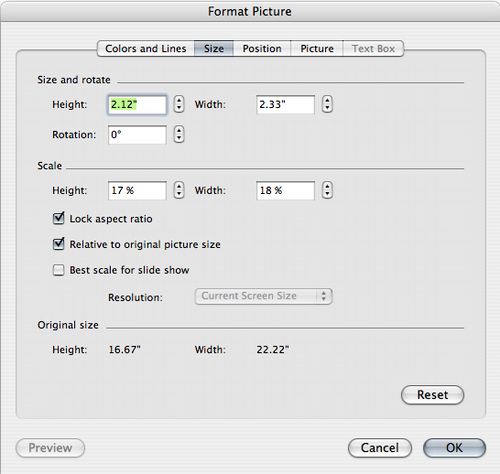
5. Edit picture. Look for: View > Formatting Palette > Picture. You can crop, flip images, change brightness and contrast, and add scale bars, arrows, and labels.
6. Proceed in the same way with all the images you want to integrate in your composite figure. If you line up several photographs in rows and columns it might be useful to select the same height and width for each of them. You can also adjust the size of a picture by dragging its corner. Important: Be sure to present graphs large enough for all labels to be clear and legible.
7. Group all the elements of your composite figure and Save as Picture: Go to Edit > Select all. Go to File > “Save as” a .png or .jpg file on your desktop. On a Mac you have the possibility to adjust the dots per inches (dpi) or the size of the composite picture by clicking on "Options..."
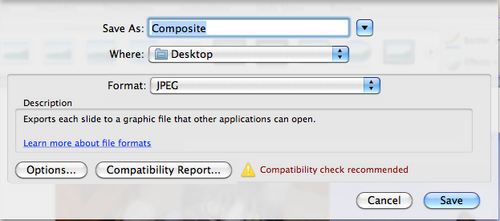
8. Exit PowerPoint. Your .png or .jpg file is likely to be less than 500 KB and thus can be easily integrated in a Word document. You can check the size of your file using “Get info” in Mac, and “Properties” in PC.
9. Open the Word document with the text of your paper and insert your composite picture in the appropriate location. To achieve that step, go to: Insert > Picture > From file
10. Add a legend to your figure (see "Results" in Science Writing Guidelines).
Statistical analysis: t-test in JMP
t-Test and One-Way Anova
T-Test, Comparing Two Means using JMP 7
1) When you first open the JMP program, a ‘JMP Starter’ window will appear as below. Select ‘New Data Table’ and a new table called ‘untitled.jmp’ will open. Go to ‘File’ and select ‘Save As’ to save your file.

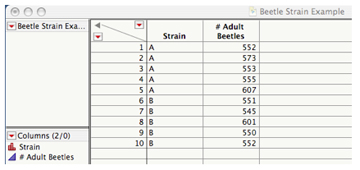
2) Now you must decide how to organize your data. In this example, there are two variables: Beetle Strain and # of Adult Beetles. Thus, you will need two separate columns.
a. To add a column, double click to the right of Column 1. This will create a second column. (Repeat this step if more columns are needed.)
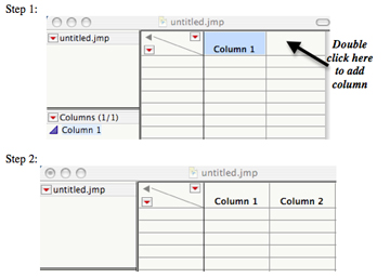
b. To label the columns and define the type of data they contain, double click directly on the ‘Column 1’ heading in the table. This will open a new window:
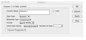
c. Label the first column heading ‘Strain’ to represent the type of beetle strain (A, B, C, or D). Under ‘Data Type’, you must specify whether the data in this column is numerical or character (letters). Since you are representing ‘Strain’ by a letter designation, select ‘Character’ as data type. Then click ‘OK’.
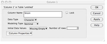
d. Repeat this process for column 2. Remember that in column 2 we are representing # of adult beetles. What data type are these? Be sure to specify under ‘Data Type’.
3) Once the columns are assigned, you can now enter your data. Simply click on a cell and enter the appropriate values. The completed table should resemble this:
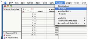
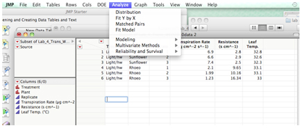
4) In order to compare means in JMP, you must select ‘Analyze’ from the top menu bar, and then select ‘Fit Y by X’.
5) This opens a new window as below. First, highlight ‘# Adult Beetles’ in the ‘Select Columns’ box on the left. Next, click the ‘Y, Response’ button. The # of adult beetles is considered to be the response (or dependent) variable since the number of adult beetles in a population depends on whether they are from Strain A or Strain B. Then, highlight ‘Strain’ and click on the ‘X, Factor’ button since strain is the fixed (or independent) variable, indicating it is the predetermined variable in our experimental design.
Note: If you incorrectly assign factor and response variables, simply highlight the column title in the ‘X, Factor’ or ‘Y, Response’ windows and click the ‘Remove’ tab on the right.
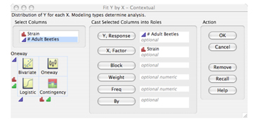
6) Click ‘OK’, and a new output window will open with a scatterplot of both Strain A and Strain B. You will see a small red triangle above the plot, which is the dropdown menu for many analysis options.
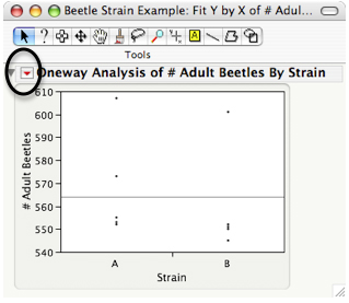
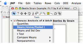
7) Click on the red triangle, and select ‘Means/ANOVA/pooled t’ from the menu to run the t-test. Please note that the ‘Means/Anova/Pooled t’ option will only appear if only two variables are being compared (e.g., strains A and B). If you have all four variables in one JMP spreadsheet (A, B, C, and D), that option is not available. You must either create a subset table with only the two groups you wish to compare (by highlighting the two sets of data you wish to compare, then go under ‘Table: subset’) or reorganize your data with only two groups per JMP spreadsheet as directed above.
8) This will generate multiple sets of output (as seen on the next page), but there are only a few factors we need for reporting our t-test results.
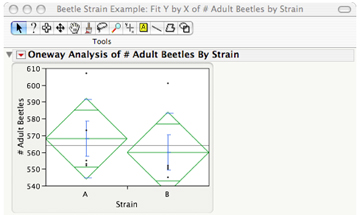
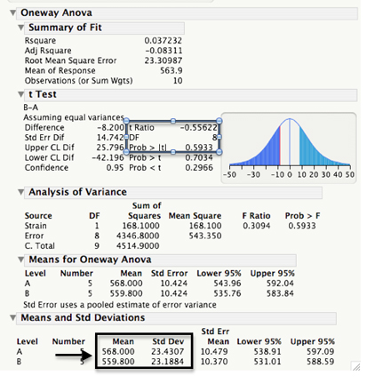
Under the ‘t Test’ heading (assuming equal variance), we are interested in the ‘t Ratio’ (which is the tstat or your hand calculated tcalc), ‘DF’ or degrees of freedom, and ‘Prob> |t|’ which is the P-value. For graphing, we are also interested in the means +/-SD (or SE) reported in the bottom table. (See the Graphing Means in this file for details on graphing and how to incorporate figures into a scientific paper.)
NOTE:
You can copy and paste whole tables or individual cells from JMP to Excel and Word and edit them. This will be useful for graphing in Excel. Click on the white plus sign in the ‘Tools’ window and then select the table or cells you wish to copy. Then you can copy and paste and edit in excel or word.
Suppose you have a data set with more than two groups but you only want to compare two. You can accomplish this by making a subset table using your large data set and performing a t-Test.
NOTE: A t-TEST assumes only 2 groups are being compared.
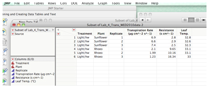
To select a subset of your data: Suppose you wanted to compare Sunflower and Rhoeo in the light for this data set:
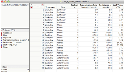
Highlight only the data for the two plants:
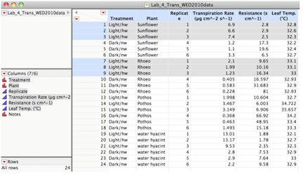
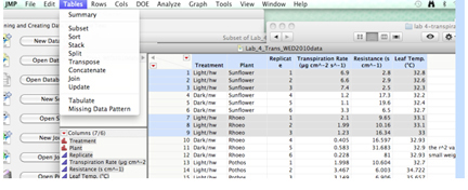
Then use Table: Subset
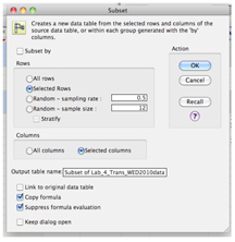
You can then proceed as for any t-test.
Statistical analysis: One-way ANOVA in JMP
One-Way ANOVA JMP One-Way ANOVA for comparing the means of more than two samples using JMP
ONE-WAY ANOVA - when your experimental set-up has multiple (> 2) levels of one experimental factor. You may think that doing many t-tests to compare all possible pairs of means would be a good approach, but so doing would increase the risk of concluding a significant difference when none actually exists. (In the statistical lexicon, you would be committing a Type I error.)
Enter the data into a JMP data sheet as shown below: Note that replicates for each type of flour are indicated by identical names – THIS IS VERY IMPORTANT.
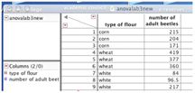
Once your data are entered: • Under the Analyze menu, select Fit Y by X • The value that you “set” is the independent variable. This variable belongs on the X axis. In this case the categorical (or nominal) variable is the selected flour types. Set this as your X value. • The dependent (numerical) variable is what you measure, and in this example would be the number of adults. Set this continuous variable as your Y value. • Click on OK and you will see a graph something like this:
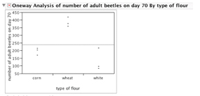
Here your raw data are plotted by factor or treatment level (type of flour).
• Pull down the red arrow in the upper left-hand corner and select Means, ANOVA. This following screen will appear:
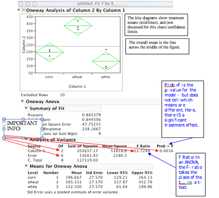
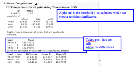
To test differences between pairs of means, back at the red arrow Select: Compare Means, then all-Tukey HSD. You will see the following print-out:
A good reference site on ANOVAs and experimental design hosted by Valerie Easton and John H. McColl will help you understand the ANOVA. Visit this site at http://www.stats.gla.ac.uk/steps/glossary/anova.html#expdes
In some experimental or observational situations you may be investigating two (or more) factors that may be influencing results (light and temperature, e.g). In this case, a two-way ANOVA may be appropriate. Two one-way ANOVAs that separately examine the two factors can also be conducted, but this approach is less efficient than the two-way approach, and also does not permit examination of a possible interaction between factors (e.g., synergism). This is an issue in the transpiration lab. A significant interaction indicates that the response to one factor depends on which level of the other factor is specified. The separate one-way approach would completely miss this important result; the presence of interaction negates the utility of this simpler approach to understanding a multi-factorial experiment.
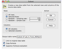
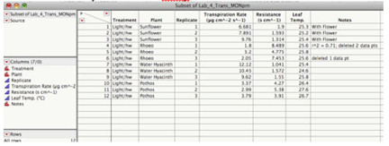
The data will be entered into JMP as below: The blue shaded cells are the plants in the light, while the unshaded are the plants in the dark conditions. To perform a one-way ANOVA you must create a subset of the data:
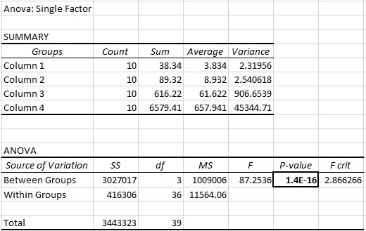
To perform a one-way ANOVA on these data you must separate the plants in the light from the plants in the dark or all the treatments for one group will be pooled. Highlight the appropriate cells using the mouse and command key. Then go to Tables: subset:
In this screen: click: OK
Perform the one-way ANOVA and Tukey-HSD as usual.
If you want to perform a two-way ANOVA refer to the stats and graphing folder document.
Expressing the results of a One-way ANOVA. as a table in a lab report or scientific paper: Note that in JMP the variation is expressed as both SD and SE. You need to chose which expression you will use and be consistent. (Also refer to the Science Writing Guide in this Wiki)
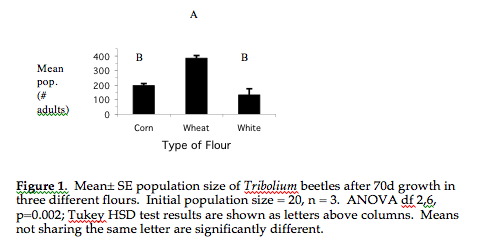
There are two ways to express the ANOVA/TukeyHSD in figures or tables in your lab report. Choose only one. Here is a concise and clear option for expressing the Tukey results in a figure:
Alternatively, the Tukey test results can be presented in a table in addition to a column graph of the means.

Results text and stats: How to express ANOVA stat results in the text of your report: Focus on the biology and use the statistical analysis to bolster your conclusions. (Remember, statistical tests are tools for understanding; statistical significance does not necessarily imply biological significance. In the case of a statistically significant finding, always report the size of the effect. Note that with very small sample sizes (e.g., n < 10) the power of a statistical test to detect a real effect is rather low. Oppositely, with very large sample sizes, even minor effects of little biological significance can be statistically significant! So, use caution in interpreting your results. Examine the trends in your data; even if not significant, they may point to a biologically interesting pattern that may suggest re-testing using larger sample sizes.)
Example of statistical test reporting: “All three grains supported beetle population growth but the greatest increase in population size was seen in wheat flour. After 70 d, the mean number of adult beetles in the starting population (20) had increased by a factor of 20 in wheat flour but only by about 10-fold in corn and 7-fold in white flour (Fig. 1). Mean population sizes in corn or white flour were not significantly different from each other but were significantly different from the mean population size in wheat flour (ANOVA, F = 22.7, df = 2,6, P = 0.002; Tukey HSD test, P < 0.05 (Table 1 OR Fig1).”
Note that the test statistic here, the F-ratio, has two types of degrees of freedom, the first for the numerator term of the ratio (the mean square of the treatments, with df = number of treatments minus 1), and the second for the denominator (the mean square of the error term, with df = total observations minus number of treatments). The F-ratio measures the amount of variation in the data due to the differences among mean treatment effects, versus that due to the variability within treatments. The F-ratio thus represents a measure of "explained" vs. "unexplained" variability, a kind of signal-to-noise ratio.
Note also that the Tukey test results are included here in text form, while the results of the overall ANOVA are provided in parenthesis.
Statistical analysis: Two-way ANOVA in JMP
Two-Way Analysis of Variance in JMP
Input the data as illustrated below. Treatment, Plant and Replicate columns have the data type 'character' 'nominal' and Transpiration rate and Total Resistance are 'numeric' 'continuous'
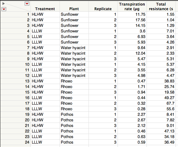
The null hypothesis for this two-way ANOVA is necessarily more complex than with a one-way ANOVA: There is no difference among the plant species' mean responses, and no effect of treatment (high light-high wind vs. low light-low wind) on mean plant response. Further, the interaction between the two factors (plant species and treatment) is nil.
Under the analyze menu select Fit Model
To specify the model, click on transpiration rate or total resistance from the Select Columns field and then and click Y (indicating the dependent variable) in the Pick Role Variables field.
To construct the test 1. highlight Treatment in the Select Columns field and then click Add in the Construct Model Effects field 2. highlight Plant in the Select Columns field and then click Add in the Construct Model Effects field 3. highlight both Treatment and Plant by clicking on Treatment and then holding down the shift key as you click on Plant. Click on Cross to add the interaction between Treatment and Plant
The Model Specification window should now look like this:
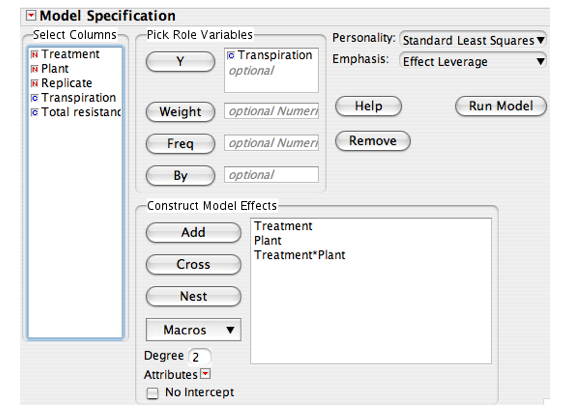
To run the model click on Run Model
Scroll down through the output until you find Effects Tests: Copy and paste this table into a word doc for later use. To do this, click on the white cross symbol in the formatting bar then place this cross over the inverted triangle to the left of Effects Test and click. The Effects test table should be highlighted in blue. Under the edit menu select Copy and then paste the table into a word file for later use in your results.
Look at each effect.
Remember that the null hypothesis for the Treatment effect row is that there is no effect of environmental conditions (HLHW vs. LLLW) on transpiration rate (or total resistance). You would not reject this null hypothesis if the P value (Prob > F) is greater than 0.05.
For the Plant row, the null hypothesis is that there is no significant difference among the plant species in transpiration rate, and again you would fail to reject this null hypothesis if the P value (Prob > F) is greater than 0.05. For the interaction row (Treatment * Plant), the null hypothesis of no interaction means that the effects of Treatment and Plant species are independent of each other. Consequently, a significant interaction row (Prob > F less than 0.05) means that you need to specify both the plant species and the particular environmental condition in order to understand transpiration rate differences. In other words, certain species may respond disproportionally more (or less) to a particular environmental condition.
The plots to the right on the screen labeled Treatment, Plant and Treatment X Plant are there to aid your interpretation of the effects table. For Treatment, click on the small red inverted triangle and select LS Means Plot. You will see a plot of the means and SE for each Treatment. The interpretation of the treatment effect should be very clear. Note that plant species have been pooled for this test.
Next look at the LS Means plot for the Plant effect. Which plant species seem to have higher transpiration rates than the others? Note that environmental conditions (Treatments) have been pooled for this test.
The Treatment * Plant plot will be the most useful in interpreting your data because here you can see both the effect of the different environmental conditions (Treatment) and the differences among the plant species (Plant). Which had the greater effect—environmental conditions or plant species? Did the plant species all respond similarly to the different environmental conditions?
If you have conducted this test for transpiration, repeat the methods but with Total Resistance as the Y variable. Is the interpretation of the test results the same?
You are encouraged to include the effects table (without the Nparms column) in your Results section and you may also want to include the Treatment X Plant LS Means plot to aid presentation of your results.
After you have finished following the two-way ANOVA instructions from the stats and graphing folder and you have successfully run the two-way ANOVA, go to the part of the output that is at the far right and press the magic little red triangle at the top on that last column of output (it should show the plant*condition interaction information). Select the Tukey HSD option there and below it will give you the letters that should go on your figure.
This is ONLY if you want to try the two-way ANOVA.
Reporting the results of a two-way ANOVA in your paper is complex because so many tests are conducted. Below is an example taken from the work of Darley, J. M. & Latané, B. (1968). "Bystander intervention in emergencies: Diffusion of responsibility". Journal of Personality and Social Psychology 8: 377–383. doi:10.1037/h0025589. You will need to modify the model for your plant experimental analysis. Notice how the results emphasize the context of the experiment and not the statistical analysis.
“An experiment was conducted to determine if the number of bystanders present in an emergency situation and the gender of the victim in an emergency situation affect the time it takes a person to help. A two-way ANOVA found a main effect of gender, F(1,24)=37.037, P ≤ 0.05, indicating that female victims are helped sooner than male victims. There was also a main effect of the number of bystanders present, F(2,24)=21.111, P ≤ 0.05. This effect showed that a lone bystander helped much sooner than when there were two or three bystanders present. Finally, there was an interaction between gender and the number of bystanders present, F(2,24)=4.815, P ≤ 0.05. Simple effects tests showed that male and female victims receive help equally quickly when only 1 bystander is present, F(1,24)=1.11, P > 0.05. However, when 2 or 3 bystanders are present, female victims were helped more quickly than male victims, F(1,24)=17.778, P ≤ 0.05 for 2 bystanders and F(1,24)=27.778, P ≤ 0.05 for 3 bystanders.”

