RAVE:Tutorial PowerExplorer
| Reproducible Analysis and Visualization of iEEG RAVE |
Power Explorer Video Tutorial
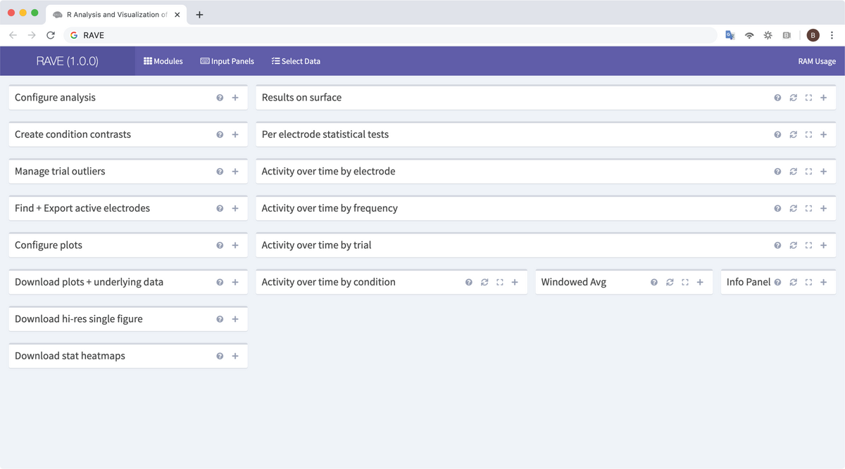
Power Explorer is the RAVE module that allows analysis of single subject iEEG data using spectral (time-frequency) analysis. The left side of the window shows ten different control panels that set analysis parameters, control plot options, and download data. The right side of the window visualizes the data with different plots. While most plots are passive, the 3dViewer plot is active and can be directly manipulated. All Panels and plots have a title bar that has functions as follows:
Click on a control panel or plot in the screenshot below for information.
Detailed Description on Navigating RAVE's Power Explorer Module
To begin, launch a RAVE session through RStudio with the following command:
>rave::start_rave()
Click the option “Select Data” from the top menu and enter a subject’s referenced data to load. (For a tutorial on loading a subject, see the tutorial here. For a tutorial on referencing a subject’s data, see the tutorial here.) For a single subject, the “Load for Group Analysis” checkbox does not need to be checked. Click “>Load Data” at the bottom right corner of the panel to launch the RAVE session with this subject. Look to the black menu at left and expand the Condition Explorer options. Select “Power Explorer.” A pop-up panel will appear asking to load the referenced voltage data for this subject and provide the size of this data and an estimated load time. Click “Load Data” to continue into the Power Explorer Module or “Cancel” to select another option from the left-hand menu. This page contains multiple panels and plots; this tutorial will cover them from top to bottom in two columns, as they appear on the page, and from left to right.
Select Electrodes
The first panel at the top left is the Select Electrodes panel. The top droplist, Electrode Categories, selects how electrodes will be organized through the rest of the module. These options come from the subject’s electrodes.csv file and are identified by column name. By default, if it is present, this droplist will be set to “Label”; if there is no “Label” column, the droplist will default to “Electrode,” a numerical list of channels. The Select Electrode by Category (Multi-Select) droplist below can be used to select individual electrodes or a group of electrodes by the value(s) selected from the Electrode Categories droplist. Click the “Merge LH/RH categories” checkbox below if the categories are sorted by left and right hemisphere to allow RAVE to organize them as a whole. To select electrodes numerically, no matter the current categorical display, enter an electrode number or a range of electrodes in the lowest textbox. RAVE may not automatically respond to changes in this panel unless the “Automatically recalculate analysis” checkbox at the bottom of the second panel, Configure Analysis, is checked (see below for details). There are two link options at the bottom. The first, “Reset electrode selectors,” will clear all settings in this panel and reset the options back to default. The second, “Download copy of meta data for all electrodes,” will download to the default Downloads location for the browser a CSV file containing all meta-analysis data for the currently selected electrode(s). Depending on the number of electrodes loaded, it may take some time for this download to complete. Do not refresh the browser or recalculate the analysis during downloading.
Configure Analysis
Immediately below the Select Electrodes panel is the Configure Analysis panel. This panel sets the analysis parameters for any and all electrodes defined by the Select Electrodes panel; these parameters can be adjusted at any time for an individual electrode or a group of electrodes. The first option on this panel is a slider with two endpoints. Set the first endpoint to the minimum frequency of the frequency range to be analyzed and the second to the maximum frequency. This slider’s total range comes from the total frequency range set in the Preprocessing Module. Unlike the Preprocessing Module, frequencies outside the set range will not be excluded from displays, solely from analysis. Look now to the second item on the panel, a droplist labeled “Electrode Unit of Analysis.” Use this droplist to change the units of analysis used throughout the Power Explorer and Group Analysis modules as well as any downloaded data. The default option is percent change of power (denoted “% Change Power) but other common options such as decibels or z-scored amplitude can be set as well. The third item on the Configure Analysis panel is another slider with two endpoints. The slider’s range is the total time loaded for the current analysis, as set by the Select Data panel before launching the current session. These timepoints set the baseline period for analysis. The baseline provides a reference within each trial against which to measure changes in power or amplitude. An ideal baseline period is one of about 500-1000ms in length, set before the first event of the trial, during a period of minimal activity (or minimal expected activity) related to the trial. Each electrode is baselined individually, by trial, according to the signal within the selected time period. To set the baseline period to be averaged across trials, check the “Use Global Baseline (across trials)” box below the slider. Set the first endpoint to the start time of the baseline and the second to the end time. The endpoints can be adjusted more finely by clicking the endpoint and pressing the left or right arrow keys to slide the endpoint by 0.01sec per click in the direction pressed. The fourth item and third slider on the panel is the Analysis Time slider. Like the Baseline Time slider, the range is the total time loaded and the analysis time period is set by adjusting the two endpoints. All of the plots displayed on this page will display data from this analysis period While it is possible to overlap the baseline and analysis periods, it is not recommended to do so as the baseline calculation may affect results. Immediately below this is another slider, Plot Time Range, that will set the start and end time points displayed on the plots. By default, this is the entire loaded time period, but it can be adjusted within that time as needed. There are two more droplists at the bottom of the panel. The Analysis Event is a list of events in the epoch file that can be set as time zero for each trial. By default, this is the time marked as the event start in the epoch file, otherwise known as the Trial Onset. However, other events such as a response period, stimulation start, or trial offset can also be added to the epoch file and set to time zero as an option in this list. The second droplist asks “How should trials be sorted?” By default, trials are sorted by numerical order as entered in the epoch file. These can be sorted as well by conditions or random shift, or by other trial qualifiers in the epoch file. At the very bottom of the Configure Analysis panel is a large blue button labeled “Recalculate everything.” Click this button to run RAVE’s Power Explorer Module analytical calculations within the current parameters set by the left-side panels. Recalculation may take a few seconds, in particular if a large number of electrodes are being run or if the parameters are extremely wide, such as running analysis on the entire frequency range or an analysis period of over five seconds. Do not refresh the browser during recalculation and avoid pressing the button multiple times while RAVE is processing the recalculation. Beneath the “Recalculate everything” button is a checkbox labeled “Automatically recalculate analysis.” When this box is checked, RAVE will automatically detect changes to the control panels and run the recalculation after every update. Because RAVE will be recalculating often, this setting can be taxing on slow computers or when analyzing large datasets. Uncheck this box at any time to stop this; RAVE will finish any calculations being run at the time of unchecking and resume manual recalculation mode.
Create Condition Contrasts
The third panel on the left-hand side of the page is the Create Condition Contrasts panel. This panel reads trial information from the epoch file’s “Condition” column and allows for the creation of condition groups containing values in the column. Each group is organized numerically (i.e., Group 1, Group 2, etc.) and must contain an alphanumerical label as well as a minimum of one trial condition. For each group, enter a name in the “Name” textbox. Select one or more conditions in the droplist below to add them to the group. By default, the first (and only) group is “All Conditions” and contains all trial conditions listed in the epoch file; the example condition groups are “Auditory Only,” “Audiovisual,” and “Visual Only,” and each contains four trial conditions within those categories. Groups cannot have overlapping conditions. To add a condition group, press the plus icon at the bottom of the panel, and to hide a condition group from analysis, press the minus icon. Hiding a group will not remove the name or conditions set to it, solely hide it from analysis. Pressing the plus icon again will reveal the hidden groups. There are two more buttons at the bottom of the panel, a blue “Save Settings” button and a grey “Load Settings” button. The former will save all current condition groups to the project folder as both CSV and YAML files, accessible later from both the Power Explorer and Group Analysis Modules. Click the “Load Settings” button to load one of these condition group settings for the current analysis. Changing the information in loaded settings will not alter the saved file so long as the “Save Settings” button is not pressed again.
Manage Trial Outliers
This small panel allows individual trials to be marked as outliers and hidden/excluded from analysis. There is a checkbox at the top that reads “Show outliers on plots”; by default, this box is checked, meaning that trials marked as outliers will be excluded from analysis but will still be shown on plots containing trial data. The central droplist contains all trials of the epoch file, sorted by numerical order. Selecting a trial will add it to the list of outliers and, if the “Automatically recalculate analysis” box is checked, will recalculate figures on the page without that electrode. If the “Show Outliers on plots” box is checked, outliers on plots that show trials will be displayed as an open circle. There are two buttons at the bottom of the panel. “Clear Outliers” will remove all values from the “Trials to Exclude” droplist and re-include those trials in the next recalculation. With one or more values in the droplist, the “Save Outliers” button will be available; this marks trials as outliers in the epoch file to exclude them from all further analysis. Outliers can be added to the droplist as well be double-clicking on the trial in the Windowed Avg panel. For more details, see the Windowed Avg panel tutorial below.
Find + Export Active Electrodes
This panel is directly related to the Group Analysis Module; to analyze data in that module, those data must first be exported through this panel to save them as YAML files that the module can load later. Understanding what data this panel processes is essential to understanding the parameters of the Group Analysis Module. At the top of the panel, there is a droplist labeled “Across electrodes results to show.” This panel will read data from all electrodes in the active condition groups, not just electrodes currently loaded for analysis. By default, the panel will display Omnibus Activity (i.e., activity across all electrodes and all trial types within the active condition groups); select a condition group from the droplist to display only those trial types or a comparison between condition groups to show the difference in data between them. There are two checkboxes below this. The “Synch display variable to 3D Viewer” checkbox will automatically set the 3D Viewer panel at the top of the page to synchronize the data it displays with the selection made in the above droplist. The “Show frequency plots beside results output” will display a graphical depiction of frequency data as well as the numerical table of results unless unchecked. Electrodes and trials can be sorted by multiple filters to identify a subset of electrodes for further analysis. Each filter defines a type of data, a target value for that data, and the relationship of the target to each electrode’s data to include. The first filter is a p-value filter; there are three types of p-value calculations/corrections that can be selected. The default is the false discovery rate (FDR) correction. Select the relationship between the p-value and a set value from the central droplist. For example, the default settings for this filter are to include only electrodes whose FDR(p) values are less than 0.01. The value in the textbox can be adjusted, such as being raised to 0.05 for a less strict analysis, and the relationship to this value can be adjusted, such as including all values less than or equal to the value. The t-value filter and mean response filter operate in the same manner. In addition, there are two anatomical filters available; these droplists will sort electrodes by columns of the electrodes.csv file. For example, electrodes listed as lying near/within an ROI within the electrodes.csv file can be filtered, excluding all electrodes outside this area. To remove a filter, leave the value textbox or droplist empty. Electrodes that pass all analytical and anatomical filters will be listed by numerical value in a read-only textbox beneath the list of filters. Click the “Apply filters to analysis” button to display only those electrodes’ data on the page’s plots. There is a large droplist beneath the filters labeled “Trials to include in export file.” By default, this droplist contains all trial types within the categories selected in the “Across electrodes results to show” droplist at the top of the panel. Click the blue “Synch from trial selector” button to exclude trial types that have been excluded by the filters or current analysis settings. This does not recalculate the data; these trial types have already been excluded from the data, but may not be excluded from exporting if they are still present on this list. Check the box “Include outliers in export” to include trials marked as outliers in the exported data. By default, these electrodes are excluded from both analysis and export. At the bottom of the panel, there is a textbox labeled “Export Filename (no spaces).” Exporting a set of electrodes will save those data as both a CSV and YAML file with the name entered in this textbox. As the label states, there cannot be spaces in these filenames; hyphens and underscores are recommended instead. Click the blue “Export data for group analysis” button to begin the exporting process. This process may take a few seconds depending on the size of the data being exported. Beneath this button is a checkbox, “Also download data”; check this box to export the CSV file to both the RAVE directory and the browser’s Downloads folder.
Configure Plots
The labels, sizes, colors, and other features of the Power Explorer’s plots can be adjusted from the Configure Plots panel. At the top, there is a droplist of “Plot Decorations.” Each item is a feature of one or more plots to the right. Removing an item from the droplist will also remove that feature from the plots that display it. RAVE will automatically refresh the displays when this option is adjusted—this is not a recalculation of the data, solely a refresh of the panel images according to the new display parameters—in other words, changes made in the Configure Analysis, Manage Trial Outliers, Select Electrodes, or other panels that manage data will not be reflected by the update of these panels. Beneath this droplist is a checkbox that can be unchecked to remove the labels of these plot decorations. There are three color palettes used across the Power Explorer Module: the color palettes of lines displayed in the Activity Over Time plots, the heatmap, and the 3D Viewer panel. These palettes are coordinated by default but can be adjusted individually from this panel. First, look at the Lines Color Palette subsection. The default palette is “Beautiful Field.” Other color options may be darker or brighter, or more or less saturated; color options are to set the RAVE plots to best fit the user’s current display and do not affect the data. Check the “Reverse Palette” box to swap the range of colors within the palette to the values to which they are set. Check the “Invert Colors” box to swap each color value within the palette with its opposite on a standard color wheel. Next, look at the Heatmap Color Palette subsection. The default option is a blue-white-red palette where blue electrodes are the lowest values, white is near zero or the data median, and red values are the highest. Select a gradient that provides clear contrast between high and low values and fits well with the current display. Beside the palette droplist, there is a text box for “Unique Color Values.” A large numerical value, around 150-200, will provide a very smooth gradient for high-resolution displays but may make nearby values difficult to distinguish from each other. A small numerical value, around 1-30, will make the gradient choppy and low-resolution but provide greater contrast between nearby values. The “Reverse Palette” and “Invert Colors” checkboxes can each be selected to create a heatmap that best fits the current display. There is a second subsection, Heat Map Range, to determine the heatmap display across the page. The heatmap can be set to a specific range of values or a percentile of the data by entering the value(s) in the textbox here. Enter zero to set the heatmap to the entire data range. Check the “Range is percentile” box to enter a single value, such as 95 or 99, into the box and exclude values outside that percentile range. Beneath this section is another checkbox, “Show data range on heat maps”; like the “Label Plot Decorations” checkbox, selecting this will add the data range label to the plots, and unchecking it will hide it. Finally, look at the subsection labeled 3D Viewer Color Palette. An individual color palette can be selected from the droplist here or this option can be set to “Synch with heatmaps,” which will apply the color palette and settings of the heatmap to display values in the 3D Viewer as well. At the bottom of the panel, the background color of these plots can be set to a neutral white, black, or grey. RAVE does not support a dark mode but setting the plot backgrounds to black can reduce eyestrain in a similar way. The display background of the 3D Viewer is always white unless the “Override 3D Viewer background” box is checked.
Download Plots + Underlying Data
RAVE allows for easy export of plots and data with this and the two following panels. This panel will export all plots and data as a *CSV file to the Downloads folder option for the current browser. Select which plots to download with the first droplist. By default, all plots on the page are listed. While a single plot can be exported from this panel, it’s recommended to use the Download Hi-Res Single Figure panel (see next section) instead, as the resolution will be much greater. Select which electrodes should be included from the second droplist. By default, all electrodes of the current session are loaded, but this can be limited to just the current electrode selection. In the third droplist, choose an option for calculation of power over time. The default option, per trial type, will calculate power over time for each trial type listed in the epoch file, regardless of condition groups. This can be set to calculate power of time for condition groups as well. Click the blue button, “Download graphs and their data,” to begin the download.
Download Hi-Res Single Figure
To download a single plot as a high-resolution image for papers, posters, and presentations, choose a graph from the top droplist of this panel and set the dimensions, in inches, of the image and the file type as which it should be saved. Click “Download Graph” at the bottom of the panel to download the image to the browser’s Downloads folder.
- ===Download Stat Heatmaps===
This panel downloads the heatmaps separately from the plots for use in MATLAB. Select the dimensions, in inches, of the *image matrices to be downloaded and click “Sheth’s special stat heatmap” to begin the export to the browser’s Downloads folder.
Results on Surface
This panel is a miniature version of RAVE’s 3D Viewer and operates in the same manner, including all the same keyboard shortcuts. A more detailed tutorial for the 3D Viewer can be found *here. This tutorial will go over the highlights of the viewer within the Power Explorer Module. The main feature of this panel is the ability to display the subject’s 3D surfaces as generated by FreeSurfer, the electrodes within and on the brain, and the data from those electrodes side-by-side. To rotate the brain, simply click and drag on the surface; the image can be zoomed in or out with the mouse wheel. Click the black “Open Controls” option to display the 3D Viewer menu. The 3D Viewer menu has multiple sub-menus. First expand the “Default” option. This menu controls the colors, camera position, and video settings of the panel. Use these options to take a high-resolution screenshot, to reset the panel or change its colors, to record a video, or to export the viewer as a zipped folder containing the command(s) to launch the 3D Viewer separately from RAVE/RStudio (it will launch in the user’s preferred browser). Expand the “Volume Settings” option. These controls affect the 3D surface(s) within the viewer. Click “Show Panels” to bring up the coronal, axial, and sagittal MRI views of the brain at the current position as three sub-windows at the left. These views can also be overlaid on the brain as slices with the “Overlay Coronal/Axial/Sagittal” checkboxes. Each window and overlay can be adjusted individually with the slider bars. Expand the “Surface Settings” option. These options affect the display of subject-specific surface files; while the Power Explorer Module only explores one subject’s data at a time, if the current session has been set to load data for group analysis, the viewer can be set to display a template brain, the brains of other subjects in the same project, or other FreeSurfer-generated surfaces for the same subject such as white matter or inflated surfaces. Hemispheres can be hidden, displayed as wireframes, or adjusted in opacity from this menu as well. Expand the “Electrodes” option. There are only two controls here; the checkbox “Map Electrodes” will convert the electrode coordinates to the selected 3D surface and the “Visibility” options will narrow the displayed electrodes to the current selection or hide them completely. Mapping the electrodes is not necessary if the electrode coordinates in the subject’s electrodes.csv file are already within the same space as the same subject’s FreeSurfer volume(s). This feature, however, is essential to map electrodes from one or multiple subjects to a template brain. Expand the “Data Visualization” option. This menu controls the display of data calculated by the Power Explorer Module on the brain’s surface. There are several calculations to display, including the Percent Change of Power and p-values, and thresholds can be set within the data range to limit the display to only electrodes meeting certain criteria. If a video has been recorded in the “Default” option, it can be played at regular or altered speeds from this menu. There are also checkboxes to show or hide certain plot labels such as the highlight box on the selected electrode, informational text about that electrode, and the heatmap legend.
Per Electrode Statistical Tests
This panel displays three plots side-by-side; these show, respectively, the mean, t-values, and FDR-corrected p-value of the selected variable (by default Percent Change of Power; see “Configure Analysis” above for details), calculated across all trials, for all electrodes in the current selection. If a threshold for any of these values has been set in the “Find + Export Active Electrodes” panel, it will appear as a dashed red line on these plots and electrodes outside these criteria will appear as open circles. Each plot has the same x-axis, electrode number, and will display each electrode’s value as a colored point of a scatterplot. This panel is not interactive; these are simply displays for the current selection of electrodes.
Activity Over Time by Electrode
This spectrogram displays the activity, measured in units selected in the “Configure Analysis” panel, of all electrodes of the current selection. Time is consistent along the x-axis and electrodes are organized numerically along the y-axis. The baseline and analysis windows are denoted by dashed lines at the start and endpoints of each. If multiple condition groups are set, the heatmaps for each group will be displayed side-by-side within this panel. Displaying a large number (i.e., five or more) of condition groups can make the data appear cramped; click and drag the bottom-right corner of the panel to expand it within the current browser page or click the expand icon (the segmented square at the top-right) to open the panel with the current analysis calculation within a new browser tab. At the left, the heatmap for the full data range is displayed as well as the current unit of analysis. This can be hidden from the “Configure Plots” panel at left.
Activity Over Time by Frequency
This spectrogram displays the activity, measured in units selected in the “Configure Analysis” panel, across all loaded frequencies. The x-axis is time and the y-axis is frequency; unlike the previous plot, this panel averages activity across the entire selection of electrodes. The display, however, is nearly identical: the baseline window is denoted by dashed lines at its start- and endpoint and the heatmap is displayed at left unless hidden from the “Configure Plots” panel. The analysis window is shown as a dashed box across the analysis time window and frequency window; the calculations in this module all come from data within this box. Multiple condition groups are shown side-by-side to the edges of the panel. If the display is too narrow, click and drag the bottom-left corner of the panel to expand it within the page or click the expand icon in the to-right to open the panel in another browser tab.
Activity Over Time by Trial
The third spectrogram on the page displays activity over time in the selected units of analysis (see the “Configure Analysis” tutorial above), averaged across electrodes, for each individual trial listed in the epoch file. Time is displayed across the x-axis and the trials, organized numerically, are listed along the y-axis. The heatmap for this spectrogram is labeled with the data range and units of analysis and is displayed at left. The baseline and analysis windows are shown as dashed lines at the start- and endpoint(s) of each. For multiple condition groups, each plot’s y-axis is labeled according to the numerical label on each trial included in the condition. Displaying more four or five condition groups at once may cramp the display; to avoid this, expand the panel either by clicking and dragging it in the bottom-left corner or by clicking the expand option in the upper-left. If any trials have been marked as outliers in the “Manage Trial Outliers” (see above) or “Windowed Average” panels (see below), they will appear greyed-out in this plot with yellow arrows marking the start and end for clarity.
Activity Over Time by Condition
This line graph displays the averaged activity of all loaded electrodes within the time period and units set in the “Configure Analysis” panel. A set threshold or, if no thresholds are set, the y = 0 line will appear as a grey line across the entire panel. The baseline period and analysis period are highlighted by color; the colors depend on the palette selected in the “Configure Plots” panel. Each condition group is denoted by a color-coded line and labeled in its respective color at the top of the graph, near the upper y-axis. Up to five groups can be displayed with unique colors; at six or more groups, the color pattern will repeat.
Windowed Average and Info Panel
These two panels are directly connected. The Windowed Average panel shows a scatterplot the mean electrode activity of each trial, grouped and color-coded by condition group, and the mean of means as a black line within each group. Click once on a trial to bring up in the Info Panel the trial number, value, label, and condition group of that trial. Click twice on a trial to mark it as an outlier in the “Manage Trial Outliers” panel (see above) or double-click an excluded electrode, denoted as an open circle, to add it back into the current analysis.
