BIOL368/S19
From OpenWetWare
Jump to navigationJump to search
Week 2 Journal
Purpose
The purpose of this lab is to learn the effect that different parameters within a society or/and a population group has on the way that a disease transmits. Also to learn the different variablites and possibilities that transmission of diseases have.
Methods/Results
- The model explored: deterministic homogeneous COMP model
- The reason that the model above was chosen: model assumes a high level of homogeneity which makes it applicable to society.
Graph 1:Initial Graph

- The graph shows the number of people in different stages of the disease over a time period of a hundred days. The light green; the removed line shows the number of people that died as a result of the disease and the graph shows that by the end of the hundred days all the people who were infected died.
- By the end of the 100 days a 100% of all the people who were infected died.
Graph 2:Open Population

- In this graph, the parameter that was changed is population. The population was changed from a close population to an open one.
- Unlike the Initial graph, this graph shows no "removed" population meaning that no one died according to this graph. Additionally, the graph shows that by the end of the 100 days, 25% of the population recovered the disease, and 25% of the population are infected as well while half the population is still susceptible.
Graph 3: Density Dependent Transmission
![]()
- The initial graph showed the results in a different mode of transmission; Frequency-dependent transmission.
- The different results that this graph has from the Initial graph is that there's no infectious-asymptomatic population.
- Also, in this case, the infectious symptomatic graph reached its peak at day 18 which is earlier than in the Initial graph.
Graph 4: Control Strategy (vaccination)

- In this graph, a control strategy of vaccination with probation of 0.5 was added which means that 50% of the population is vaccinated.
- The number of infectious-symptomatic people showed a huge decline.
- By the end of the 100 days, only 10% of the population is susceptible, 40% recovered and the rest are vaccinated.
- The recovery graph showed that it was not as fast as when no vaccination was used.
Graph 5: Control Strategy (Culling)

- In this graph a control strategy of culling (5 days) is applied.
- The graph shows that eventually all the population is removed at the 45th day as they get infected
- The way the disease acts in terms of spreading is the same as in the previous graphs.
Graph 6: Time Period

- In this graph the time period was changed to 500 days instead of 100
- The graph shows the same results from the initial graph; all population is removed by the day 100.
- extended period of time did not show a change in terms of result.
Graph 7: Immune Period

- This graph shows that the recovered population is only immuned for a while and then they are susceptible to being infected again.
- First there was a huge number of susceptible people then it decreased with the increasing recovery. Then we could see that the number of susceptible people increased again with a decrease in the number of recoveries.
- The graph shows no complete recovery nor removal of the population.
Graph 9:control strategy (Vaccine + Culling

- This graph shows the results of using both vaccines in half of the population along with culling (5 days)
- The graph shows a decline in the population of the people removed to 45% of the total population after the 100 day period.
- 5 are still susceptible.
- In this graph there's no recovery at all, instead it shows a flat curve throughout the graph.
Graph 10:Infection States

- In this graph, the states chosen are S - Susceptible, E - Infected (latent), and Ia - Infectious and asymptomatic.
- The graph shows that everyone is either susceptible to asymptomatic infectious and the graph reaches a point where the number of people asymptomatic infectious and susceptible is equal.
Graph 11:Starting Population

- This graph demonstrates the results from having an open population with 4 infected people at the beginning of the stimulation
- The amount of infected individuals declines fast after reaching sixty individuals on day 15.
- The amount of infected individuals=recovered immune individual on day 25.
- Susceptible, infected, and recovered immune maintain the same number from day 25 until day 100
Questions from the article "Modelling the COVID-19 epidemic and implementation of population-wide interventions in Italy"
- How did the authors modify the simple SIR model to take into account features of the COVID-19 pandemic?
- The author modified the model so that it's variable and shows the different ways that COVID-19 could spread in and how in some individuals it's first undetectable but could be detected later and in some, it's not detectable at all. The author also made sure to show that the virus could go from not showing symptoms in some people to be extremely dangerous so the model was very informative and accurate.
- What public health policy implications does their model have?
- The public health policy implications their model has is a lack of testing. Not every individual that gets infected gets tested or even ones that show signs of infection.
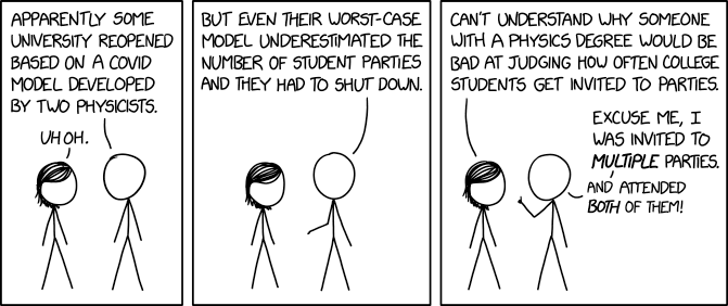
Check your understanding: https://xkcd.com/2355/. Why is this comic funny? (Hint: hover your mouse over the graphic to see the extra joke in the tooltip.)
- This comic is funny because it making fun of schools that opened and referring to that they must have consulted the wrong people when they opened. Also, the person telling the story doesn't fully understand what a pandemic is shown by that he attended two parties. This is so similar to what's happening nowadays with people underestimating the pendamic which results in higher number of cases and makes it even worse.
Scientific Conclusion
This excerise showed the diffrent variations that a disease spreads in. It also showed the different results it could have in a population and the huge negative impact it could have on it. Finally it demonstrated an example of how diseases transmitted could be underestimated.
Acknowledgments
- My partner Aiden Burnett helped me in understanding the assignment.
References
- OpenWetWare. (2020). BIOL368/F20:Week 2. Retrieved September 16, 2020, from https://openwetware.org/wiki/BIOL368/F20:Week_2
- XKCD. (2020).University COVID Model. Retrieved September 16, 2020, from https://imgs.xkcd.com/comics/university_covid_model.png.
- Giordano, G., Et. Al. (2020). Modelling the COVID-19 epidemic and implementation of population-wide interventions in Italy. Nature Medicine, 30,855-860. https://doi.org/10.1038/s41591-020-0883-7
