IGEM:IMPERIAL/2006/Logo
Final Logo & Poloshirt
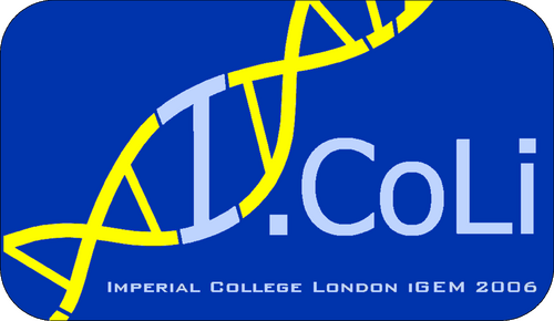

Modified Logo (Modified by Dora)

Modified Logo (year added)

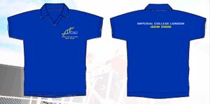
Polo suggestion
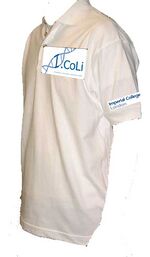
what is our decision now? i need it asap! Thanks
- by jimmy
Sizes
- Men-Poloshirt - edit the number of size you want (UK sizes):
- 1 x Small (Jonny)
- 1 x Medium (JohnC)
- 1 x Large (John Sy)
- ? x XLarge
- Women-Poloshirt - edit the number of size you want:
- ? x Small
- 1 x Medium (Christin)
- ? x Large
- Whoever does not respond is being allocated a size...
Color of polo & logo
- JohnS and Deepti expressed their preference for blue&yellow.
- Vincent for blue&blue.
- Christin for red&white.
- Colour of polo - a dark colour I would say, except if we take the blue&blue logo
- Since you are the one in charge of ordering, Jimmmy, you can make the final decision.
Position of Logos
- As outlined in the picture - additionally, we could have the logo printed in bigger in the middle of the back of the shirt.
Logo itself
- Should include the year
We need to decide on several points:
- color of the Polo (I would say white or dark blue)
- color of the I.Coli logo (I would say the blue one, maybe different background if polo is dark blue)
- size and position of both logos
We need to provide ASAP to Jimmy:
- a mock-up of the Polo with clear position of the logos
- very high resolution of both logos (>300-400dpi)
URGENT-T-shirt(25 Sept 2006)
- see suggestion IGEM:IMPERIAL/2006/Logo
- I am looking for our team t-shirt now... farah have suggested polo shirt, with school name on the sleeve, logo on the chest, but i need more info if u all want me to settle the t-shirt in china, i only have 10 days left!!!
- I need the following: number of t-shirts, size, colour, expected pattern and anything u want for the t-shirt, and i do not want to collect ideas. I need the definate answer, so i could go and look out to order them, state your expected price as well, we only order a very small amount, so do not expect it to be very cheap.
- time is running out, if possible, i wish i could have an answer before wednesday if u all are expecting me to make and bring the shirts to london. cheers :)
New Draft
Special thanks to Dora Dong Weijia for designing this set of Logos!
Personally don't think it's nicer than before though because it is not so compact... open to suggestion
- Should highlight "Imperial COllege London Igem"(all the capital letters should be in different colours from the other letters)
Christin 18:05, 7 September 2006 (EDT): Hope these comments come still in time....
- I think we should also include the year - Imperial College London Igem 2006
- For the blue and yellow one (I think the yellow writing and blue DNA is much nicer than vice versa) - could we get a lighter blue for the DNA? For example that light blue of the blue-coloured logo suggestion.
- Johnsy 09:57, 7 September 2006 (EDT): I personally like the blue and yellow one....
- Da104 04:54, 8 September 2006 (EDT): Yellow and Blue is also my favourite. I agree with Christin;s comments though- all capital letters in a stronger shade of blue, the small letters in a lighter shade perhaps? Keep it subtle though- we don't want tacky!!!
- Version 1
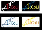
- Version 2
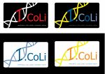
Tom Draft
Hi guys, did a little photoshopping on the logo to show off some ideas of how I think it should look
Idea 1
Same as Jimmy's friend's one really, except the DNA has been rotated and englarged to make the I look better.

Idea 2
I didn't think the DNA was easily distinguisahble as DNA on idea 1, so extended it out of the box. I think this one looks really nice (well, if my photoshop skills could clear up the rubbish) with the box highlighting the I as an I. The C would have to change colour though as its not in the box anymore
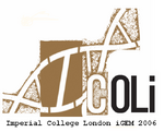
What do you think?
- Da104 05:14, 31 August 2006 (EDT) I like it!! I'm with Christin in saying little "O", "C" the same colour as "oLi" and please please please let's get rid of the awful brown!!! (ask Jonny for colours!!!)
Second Draft
Specail thanks to Dora Dong Weijia for refining the logos!
Christin: Good job! I really like the new design.
- Some suggestions for amendments:
- Small 'o' in I.CoLi
- Shifting the I a bit downwards and making the contrast a bit more obvious
- iGEM in a new line and add 2006 to it
- Colours: dark red, red/orange, periwinkle/blue
- Perhaps a shade of the colour within the rectangle with the upper part being more intense, the lower part being lighter ?! (or vice versa)
Johnsy: It might be nicer to move the Imperial College iGEM part closer to the I.Coli part. They seem very far apart. Also, the first I needs to be darker, since you have a light background for the DNA. Overall, quite a nice design though
Tom: Yeah, I agree with Christin's comments. Not sure about the idea of shading though.
- I think the DNA needs to be tilted clockwise more, so we can get a straigher I. If that means some kind of overlap of DNA with the C of Coli then so be it.
- It might mean having to crop the top of the brown box down a bit, and moving the 'Imperial college..' thing below the logo.
- And I also think the I should be bigger, should be the biggest letter!
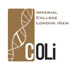
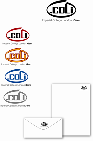
Design 1
Specail thanks to Huang Xiaonan for designing this set of Logos!
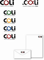
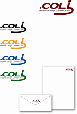
Design 2
Specail thanks to Huang Xiaonan for designing this set of Logos!
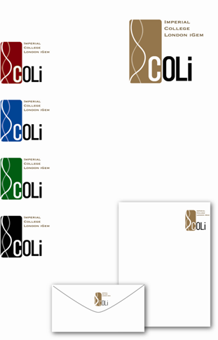
Design 3
Specail thanks to Huang Xiaonan for designing this set of Logos!
Design 4
Specail thanks to Huang Xiaonan for designing this set of Logos!
