GRNmap Testing Report: Non-1 Initial Weight Guesses 2015-05-28
From OpenWetWare
Jump to navigationJump to search
Purpose
- The purpose of this test is to see how model outputs for the same network are affected by different initial weight guesses (other than 1, the standard on which all previous models have been run). By looking at LSE values and estimated parameters, we hope to discover if there is any bias toward certain initial weight guesses.
- GitHub Issue #95: [1]
Test Conditions
- Date: 2015-05-28
- Test Performed by: User:Katherine Grace Johnson, Katherine Grace Johnson Electronic Lab Notebook and User:Natalie Williams, Natalie Williams: Electronic Notebook
- Code Version: from BIO398 Spring 2015
- MATLAB Version: 2014b
- Computer on which the model was run: SEA120-03
Results

Two strain Comparison
wt and dHMO, Initial Weight Guess: 0
- Media:GJ Input 21 Gene Network Sigmoid Model Estimate wt dHMO1 weight0test.xlsx
- Media:GJ Input 21 Gene Network Sigmoid Model Estimate wt dHMO1 weight0test estimation output.xlsx
- Media:GJ wt dHMO1 weightguess0.zip
- analysis.xlsx containing bar graphs
- LSE: 15.5341
- Penalty term:0.1893
- both LSE and penalty term same as control (w=1) run, maybe the number of iterations is different? I did not save the counter image, but will do with future runs.
- Initial quick comparisons show that estimated weights, b values, and production weights were slightly different (out to the third decimal place) between the w=1 and w=0 runs.
Individual Strains
wt alone, all initial Weights 0
- Input sheet: Media:2015.05.28.Input 21 Gene Network Sigmoid Model wt weights0.xlsx
- output sheet: Media:2015.05.28.Input 21 Gene Network Sigmoid Model wt weights0 estimation output.xlsx
- Figures Media:Wt tester figures NW.zip
- analysis.xlsx containing bar graphs
- LSE: 6.8824
- both LSE and penalty term same as control (w=1) run
- Initial quick comparisons show that estimated weights, b values, and production weights were slightly different (out to the third decimal place) between the w=1 and w=0 runs.
dCIN5, all initial weights 0
- Input sheet: Media:2014.10.23.Input 21 Gene Network Sigmoid Model dCIN5 estimation weights0.xlsx
- Output sheet: Media:2014.10.23.Input 21 Gene Network Sigmoid Model dCIN5 estimation weights0 estimation output.xlsx
- Figures: Media:DCIN5 weights0 figures NW.zip
- analysis.xlsx containing bar graphs
- LSE:7.4497
- both LSE and penalty term same as control (w=1) run
- Initial quick comparisons show that estimated weights, b values, and production weights were slightly different (out to the third decimal place) between the w=1 and w=0 runs.
dGLN3, all initial weights 0
- Input sheet: Media:2015.05.28.Input 21 Gene Network Sigmoid Model GLN3 estimation weights0.xlsx
- Output sheet: Media:2015.05.28.Input 21 Gene Network Sigmoid Model GLN3 estimation weights0 estimation output.xlsx
- Figures: Media:DGLN3 weights0 figures NW.zip
- analysis.xlsx containing bar graphs
- LSE: 9.5367
- both LSE and penalty term same as control (w=1) run
- Initial quick comparisons show that estimated weights, b values, and production weights were slightly different (out to the third decimal place) between the w=1 and w=0 runs.
dHMO1, all initial weights 0
- Input sheet: Media:2015.05.28.Input 21 Gene Network Sigmoid Model dHMO1 estimation weights0.xlsx
- Output sheet: Media:2015.05.28.Input 21 Gene Network Sigmoid Model dHMO1 estimation weights0 estimation output.xlsx
- Figures: Media:DHMO1 weights0 figures NW.zip
- analysis.xlsx containing bar graphs
- LSE: 6.9139
- both LSE and penalty term same as control (w=1) run
- Initial quick comparisons show that estimated weights, b values, and production weights were slightly different (out to the third decimal place) between the w=1 and w=0 runs.
dZAP1, all initial weights 0
- Input sheet: Media:2015.05.28.Input 21 Gene Network Sigmoid Model dZAP1 estimation weights0.xlsx
- Output sheet: Media:2015.05.28.Input 21 Gene Network Sigmoid Model dZAP1 estimation weights0 estimation output.xlsx
- Figures: Media:DZAP1 weights0 figures NW.zip
- analysis.xlsx containing bar graphs
- LSE: 6.9793
- both LSE and penalty term same as control (w=1) run
- Initial quick comparisons show that estimated weights, b values, and production weights were slightly different (out to the third decimal place) between the w=1 and w=0 runs.
Wt Alone with various initial weights
wt alone, Random Positive and Negative values for weights assigned 1
To create this sheet, the following formula was entered into the network_weights tab:
=IF(network!D16=1,(RANDBETWEEN(-1,1)+ROUND((RAND()),3)),0)
Next, the resulting adjacency matrix was copied with its values pasted into a new worksheet. For values that were greater than one, one was subtracted from them. The formula used for that was:
=1.xyz - 1, where xyz are random numbers from 0-9 for a decimal point. The resulting number in the cell was 0.xyz
The workbook was then saved under another name with a .xlsx extension.
- Input sheet: Media:2015.06.01.Input 21 Gene Network Sigmoid Model wt randomPos Neg Run.xlsx
- Output sheet: Media:2015.06.01.Input 21 Gene Network Sigmoid Model wt randomPos Neg Run estimation output.xlsx
- Figures: Media:Wt pos neg NW.zip
- LSE: 6.8824
- Penalty term: 0.1793
wt alone, all initial weights 3
- Input sheet: Media:2015.06.01.Input 21 Gene Network Sigmoid Model wt weights3 NW.xlsx
- Output sheet: Media:2015.06.01.Input 21 Gene Network Sigmoid Model wt weights3 NW estimation output.xlsx
- Figures: Media:Wt alone weight3 figures.zip
- LSE: 6.8824
- Penalty term: 0.1793
All strains with various initial weights
all strains, all initial Weights 0
- Input sheet: Media:GJ input 21 Gene Network Sigmoid Model Estimate all strains weight0test.xlsx
- Output sheet: Media:GJ input 21 Gene Network Sigmoid Model Estimate all strains weight0test estimation output.xlsx
- Output .mat file (zipped): Media:GJ input 21 Gene Network Sigmoid Model Estimate all strains weight0test estimation output.zip
- LSE:45.3083
- Penalty term: 0.7808
- Number of iterations (counter): 34100
- Both LSE and penalty term are noticeably different between this run an the w=1 run. The LSE of this run is slightly smaller.
- ppt containing comparisons of estimated weights of major regulators, production rates, and b's: Media:All strains w0 vs w1.xlsx
- Figures: Media:All strains weight0 figures.zip
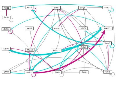
- GRNsight figure of weighted network:


all strains, initial weights -1
- Input sheet: Media:GJ input 21 Gene Network Sigmoid Model Estimate all strains weight neg1.xlsx
- Output sheet: Media:GJ input 21 Gene Network Sigmoid Model Estimate all strains weight neg1 estimation output.xlsx
- Output .mat file (zipped): Media:GJ input 21 Gene Network Sigmoid Model Estimate all strains weight neg1 estimation output.zip
- LSE: 45.2566
- Penalty term: 0.7878
- Number of iterations (counter): 33600
- Figures: Media:All strains weight neg1 figures.zip
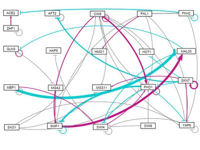
- GRNsight figure of weighted network:

all strains, Random distribution of weights (-1,1) assigned 1: Run 1
- Input sheet: Media:2015.06.01.Input 21 Gene Network Sigmoid Model allstrain randomPos Neg Run.xlsx
- Output sheet: Media:2015.06.01.Input 21 Gene Network Sigmoid Model allstrain randomPos Neg Run estimation output.xlsx
- Output .mat file (zipped): Media:2015.06.01.Input 21 Gene Network Sigmoid Model allstrain randomPos Neg Run estimation output NW.zip
- LSE: 45.3083
- Penalty term: 0.7808
- Counter: 48400
- Figures: Media:All strain pos neg NW.zip
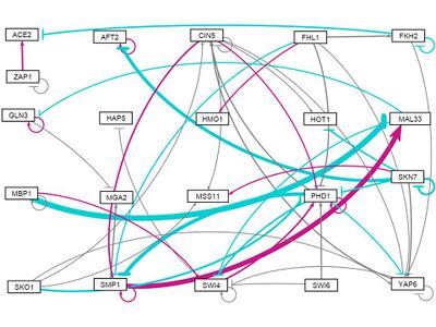
- GRNsight figure of weighted network:

all strains, Random distribution of weights (-1,1) assigned 1: Run 2
- Input sheet: Media:2015.06.01.Input 21 Gene Network Sigmoid Model wt randomPos Neg Run2 NW.xlsx
- Output sheet: Media:2015.06.01.Input 21 Gene Network Sigmoid Model wt randomPos Neg Run2 estimation output NW.xlsx
- Output .mat file (zipped): Media:2015.06.01.Input 21 Gene Network Sigmoid Model wt randomPos Neg Run2 estimation output NW.zip
- LSE: 45.3083
- Penalty term: 0.7808
- Counter: 39400
- Figures: Media:Wt Pos Neg Run2 NW.zip
- analysis.xlsx containing bar graphs
- GRNsight figure of unweighted network:

all strains, Random distribution of weights (-1,1) assigned 1: Run 3
- Input sheet: Media:2015.06.01.Input 21 Gene Network Sigmoid Model wt randomPos Neg Run3 NW.xlsx
- Output sheet: Media:2015.06.01.Input 21 Gene Network Sigmoid Model wt randomPos Neg Run3 estimation output NW.xlsx
- Output .mat file: Media:2015.06.01.Input 21 Gene Network Sigmoid Model wt randomPos Neg Run3 estimation output NW.zip
- LSE: 45.3083
- Penalty term: 0.7809
- Counter: 48500
- Figures: Media:Wt Pos Neg Run3 NW.zip
- analysis.xlsx containing bar graphs
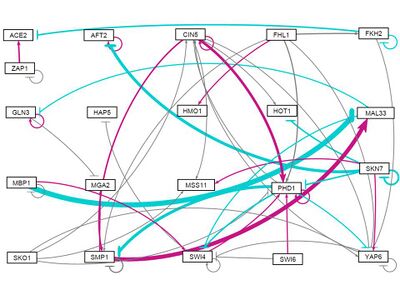
- GRNsight figure of weighted network:

all strains, all initial weights 3
- Input sheet: Media:2015.06.01.Input 21 Gene Network Sigmoid Model all strains weights3 GJ.xlsx
- Output sheet: Media:2015.06.01.Input 21 Gene Network Sigmoid Model all strains weights3 GJ estimation output.xlsx
- Output .mat file (zipped): N/A
- LSE: 45.6978
- Penalty term: 0.7251
- Number of iterations (counter): 39000
- Figures: Media:All strains weight3 figures.zip
- GRNsight figure of weighted network:

all strains, all initial weights -3
- Input sheet: Media:GJ input 21 Gene Network Sigmoid Model Estimate all strains weight neg3.xlsx
- Output sheet: Media:GJ input 21 Gene Network Sigmoid Model Estimate all strains weight neg3 estimation output.xlsx
- Output .mat file (zipped): [[Media:]]
- LSE: 45.2565
- Penalty term: 0.7879
- Number of iterations (counter): 39100
- Figures: Media:All strains weight neg3 figures.zip
- GRNsight figure of weighted network:

all strains, all initial weights 10
- Input sheet: Media:GJ input 21 Gene Network Sigmoid Model Estimate all strains weight10.xlsx
- Output sheet: Media:GJ input 21 Gene Network Sigmoid Model Estimate all strains weight10 estimation output.xlsx
- Output .mat file (zipped): Media:GJ input 21 Gene Network Sigmoid Model Estimate all strains weight10 estimation output.zip
- LSE: 45.3083
- Penalty term: 0.7808
- Number of iterations (counter): 44000
- Figures: Media:All strains weight10 figures.zip
- GRNsight figure of weighted network:

all strains, initial weights distributed between -3 and 3
- Input sheet: Media:2015.06.01.Input 21 Gene Network Sigmoid Model wt randomPos3 Neg3 NW.xlsx
- Output sheet: Media:2015.06.01.Input 21 Gene Network Sigmoid Model wt randomPos3 Neg3 estimation output NW.xlsx
- Output .mat file (zipped): Media:2015.06.01.Input 21 Gene Network Sigmoid Model wt randomPos3 Neg3 estimation output NW.zip
- LSE: 45.3083
- Penalty term: 0.7808
- Counter: 38300
- Figures: Media:Wt rand neg3 to 3 NW.zip
- analysis.xlsx containing bar graphs
- GRNsight figure of weighted network:

Discussion
- Examine the bar charts comparing the weights and production rates between the two runs. Were there any major differences between the two runs? Why do you think that was? Given the connections in your network (see the visualization in GRNsight), does this make sense? Why or why not?
- In comparing the all strains output sheets, we noticed a trend in the production rates as well as the threshold values. Weights equal to 1 or 3 had more values in common while the all 0 and the random distribution of weights ranging from -1 to 1 had similarities.
- In analyzing the LSE, it appears that a slightly larger value is obtained when the network contains a bias for positive numbers.
- To view the comparison of all strains: Media:NW All strains 0 1 3 rand.xlsx
- For the wt alone, the values differed once reaching the third value or the thousandths place in the decimal. The LSEs for all the runs - weights set at 1, 0, 3 and than randomly distributed between -1 and 1 - were identical at 6.8824
- To view the comparison of wt alone: Media:2015.06.01.Comparing wt 0 1 3 random NW.xlsx
- To view the comparison of all strains that included the new weight values: -1, -3, 10, and the 3 additional random distribution of weights, click Media:2015.06.02.Comp all strains 0 pn1 pn3 10 4rand.xlsx
- What other questions should be answered to help us further analyze the data?
Summary ppt for 2013-06-03 meeting: Media:GRNmap Testing.pptx
Preliminary Analysis of Resulting Data from Strain Run Comparisons and Non-One Initial Weight Estimations:
Media:2015.06.03.Strain Run Comparison Weight Estimation KG NW.docx
- Discuss the results of the test with regards to the stated purpose. Additionally, answer the relevant questions below:
- Examine the graphs that were output by each of the runs. Which genes in the model have the closest fit between the model data and actual data? Which genes have the worst fit between the model and actual data? Why do you think that is? (Hint: how many inputs do these genes have?) How does this help you to interpret the microarray data?
- Which genes showed the largest dynamics over the timecourse? In other words, which genes had a log fold change that is different than zero at one or more timepoints. The p values from the Week 11 ANOVA analysis are informative here. Does this seem to have an effect on the goodness of fit (see question above)?
- Which genes showed differences in dynamics between the wild type and the other strain your group is using? Does the model adequately capture these differences? Given the connections in your network (see the visualization in GRNsight), does this make sense? Why or why not?
- What other questions should be answered to help us further analyze the data?
