William A. C. Gendron Week 12
From OpenWetWare
Jump to navigationJump to search
Questions
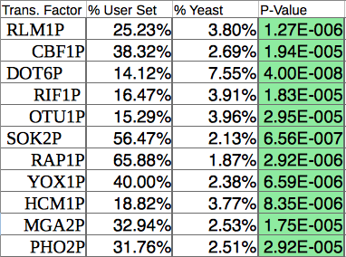
- How many transcription factors are significant?
- I collected significant ones from all of the profiles resulting in 11 significant transcription factors.
- As you can see, CIN5, GLN3, HMO1, and ZAP1 are not on the list.
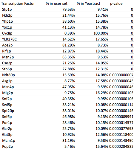
- My partner's list was created using the wild type data from profile 45:
- Again, the major transcription factors were not identified on this list. They may be so common that the program that does not distinguish them as significant in this case.
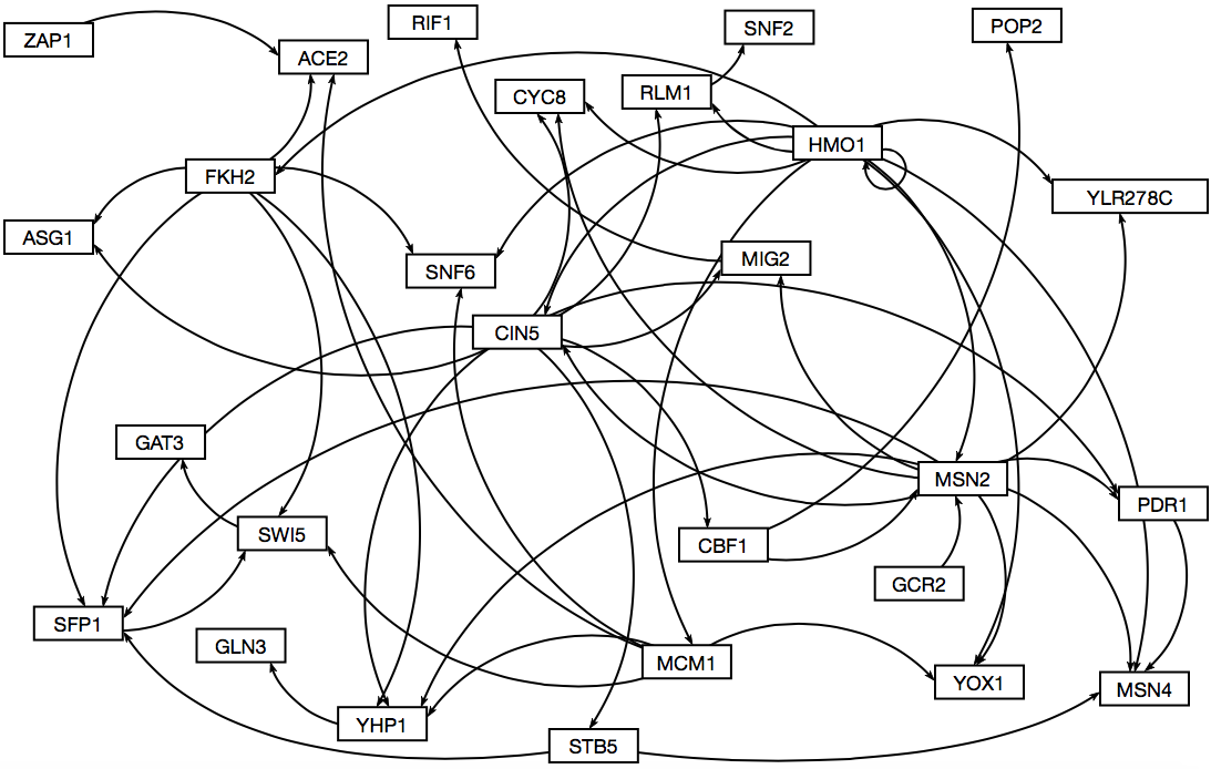
- We ended up using an amalgamation of the two. I selected to use two of my transcription factors taken from the same cluster and all of Jeffreys which overlapped with genes from other columns. This was the final list used for the "binding only" data so some were removed due to lack of connections to other transcriptions factors.
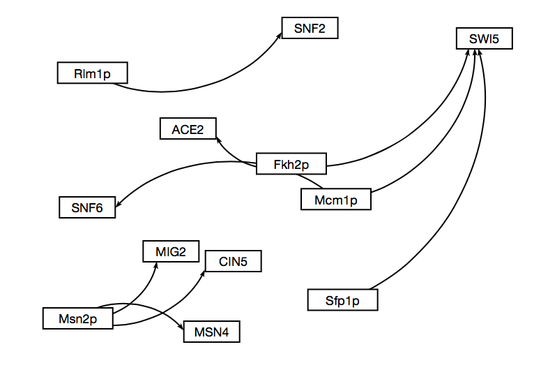
- Here is what the resulting map looked like through GRNsight.
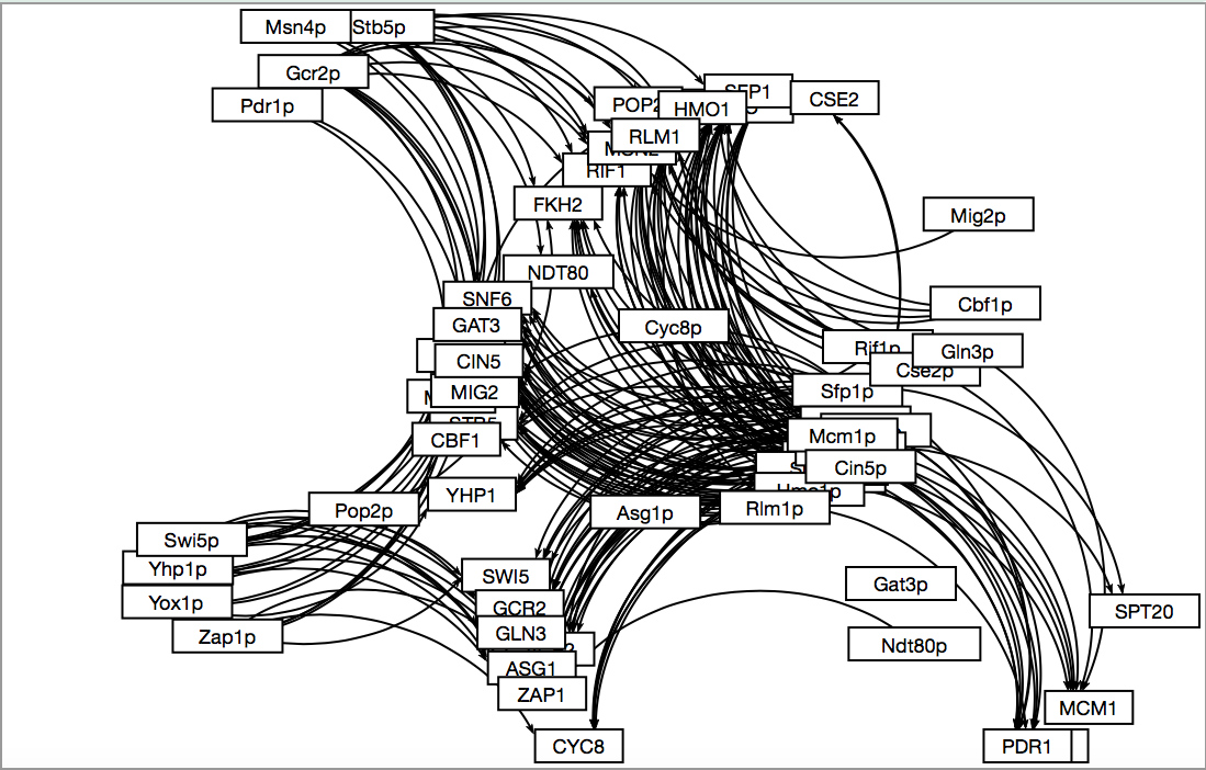
- The "plus" network was just too large to deal with.
- The "and" network broke into three pieces with only 9 edges.
- How many overlaps were there between the dCIN5 significant transcription factors and the wild type(profile 45)?
- Only 5 overlapped, 3 of which were from the borderline significance list of dCIN5 which is not shown. We used most of the transcription factors that were significant. We used all of them from dCIN5 due to the fact that there were so few of them and then arbitrarily dropped some of them at the end of the wild type list. In hindsight, we can probably go back and rank them based off of which has the most hits or some other level of connectedness.
- On the topic of this weeks work:
- Determining which transcription factors are significant was difficult due to the fact that dCIN5 had a lack of significant transcription factors. In general though this would be done by selecting the gene names from a profile that was created by STEM. These names are then run through Yeastract transcription factor page. The list of genes goes in the right column labelled genes and the check box marked all TFs should be selected. It is then run and the output should be a list of TFs with P-values. The ones that are significant will be green. One should be able to find a profile that has a large number of TFs, although that was not the case for dCIN5. 15-30 significant TFs should be appropriate for this study. The wild type results were the appropriate number for the study.
- The creation of the three candidate gene regulatory networks are based on using different standards to declare relatedness. The DNA binding plus expression evidence was the least stringent and found a connection between all of them. Binding only was slightly more specific and therefore found fewer connections than the other method. The DNA binding and expression data required that there was evidence for relatedness in both a DNA binding test and in expression tests and therefore has fewer connections and TFs in the network.
- The edges between the groups varied. The most stringent "AND" data set had 17 edges, mostly low in degrees and diverse out degrees. That means that it didn't find many connections, most TFs were only affected by a small number of genes and the amount of genes that they went on to effect varied a lot. The binding evidence only data showed similar results but with more edges: 52. Again, the in-degrees were smaller while the out degrees were larger. Several TFs affect a larger number of other TFs but the number of TFs that can affect a single TF is smaller. The "PLUS" group was very large with 207 edges and as a result somewhat useless. There are too many connections to make sense of it. The in degrees for some of them were even larger than the out degrees of the binding only group. The out degree includes a TF with 28 edges. Even if this data is an accurate description of how it interacts, it is still ineffective at creating a way to understand it. I doubt that it is accurate and it is picking up on downstream effects and calls them a direct relation.
- The visualization done by inputting the data into GRNsight after modifying the excel files appropriately and then moving the boxes around so that they are visually appealing/easy to read. "AND" and "Binding only" had reasonable sized maps and could be sorted, but "PLUS" as I said earlier is useless.
- We have selected "Binding only" because it is a reasonable size: "AND" is too small and "PLUS" is too large.
Methods
- Used the gene list created from last week. Excel or an excel style program is needed(LibreOffice is a good free option). Week 11 Assignment.
- The gene terms/IDs were copied into clipboard.
- Went online to: YEASTRACT database.
- The “Rank by TF” button was pressed on the left hand side of the screen.
- The list of genes were pasted into the box labeled ORFs/Genes.
- The box for “Check for all TFs” was selected.
- None of the other default settings were selected.
- Clicked the Search button.
- This produced a list of TFs ranked by significance.
- This was done for each significant profile of dCIN5 and the for one profile in the wild type: Profile
- We looked to find 15-30 TFs in common, but were unable to so we reached that with additional TFs that were significant.
- We then went back to the Yeastract and clicked on the “Generatye Regulation Matrix” Button.
- The list of transcription factors previously identified were copied and pasted with CIN5, GLN3, HMO1, and ZAP1 into both the "Transcription factors" field and the "Target ORF/Genes" field.
- This was run three times: The “AND”, “PLUS” and “DNA Binding Only”.
Organizing the Transcription Factors: Organizing and Visualization
All of these processes were repeated for each map.
- *Downloaded the csv file.
- Opened the file in excel or officelibre. OfficeLibre automatically sorts it.
- Made it an excel file and continued work. (.xlsx).
- The data was transposed and then the titles for the genes were made capitals and to match. Removed the “p” from the names. Copy and transpose paste helps out here.
- A new worksheet called degree" was made and then the matrix was copied over to it. Same was down for another worksheet called “network”.
- After the last cell in column A, put “out-group” and then we created summations of each column below.
- At the end of the rows, a vertical version of this was made with “in-group” and a summation of all the rows and the “out-group” are created.
- The lower right vertex will have the sum of all the values or the number of edges. This should be between 50-60 ideally.
- After that, they created three columns to the right called "Frequency", "In-degree total", and "Out-degree total". In the "Frequency" column, numbered sequentially from 1 to the largest degree number in the calculations in the “in-degree” and “out-degree”. Numbered the frequency of each connection under each degree.
- We created a chart of "Frequency", "in-degree" and "out-degree"
- We then went to GRNsight and clicked file open for each of the trials.
- This gave us maps which we organized to have the same basic patterns so they aligned.
- Results can be seen on the lionshare powerpoint or above. The discussion is above in the form of the paragraphs.
