Dahlquist:GCAT-SEEK Workshop 2016
This page contains the electronic lab notebook generated by Kam D. Dahlquist in preparation for and at the GCAT-SEEK Workshop held on June 28-July 2, 2016 at Cal-State LA.
2016-06-28 Notes
Chapter 2: Sequence Processing and Quality Control
- go to workshop directory
cd /N/dc2/projects/GCAT/workshop
- FastQ results file.
Pre-Workshop Tutorials
R Tutorials
This is based on An introduction to statistics in R, a series of tutorials by Mark Peterson for working in R.
Scripts and notebooks are stored in my GitHub repository.
Basics of Data in R (Chapter 1)
2016-06-03
- Downloaded and installed the current version of R for Windows, v3.3.0 from here; this is the direct download link.
- Downloaded and installed the current version of RStudio, v0.99.902 from here; this is the direct download link.
- Launch RStudio (it default opens with the v3.3.0 version of R I just installed, noting that I have other versions of R installed on my laptop.)
- Create a script file
- File > New > R Script
- Save file using the menu item: File > Save,
Dahlquist_learningR.Rin folder My Documents > Travel-Conferences > GCAT-SEEK_2016 > scripts - Made the following comments:
# Script written by Kam Dahlquist
# Learning R First Script
# 2016-06-03
- Did some simple arithmetic
# Try some simple arithmetic
3+2
3-2
3*2
3/2
- By highlighting and typing
Ctrl+Enter, R will compute the result and show results in the console window. - Variables in R must begin with a letter, but can be any length and can include numerals. An "arrow", a less than symbol followed by a dash
<-is used to assign variables.
# Store a simple variable, then display it
testVariable <- 3
testVariable
- Note that the first command assigns the variable, the second one displays it.
# Use the variable
testVariable + 2
testVariable * 2
- Highlight and use
Ctrl+Enterto compute answer.- Change testVariable and run again.
# Change test variable
testVariable <- 4
testVariable
- Note that in the console window, the [1] next to the answer is the index telling us that the vaaule is the first element of the variable (also note that the index starts at 1, not zero).
# Make a test vector, then display it
testVector <- c(1,3,4,6,8,10,15)
testVector
- Note that the function
cstands for "concatenate". This function takes a series of numbers and returns them as a single vector. - Note that a function takes arguments separated by commas inside of parentheses.
# See how vectors respond to arithmetic
testVector + 3
testVector * 2
testVector + testVector
- In the output, for arguments that are only one number long, the same procedure is applied to each item of
testVector. When the arguments are the same length, the argument is applied element-for-element.
# Create a second vector
testVectorB <- testVector + 3
testVectorB
# Display only the 3rd element of a vector
testVectorB[3]
- Answer is 7
# Display only elements greater than 8
testVectorB[testVectorB > 8]
- Answer is 9 11 13 18
# Show how it is done:
testVectorB > 8
- Answer is FALSE FALSE FALSE TRUE TRUE TRUE TRUE
- In this case it is testing each element of the vector and returning the logical answer.
- At this point I think I need a little more explanation of the syntax. The tutorial is telling me what code to enter without explaining the syntax, so it will be difficult for me to extract the general lesson from this.
# Display the value of testVectorB when testVector equals 3
# Note that two '=' are used for logical tests
testVectorB[testVector == 3]
- Answer is 6
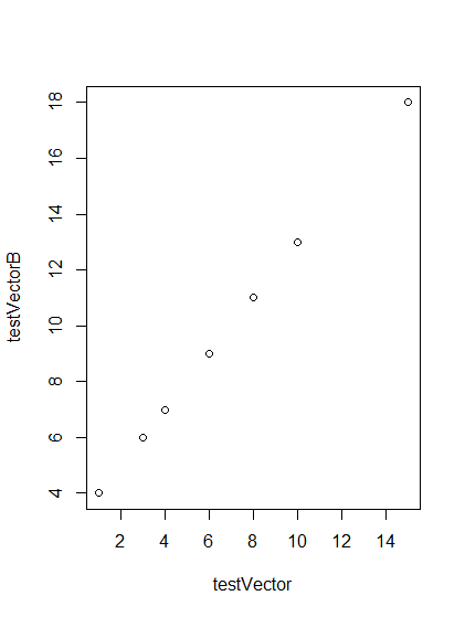
# Make a plot of two vectors
plot(testVector, testVectorB)
- This generates a plot of the two vectors, the x-coordinates are given in the argument first, then the y-coordinates.
I completed the section 1.7 Playing with Data and will pick up with section 1.8 Spreadsheet style data when I pick this up again.
2016-06-06
- Picking up where I left off with Section 1.8 of An introduction to statistics in R tutorial.
- Launch RStudio. It launched, automatically opening my previous script, likely because I saved my workspace image.
- Practice making a type of variable called a data frame (
data.frame) that will match vectors like a spreadsheet in Excel.
# Practice making a data frame
testDataFrame <- data.frame(testVector,testVectorB)
testDataFrame
- Output looks like this:
           testVector  testVectorB
1          1           4
2          3           6
3          4           7
4          6           9
5          8          11
6         10          13
7         15          18
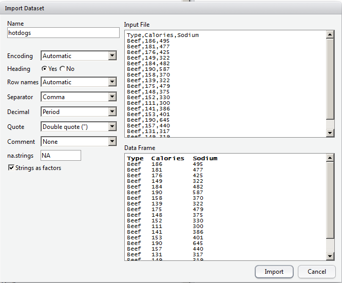
- Create new folder called "data" and download the .csv file into it: hotdogs.csv.
- Use the menus to import data: Tools > Import Dataset > From local File.
- The data displayed. Copy the following command into the script so that the data will load the next time I run the script:
# What RStudio added to my Console
hotdogs <- read.csv("~/Travel-Conferences/GCAT-SEEK_201/data/hotdogs.csv")
View(hotdogs)
- The issue with this command is that it records the absolute path to the directory, which may change. To get around this, we need to set the relative path, aka, "set the working directory".
- In RStudio click Session > Set Working Directory > To Source File Location.
# Manually set working directory
# Made sure that this is set for my computer, not the tutorial
setwd("~/Travel-Conferences/GCAT-SEEK_2016/scripts")
- Put the above code near the top of the script so it is easy to see and change if working on a different computer or sharing a script.
- Now that the directory is set, going to type commands to read data
# What RStudio added to my Console after using menu to read csv data file
hotdogs <- read.csv("~/Travel-Conferences/GCAT-SEEK_2016/data/hotdogs.csv")
View(hotdogs)
# Read hotdogs.csv data file directly instead of from menu
read.csv("../data/hotdogs.csv")
# previous data was read in, but not saved, so we are going to assign it to the variable hotdogs
hotdogs <- read.csv("../data/hotdogs.csv")
# Look at the top of the hotdogs data
head(hotdogs)
- displays the first six rows of the data (by default, can change this)
- this is what it showed:
  Type    Calories Sodium
1 Beef      186    495
2 Beef      181    477
3 Beef      176    425
4 Beef      149    322
5 Beef      184    482
6 Beef      190    587
- Use
summaryfunction to get some descriptive statistics of the data
# Look at the data a little more completely
summary(hotdogs)
- Results shown
     Type       Calories         Sodium
Beef   :20   Min.   : 86.0   Min.   :144.0
Meat   :17   1st Qu.:132.0   1st Qu.:362.5
Poultry:17   Median :145.0   Median :405.0
             Mean   :145.4   Mean   :424.8
             3rd Qu.:172.8   3rd Qu.:503.5
             Max.   :195.0   Max.   :645.0
- Install
knitrpackage to create an HTML output from this script.
# Install knitr
# commented out line after running it so that it doesn't run again each time I run this script
install.packages('knitr')
- ran install, clicked on notebook icon in menu bar in script tab and it installed further dependencies.
- it found an error in line 19 (it looks like I pasted the plot command there spuriously), so fixed it.
- ran it again and it worked, creating file called "Dahlquist_learningR.html" in the "scripts" directory. I will commit to github repository since OWW doesn't take HTML files.
Summary of commands learned so far
- Highlight text and type
Ctrl+Enterto run a command - simple arithmetic
- setting a variable
variableName <- value - displaying a variable
variableName> - setting a vector
vectorName <- c(list of elements separated by commas) - perform arithmetic on vectors
- displaying a vector
vectorName- a particular element
- based on a criteria
- producing a logical from each element
- simple x-y plot
plot(vector1,vector2) - make a data frame from two vectors
dataframeName <- data.frame(vector1,vector2) - import csv data from menu and command line
read.csv(path) - set working directory from menu and command line, including relative directory
setwd - look at first six lines of data frame
head(dataframeName) - look at summary statistics of data frame
summary(dataframeName) - create an HTML notebook
Plotting and evaluating one categorical variable (Chapter 2)
2016-06-07
- Launch RStudio; note that it opens with my previous script because I saved the workspace image.
- Create a new script called "Dahlquist_ch2_ploting-one-categorical-variable_20160607.R"
# Script written by Kam Dahlquist
# 2016-06-07
# From http://petersonbiology.com/math230Notes/ Chapter 2
# Electronic lab notebook found at: http://www.openwetware.org/wiki/Dahlquist:GCAT-SEEK_Workshop_2016
# Manually set working directory
# Made sure that this is set for my computer, not the tutorial
setwd("~/Travel-Conferences/GCAT-SEEK_2016/scripts")
# Read in the data directly
hotdogs <- read.csv("../data/hotdogs.csv")
# Look at the hotdogs data
head(hotdogs)
- Result is:
 Type Calories Sodium
1 Beef      186    495
2 Beef      181    477
3 Beef      176    425
4 Beef      149    322
5 Beef      184    482
6 Beef      190    587
- Result is:
 [1] Beef    Beef    Beef    Beef    Beef    Beef
 [7] Beef    Beef    Beef    Beef    Beef    Beef
[13] Beef    Beef    Beef    Beef    Beef    Beef
[19] Beef    Beef    Meat    Meat    Meat    Meat
[25] Meat    Meat    Meat    Meat    Meat    Meat
[31] Meat    Meat    Meat    Meat    Meat    Meat
[37] Meat    Poultry Poultry Poultry Poultry Poultry
[43] Poultry Poultry Poultry Poultry Poultry Poultry
[49] Poultry Poultry Poultry Poultry Poultry Poultry
Levels: Beef Meat Poultry
- All text columns by default are a special kind of variable called a <factor>factor</factor>. It has "Levels", which in this case are Beef, Meat, Poultry, which are the options for that variable.
# Check just the levels directly
levels(hotdogs$Type)
- Result is:
[1] "Beef" "Meat" "Poultry"
- To count how many of each type, use the table function
# Make a table of hotdog types
table(hotdogs$Type)
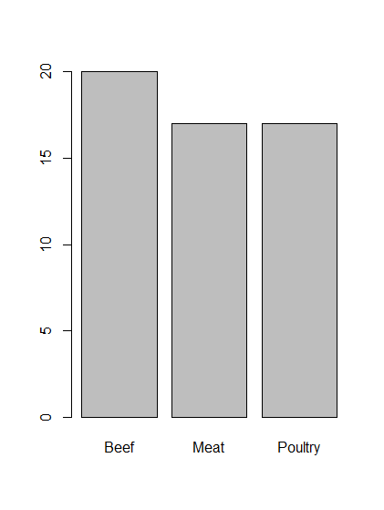
- Result is:
 Beef    Meat Poultry
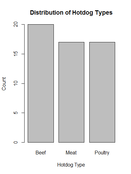
   20      17      17
- Instead, store this result in a variable
# Make a table of hotdog types, this time assigning it to a variable
typeCounts <- table(hotdogs$Type)
- Note that when this line is run, the Values window of the console shows that the typeCounts variable has the value of
'table' int [1:3(1d)] 20 17 17
- Question: what is the difference between a data.frame and a table?
tableis a function to create tabular results of categorical variables whereas a data.frame is a datatype.
# See how many total hotdogs are in the data
sum(typeCounts)
- Result is
[1] 54
- Is this the only way to get a sum of how many hotdogs are in this dataset? It seems a little indirect to first have to count how many there are of each individual type and then sum that together. Why not just count records? It seems that it is tied to the next task, which is to calculate the proportions for each type.
# Calculate proportions for each type of hotdog
typeCounts / sum( typeCounts )
- Result is:
     Beef      Meat   Poultry
0.3703704 0.3148148 0.3148148
# Calculate proportions for each
typeCounts / sum( typeCounts )
- There is a function called
prop.tablethat directly will calculate proportions from a table
# Use prop.table to directly compute proportions of each type in a table
prop.table(typeCounts)
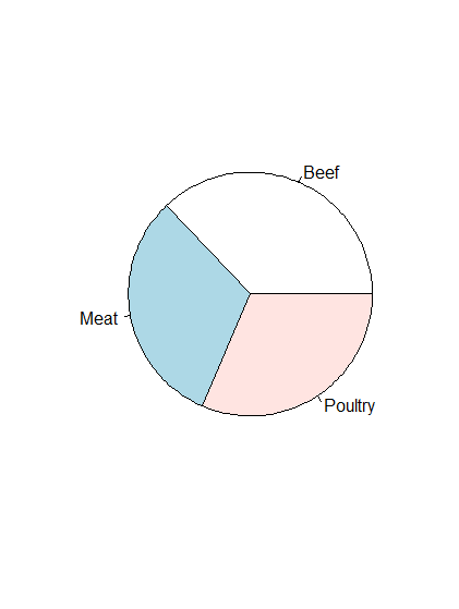
- Already have count data saved as a variable, so can just pass it to the built-in function
pie().
# Make a pie chart of count data stored in typeCounts variable
pie(typeCounts)
# Make a barchart of count data stored in typeCounts variable
barplot(typeCounts)
- We are going to fix up this basic plot by adding a title and labels for the x and y axes, by passing arguments to the function. So far, all of the arguments we have passed to functions were implicit, i.e., not named explicitly, but assumed to be certain things because of the order they were given. To give the arguments out of order, use the format
argument = value.
# Beautify the plot by adding title and axis labels
barplot( typeCounts,
         main = "Distribution of Hotdog Types",
         xlab = "Hotdog Type",
         ylab = "Count")
- Do a second example.
- Download titanicData.csv into the data directory.
# Load Titanic data by reading it into a variable called titanicData
titanicData <- read.csv("../data/titanicData.csv")
# Check the data
head(titanicData)
- Result is:
  class   age gender survival
1 First Adult   Male    Alive
2 First Adult   Male    Alive
3 First Adult   Male    Alive
4 First Adult   Male    Alive
5 First Adult   Male    Alive
6 First Adult   Male    Alive
# Save and display the counts of living and dead in a variable called titanicSurvival
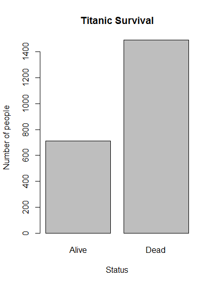
titanicSurvival <- table(titanicData$survival)
titanicSurvival
- Result is:
Alive  Dead
  711  1490
# How many people were on the Titanic?
sum(titanicSurvival)
- Result is:
[1] 2201
# What proportion lived and died?
prop.table(titanicSurvival)
- Result is:
   Alive     Dead
0.323035 0.676965
# Make a plot of survival
barplot(titanicSurvival,
        main = "Titanic Survival",
        xlab = "Status",
        ylab = "Number of people")
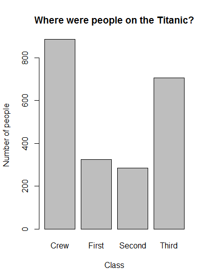
- Do this again, for people in each class. I copied and pasted the previous four blocks of code and changed it to reflect the class category:
# Save and display the counts of people in different classes in a  variable called titanicClass
titanicClass <- table(titanicData$class)
titanicClass
# How many people were on the Titanic?
sum(titanicClass)
# What proportion were in each class?
prop.table(titanicClass)
# Make a plot of peole in each class
barplot(titanicClass,
        main = "Where were people on the Titanic?",
        xlab = "Class",
        ylab = "Number of people")
Commands learned in this module
- use the $ to display the types of data stored in a variable as in
hotdogs$Type - levels()
- table()
- sum()
- prop.table()
- pie()
- barplot()
Plotting and evaluating two categorical variables (Chapter 3)
2016-06-08
- Launch RStudio.
- Download popularKids.csv data and save it in my data directory.
- Start new script called: Dahlquist_ch3_plotting-two-categorical-variables_20160608.R
# Script written by Kam Dahlquist
# 2016-06-08
# From http://petersonbiology.com/math230Notes/ Chapter 3
# Electronic lab notebook found at: http://www.openwetware.org/wiki/Dahlquist:GCAT-SEEK_Workshop_2016
# Manually set working directory
# Made sure that this is set for my computer, not the tutorial
setwd("~/Travel-Conferences/GCAT-SEEK_2016/scripts")
# Load data into variables by reading from csv files
titanic <- read.csv("../data/titanicData.csv")
popularKids <- read.csv("../data/popularKids.csv")
Going to stop here and continue later because I've stared at the computer too long today and I'm glazed over. — Kam D. Dahlquist 19:29, 8 June 2016 (EDT)
2016-06-09
- Continuing from yesterday:
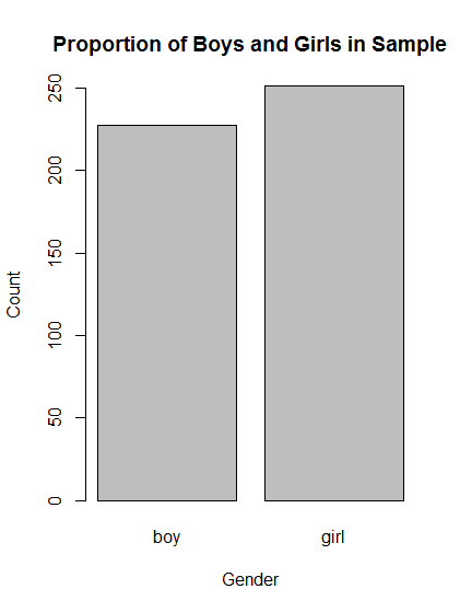
# Make table of Gender
table(popularKids$Gender)
# Make barplot of Gender
barplot( table(popularKids$Gender),
         main = "Proportion of Boys and Girls in Sample",
         xlab = "Gender",
         ylab = "Count")
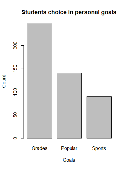
# Make table of Goals
table(popularKids$Goals)
# Make barplot of Gender
barplot( table(popularKids$Goals),
         main = "Students choice in personal goals",
         xlab = "Goals",
         ylab = "Count")
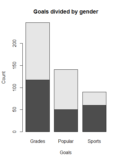
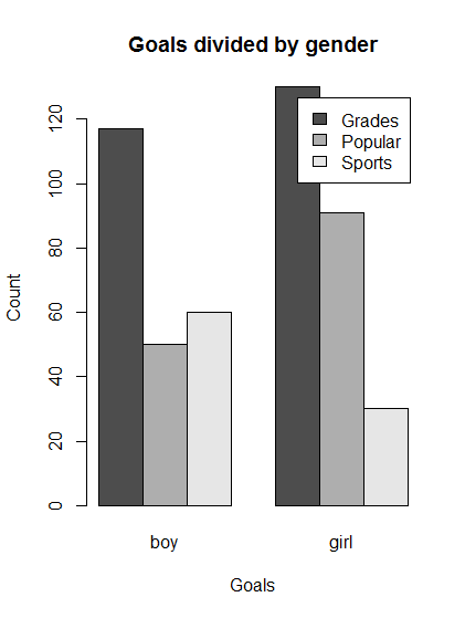
- We want to know how many boys want to be good in sports.
# Save a table of the two-way interaction
genderGoals <- table(popularKids$Gender, popularKids$Goals)
# Enter the variable name to actually see it
genderGoals
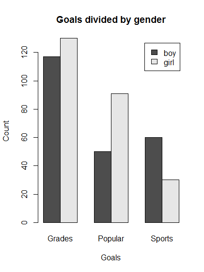
- results
      Grades Popular Sports
 boy     117      50     60
 girl    130      91     30
# Make a simple (default) barplot
barplot(genderGoals,
        main = "Goals divided by gender",
        xlab = "Goals",
        ylab = "Count")
# Make a barplot with a legend, with bars side-by-side
barplot(genderGoals,
        main = "Goals divided by gender",
        xlab = "Goals",
        ylab = "Count",
        legend.text = TRUE,
        beside = TRUE)
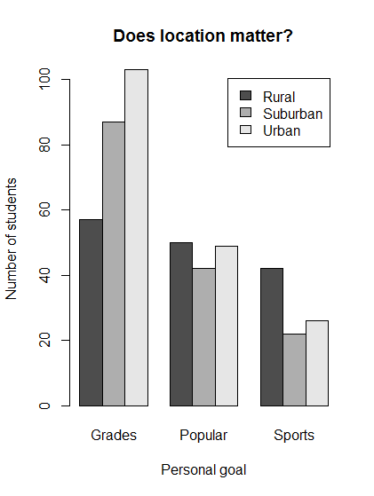
# Save a table of location and goals
locGoals <- table(popularKids$Urban.Rural,
                 popularKids$Goals)
# View the table
locGoals
- Results
          Grades Popular Sports
 Rural        57      50     42
 Suburban     87      42     22
 Urban       103      49     26
# Plot the result of location vs. goals
barplot(locGoals,
        legend.text = TRUE,
        beside = TRUE,
        main = "Does location matter?",
        xlab = "Personal goal",
        ylab = "Number of students")
# Save a second table of location and goals so data is transposed
locGoalsB <- table(popularKids$Goals,
                    popularKids$Urban.Rural)
# Plot the result of transposed location vs. goals
barplot(locGoalsB,
        legend.text = TRUE,
        beside = TRUE,
        main = "Does location matter?",
        xlab = "Location",
        ylab = "Number of students")
# Display the original table transposed
t(locGoals)
# Plot the original table transposed
barplot(t(locGoals),
        legend.text = TRUE,
        beside = TRUE,
        main = "Does location matter?",
        xlab = "Location",
        ylab = "Number of students")
- Had to end here. — Kam D. Dahlquist 20:13, 9 June 2016 (EDT)
2016-06-10
# Make a plot of the difference in goals by gender with the bars reversed from before.
barplot(t(genderGoals),
        main = "Goals divided by gender",
        xlab = "Goals",
        ylab = "Count",
        legend.text = TRUE,
        beside = TRUE)
- Interpretation: boys and girls are similar with respect to desire for good grades, but girls rate being popular higher than sports and boys rank them about equal.
- Now using the titanic data...
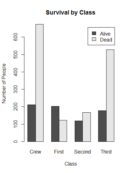
# Save a two-way table of survival for the Titanic data
survivalClass <-  table(titanic$survival,titanic$class)
# Make a plot of survival for each class of passenger
barplot(survivalClass,
        main = "Survival by Class",
        xlab = "Class",
        ylab = "Number of People",
        legend.text = TRUE,
        beside = TRUE)
- It is difficult to interpret the results because there are different numbers in each class. We can use the function
addmargins()to see group totals.
# Look at the margins
addmargins(survivalClass)
- Result
       Crew First Second Third  Sum
 Alive  212   203    118   178  711
 Dead   673   122    167   528 1490
 Sum    885   325    285   706 2201
- This adds a sum column that gives a "marginal" total because it was literally written in the margins of the table when calculated by hand.
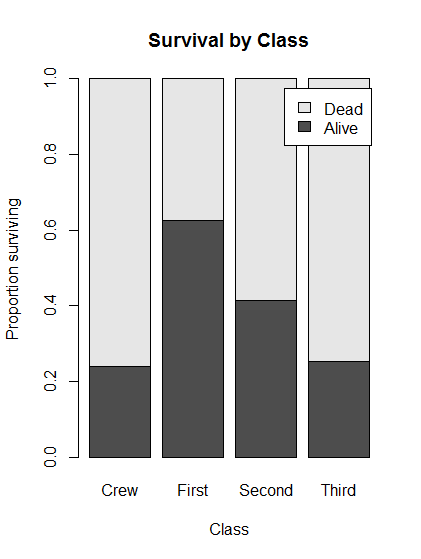
- What we want to know is the conditional distribution of survival, i.e., what proportion of people survived given that they were in each class.
# Simple example of the conditional distribution of survival
prop.table(survivalClass)
- Results
             Crew      First     Second      Third
 Alive 0.09631985 0.09223080 0.05361199 0.08087233
 Dead  0.30577010 0.05542935 0.07587460 0.23989096
- but this is the proportion of the grand sum, we want the proportion of each class, so use the option "margin" where 1 is rows and 2 is columns.
# compute the conditional distribution by column, which is class
prop.table(survivalClass,
           margin = 2)
- results in
            Crew     First    Second     Third
 Alive 0.2395480 0.6246154 0.4140351 0.2521246
 Dead  0.7604520 0.3753846 0.5859649 0.7478754
# check answer to see if columns sum to 1 as we would expect
addmargins(prop.table(survivalClass,
                      margin = 2))
            Crew     First    Second     Third       Sum
 Alive 0.2395480 0.6246154 0.4140351 0.2521246 1.5303231
 Dead  0.7604520 0.3753846 0.5859649 0.7478754 2.4696769
 Sum   1.0000000 1.0000000 1.0000000 1.0000000 4.0000000
- result verifies this
# Plot the conditional distribution of survival by class, embedding computation in plot call
barplot( prop.table(survivalClass,
                    margin = 2),
         main = "Survival by Class",
         legend.text = TRUE,
         ylab = "Proportion surviving",
         xlab = "Class")
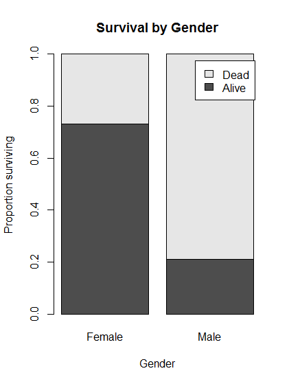
- Now look at whether women were more likely to survive than men.
# Make a table of gender by survival
survivalGender <- table(titanic$survival,titanic$gender)
# Plot the conditional distributions of gender by survival
barplot( prop.table(survivalGender, 2),
         main = "Survival by Gender",
         legend.text = TRUE,
         ylab = "Proportion surviving",
         xlab = "Gender")
- Large difference in survival between women and men
# Look at the raw counts of survival by gender
survivalGender
- results
       Female Male
 Alive    344  367
 Dead     126 1364
# Save a two-way table of gender by class for Titanic data
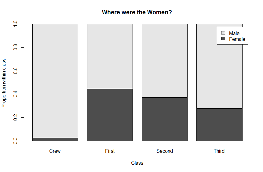
genderClass <-  table(titanic$gender,titanic$class)
genderClass
# Plot the conditional distributions of gender by class
barplot( prop.table(genderClass, 2),
         main = "Where were the Women?",
         legend.text = TRUE,
         ylab = "Proportion within class",
         xlab = "Class")
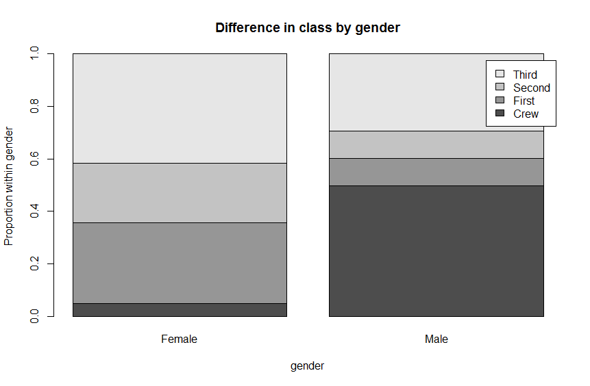
# define a new variable which is the transpose of gender by class and display
genderClass2 <- t(genderClass)
genderClass2
# Plot the conditional distributions of class by gender
barplot( prop.table(genderClass2, 2),
         main = "Difference in class by gender",
         legend.text = TRUE,
         ylab = "Proportion within gender",
         xlab = "gender")
Completed Chapter 3 and committed script and notebook to GitHub repository. — Kam D. Dahlquist 19:52, 10 June 2016 (EDT)
Linux Tutorial
- Launched PuTTY
- selected mason.indiana.edu host
- got warning about privacy key, selected to connect just once, not to cache
- logged in with username and password
- selected bash
- Now am working through tutorial here: http://www.ee.surrey.ac.uk/Teaching/Unix/.
- Did 1, 2, and almost all of 3.

