BISC220/S13: Linear Regression
From OpenWetWare
Jump to navigationJump to search
Linear Regression
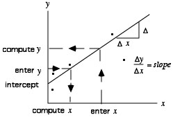
Linear regression calculations are often used to create a standard curve which can then be used to predict concentrations in unknown samples.

This line is described by y = mx + b, where m is the slope of the line and b is the y-intercept. The correlation coefficient (r2 value) is an indication of how well the data points conform to the calculated line. A correlation coefficient of 1 is indicative of perfect conformity of the data to the calculated line.
Microsoft Excel Instructions to Plot Linear Regression Curves :
The following directions will enable you to plot graphs using the program Microsoft Excel from Microsoft Office pre-2007.
- Select Microsoft Excel by double clicking on the icons. A new spread sheet will appear on the screen. If Microsoft Excel has already been accessed, select New from the File menu to display a new spreadsheet.
- Assign a title to the x axis and enter the concentration values in ascending order into column A of the spreadsheet.
- Assign a title to the y axis and enter the absorbance values that correspond to the concentrations into column B of the spreadsheet.
- To indicate which data are to be plotted, select both columns of numbers by dragging the cursor until all are highlighted.
- Pull down the Insert menu and select Chart or click on the Chart Wizard icon in the toolbar. “Chart Wizard, Step 1 of 4” appears on the screen.
- In step 1 of the Chart Wizard, under Chart Type click on XY Scatter. Under Chart Sub Type click on the lowest left hand graph. The text box should now read “Scatter with data points connected by line”. Click on Next.
- In step 2 of the Chart Wizard, select Columns in the Data Range Folder and check to insure that the correct data cells are selected for plotting. In the Series Folder, verify that the correct data cells are designated as the x and y data points. Click on Next.
- Under step 3, in the Titles Folder type the title in the chart title text box. You may use the mouse to select the X and Y axes text boxes so you can type in labels for each axis. In the Axes Folder insure that the Value (x) Axis and Value (y) Axis are both checked. Gridlines may be added or deleted at this time in the Gridlines Folder. Click Next.
- In step 4 of Chart Wizard, select New Sheet. Click on Finish. A line plot of the data will now be displayed, but it is not a regression plot at this time.
- Single click on the line of the graph that is now displayed on the screen. This will highlight the data points.
- Under Chart, select Add Trendline, and choose Linear for type. In the Options Folder of Trendline check off Display Equation On Chart and Display R-Squared Value on Chart. Click OK. The linear regression line will now be plotted on the chart along with the equation and r2 value. To move the equation, single click on it and drag it to where you want it to be on the chart.
- Single click on any label to drag it to a new location on the chart. Double clicking on a label will allow you to change the font and font size.
- To change the size of the entire chart, single click on the chart and 8 black squares will appear on the highlighted border. Drag the lower right-hand square up, down or to the sides to set the desired chart size. Fine adjustments can be made by clicking and dragging the other black squares.
- Before printing, make sure that nothing is selected or highlighted. Check Print Preview under File to insure that the chart will be displayed on one page. Select page Set Up under File to orient the chart as you wish. Then select Print to obtain a copy of the linear regression curve.