Alice Finton Online Lab Notebook
From OpenWetWare
Jump to navigationJump to search
Summer 2019
Microarray data for each of the strains used in the analysis:
- dCIN5: dCIN5_one_strain_ANOVA_out_data.xls
- dGLN3: dGLN3_one_strain_ANOVA_out_data.xls
- dHAP4: dHAP4_one_strain_ANOVA_out_data.xls
- dHMO1: dHMO1_one_strain_ANOVA_out_data.xls
- dZAP1: dZAP1_one_strain_ANOVA_out_data.xls
- Wild-Type: wt_one_strain_ANOVA_out_data.xls
Week 2: May 28 - 30
- Goals:
- Perform an exploratory search for software that can be used for comparing gene ontologies of the wild-type, dCIN5, dGLN3, dHAP4, dHMO1, and dZAP1 strains of Saccharomyces cerevisiae.
- Organize STEM profile results for all strains to make comparison of the profile types.
- Present a Journal Club on "Parameter Estimation for Gene Regulatory Networks from Microarray Data: Cold Shock Response in Saccharomyces cerevisiae"
- Progress
- Alice and Mihir May 28 Journal Club Powerpoint
- Comparative gene ontology web search
- Software reviewed:
- Revigo- Allows for the creation of scatterplots from a single list of gene ontology IDs, with the option of including p-values. The resulting graphs colorize the functional groups according to the p-value.
- Does not allow for a comparison between GO lists. Therefore, it can be used only for a single strain.
- WEGO- Creates comparative plots, but supports narrow file types.
- Need to determine how to change file format of GO list from STEM software to work on WEGO.
- Panther Classification System- Creates bar graphs or pie charts of the gene ontology terms from the gene list data from STEM.
- There is no option to restrict the GO terms based on p-value significance.
- You have to use the gene list, not the GO list from STEM.
- ClueGO- Creates networks from the gene ontology terms and allows for a comparison between two lists of data.
- Requires Cytoscape, as it is a plug-in for the software.
- On May 30, Dr. Dahlquist requested access to the plug-in. (On June 2, the license was given to Dr. Dahlquist)
- Requires Cytoscape, as it is a plug-in for the software.
- CompGO
- Requires R software to run. Need to figure out how to use CompGO in the R software.
- Comparative GO- "A webserver for comparative gene ontology, gene ontology network and gene ontology based gene selection"
- Limited species inclusion: Bacteria, Virus, Zebrafish, Human, Rice. Unsure if it supports S. cerevisiae genes.
- BiNGO- Cytoscape plug-in that creates networks of the gene ontologies.
- Determines which gene ontology categories are overrepresented in the gene list.
- Supports a wide range of organisms.
- GOTaxExplorer- Allows for the comparison between gene sets.
- " It is possible to compare arbitrarily selected organisms or groups of organisms from the taxonomic tree on the basis of the functionality of their genes" (GO Tools: Visualization)
- Unable to download the software. May need to request access to use the software.
- Panther Compare Lists- Allows for a comparison between gene ID lists. Statistical overrepresentation test.
- Produces p-values from the analysis. (Gives the option of using Bonferroni corrected p-values)
- Allows for the visualization of the gene ontology groups with a bar chart, multiple pie diagram, overlaid area chart of difference, and bar chart of difference.
- Revigo- Allows for the creation of scatterplots from a single list of gene ontology IDs, with the option of including p-values. The resulting graphs colorize the functional groups according to the p-value.
- Simple comparison of GO lists
- Venn Diagrams
- Pangloss- Creates a venn diagram from only two lists of data, but states which terms are overlapping and which are unique
- InteractiVenn- Allows for the creation of a venn diagram for up to six sets of data.
- Does not indicate which terms are overlapping or unique.
- Microsoft Excel to Compare IDs
- Allows for the comparison of gene ontology terms to determine which are overlapping and which are unique between the strains.
- Compare Two Lists
- Allows you to input sets of data and compare them. It offers information about which inputs are unique to either list and those that are overlapping.
- Venn Diagrams
- Software reviewed:
Week 3: June 3 - 6
- Goals:
- Run ClueGO with Cytoscape and create powerpoint of various functions it can do
- Try to figure out CompGO and how to use the R software
- Present a Journal Club on "Physiological and Transcriptional Responses of Anaerobic Chemostat Cultures of Saccharomyces cerevisiae Subjected to Diurnal Temperature Cycles"
- Progress:
- Alice June 3 Journal Club Powerpoint
- ClueGO
- ClueGO does not allow for unique gene ontology groups to be included in the network. Only the categories that are common to all sets of genes are included in the network.
- There is the option of using gene list IDs or gene ontology terms for the analysis. Gene IDs offer the creation of a network, but the gene ontology terms only create separate nodes with no edges.
- There is a ClueGO plugin that gives the option to make the nodes of the network pie charts, giving information about the percentage of genes in each cluster that are part of the specific functional group. I downloaded the plugin and used it to determine the percentages of wt and dCIN5 genes were part of the functional categories in the network, but each pie chart showed the same percentages. Therefore, the number of genes belonging to the specific functional category could be the same for each node.
- When I created the network comparing wild-type profile 45 and dCIN5 profile 45 gene IDs, every functional category was more highly overrepresented in the wild-type strain than the dCIN5 strain. Therefore, each node in the network was colorized red (indicating wild-type) based on the color settings in ClueGO.
- I am currently working on creating a PowerPoint with the various functions of ClueGO.
- Run ClueGO analysis on the clusters, comparing different strains in each cluster that would be useful for analysis.
- When using ClueGO for analyzing the GO terms that are given through STEM, the title of the columns for p-value and GO ID are sensitive.
- In order to run an analysis with GO terms, you need to select "Preselected Functions"' instead of "Functional Analysis' at the top of the window.
- Initially when I pasted the columns into the box, I wrote "GOID" for the gene ontology ID column, and "p value" for the column listing the respective p-values. When I ran the test, the result was not in the form of a network, rather just a grid of functional categories.
- I ran another test without putting a header for the columns. Initially, I began getting networks for the results, with nodes and edges. But after restarting Cytoscape, running the software with no headers resulted in grids of functional categories rather than the network.
- I looked back through the ClueGO documentation to see if there was any information about what to include in the headers. I found that when running GO terms, the header of the column including the GO Ids should be labelled "GOID:PathwayID" and the column including the p-values should be labelled "p value" (Fig. 1). After correcting the format, the results of the tests were networks.
- When I tried to save the networks that I had created on June 5, Cytoscape crashed because too much memory was being used. Therefore, it is important to save your work as you go.
- Additionally, do not save as a Cytoscape file. Save as a file on ClueGO, otherwise only the networks can be seen, not the analysis tables.
- You should save your work as a ClueGO file and also as a Cytoscape session. It takes a long time to load a large ClueGO file (I tried loading the file from the work I had done on June 6 and it got stuck and crashed Cytoscape. I will attempt to open that session later.)
- On June 5, I ran an analysis on all of the profiles and the gene list IDs and took screenshots of the resulting networks. The actual ClueGO files were lost because Cytoscape crashed.(I will have to redo the analysis on gene list)
How to run ClueGO
- File Formating:
- Choose either the Gene ID list or GO term list from the STEM analysis. Open the txt file and put in an excel sheet.
- For a gene list run:
- Open an excel workbook and create a sheet for each of the strains included in the data. Include the profile number for each of the new sheets. For example, a sheet can be named "wt Gene List 45" or "dCIN5 Gene List 45", where '45' refers to the STEM profile.
- Copy and paste the contents of the Gene list txt file from the STEM software into the excel sheet. You should then have columns A-J filled.
- Delete columns A-B and D-J, leaving only one column in the sheet. Delete the "gene symbol" column header, leaving only a column of genes.
- Repeat for every strain in the STEM analysis for each profile.
- For a GO term run:
- Open an excel workbook and create a sheet for each strain included in the STEM analysis as done for the gene list analysis. For example, a sheet can be named "wt GO 45" or "dCIN5 GO 45", where '45' refers to the STEM profile.
- Open the GO list txt output file generated by the STEM software.
- Copy and paste the txt file into excel. You should then have columns A-I filled.
- Delete columns B-F and H-I, so that only two columns remain, one with the GO IDs and one with the p-values.
- Repeat for the rest of the strains in the profile.
- Example of an excel workbook with Gene lists and GO terms.
- Open Cytoscape and run the ClueGO plugin
- For a gene list run:
- Analysis Mode: keep "Functional Analysis" selected.
- When first using ClueGO, Saccharomyces cerevisiae has to be downloaded from ClueGO for use.
- Click the button next to the box that reads "Homo Sapiens [9606]". Then search for Saccharomyces cerevisiae in the list and download. It will now be in the drop-down menu for the organism selection.
- For a single strain run:
- In the empty box in the "Load Marker List(s)" section, copy and paste the list of genes from the excel workbook. Do not include any column header.
- In the "ClueGO Settings" section under the Ontologies/Pathways, select the GO term analysis you want.
- In addition, you can change the network specificity and select whether to show pathways with p value restriction.
- Once you have selected all of the settings, run the analysis by clicking the "Start" button under the "ClueGO Functional Analysis" section.
- A network will be shown on the right side and a table will be shown below the network.
- For a comparison:
- Copy and paste the list of genes into the empty box in the "Load Marker List(s)" section. For example, the gene list from "wt Gene List 45".
- Click the "+" button below the box to add more strain data.
- A new box will appear. Copy and past a gene list from another strain into this box. For example, the gene list from "dCIN5 Gene List 45".
- The automated coloring for each input is red for the first list and blue for the second list, this can be changed by selecting the box with the colored line that appears to the right of the input box.
- Select the settings the same way as for a single run and click "Start".
- Visualize the network in different ways using the "Visual Style" section. You can visualize the network by the functional groups, clusters (or strain), or significance.
- For a GO term run:
- Analysis Mode: select 'Preselected Functions'
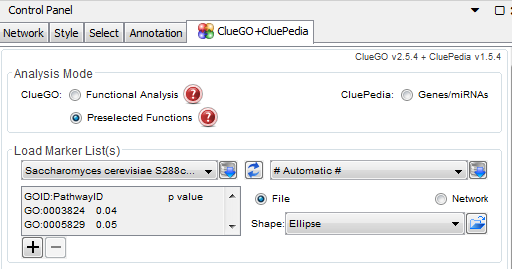
Figure 1: ClueGO Headers for GO Term Analysis - For a single strain run:
- Copy and paste the list of GO terms and p-values from the excel sheet into the empty input box in the "Load Marker List(s)" section. You should have two columns in the ClueGO input box. Scroll to the top of the lists in the box and rename the columns as follows: (Fig 1)
- For the GO term list: "GOID:PathwayID", hit tab
- For the p-values: "p value"
- Select the ClueGO settings as you would for a run with the gene IDs and then click "start".
- Copy and paste the list of GO terms and p-values from the excel sheet into the empty input box in the "Load Marker List(s)" section. You should have two columns in the ClueGO input box. Scroll to the top of the lists in the box and rename the columns as follows: (Fig 1)
- For a strain comparison run:
- Copy and paste the list of GO Ids into the empty box in the "Load Marker List(s)" section. For example, the GO ID list from "wt GO 45". Make sure to name the columns with "GOID:PathwayID" and "p value".
- Click the "+" button to add more data. A new box will appear. Copy and past a GO ID list from another strain into this box. For example, the GO ID list from "dCIN5 GO 45". Rename the columns.
- Select the CluGO settings as you would for a single strain run. Click "Start".
- Visualize the network in different ways using the "Visual Style" section.
- Analysis Mode: select 'Preselected Functions'
- For a gene list run:
- CompGO
- CompGO Vignettes, CompGO paper, and CompGO user manual

Week 4 : June 10 - 13
- Goals:
- Present a journal club on the ClueGO paper and the progress that I have made on ClueGO so far.
- Begin modeling experiments
- Variable inclusion of strain data for db5
- First make a list of experiments in Excel to keep track.
- wt-only
- wt + each strain individually
- wt + two strains
- wt + three strains
- wt + 4 of the five deletion strains (in other words, leaving one deletion strain out)
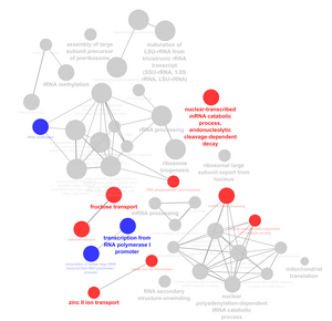
Figure 2: Example of ClueGO GO Term Comparison - Profile 45 wt vs. dCIN5
- looking at production rates
- Variable inclusion of strain data for db5

- Progress:
- Week 4 ClueGO Journal Club
- Includes all of the networks that have been created with ClueGO so far.
- ClueGO
- Run a ClueGO analysis on the rest of the strains for the GO terms. Run a comparison analysis between wild-type and deletion strain (not including dHMO1) for profile 45, 9, 22, and 48. Figure 2 shows an example of a ClueGO comparison.
- Modeling experiments:
- Models will be run on the strains (wt, dCIN5, dGLN3, dHAP4, dHMO1, and dZAP1) by deleting data entirely. For example, a model will run with all but one strain (i.e. wt-dCIN5-dGLN3-dHAP4-dHMO1). I have created an Excel sheet that shows all of the models that will be run. Performing multiple runs on the same computer with MATLAB GRNmap
- On June 11, I have started to run 26 models on GRNsight MATLAB version 1.10.
- There was an issue with the CPU affinity selections for the trials. I would select an affinity for the MATLAB run, but when I would check the CPU again, all of the processors would be selected. After that, I did not know which CPU correlated to which deletion run. For instance, CPU 0 was chosen for the all-strain model, but when I went back through the affinities, I could not find a MATLAb.exe with CPU 0 selected.
- In order for one processor to be used, the CPU has to be chosen after the model has started to run, not when the MATLAB command window pops up. Once the model ("Figure 1") window pops up, the CPUs return to being all checked. Therefore, in order to keep each model restricted to one CPU, it has to be selected after the file has been chosen and the "Figure 1" window pops up.
- There was an issue with the CPU affinity selections for the trials. I would select an affinity for the MATLAB run, but when I would check the CPU again, all of the processors would be selected. After that, I did not know which CPU correlated to which deletion run. For instance, CPU 0 was chosen for the all-strain model, but when I went back through the affinities, I could not find a MATLAb.exe with CPU 0 selected.
- On June 12, I started to run the rest of the models. In total, there are 32 models.
Times and computer used for all of the model runs
.
Cerevisiae Computer June 11, 2019                           Paradoxus Computer June 11, 2019                     Paradoxus Computer June 12, 2019
   Time              Strains Included                          Time               Strains Included                  CPU         Time           Strains Included
1:20 - 4:43      all-strain                                 2:38 - 6:30      wt - dCIN5 - dHMO1 - dZAP1              0      11:02 - 12:15        wt-only
1:27 - 7:27      wt - dCIN5 - dGLN3 - dHAP4 - dHMO1         2:41 - 7:08      wt - dGLN3 - dHAP4 - dHMO1              1      11:03 - 12:14       wt - dCIN5
1:33 - 7:31      wt - dCIN5 - dGLN3 - dHAP4 - dZAP1         2:44 - 8:07      wt - dGLN3 - dHAP4 - dZAP1              2      11:06 - 11:51       wt - dGLN3
1:37 - 8:42      wt - dCIN5 - dGLN3 - dHMO1 - dZAP1         2:47 - 7:00      wt - dGLN3 - dHMO1 - dZAP1              3      11:09 - 12:30       wt - dHAP4
1:40 - 6:16      wt - dCIN5 - dHAP4 - dHMO1 - dZAP1         2:52 - 6:17      wt - dHAP4 - dHMO1 - dZAP1              4      11:12 - 2:22        wt - dHMO1
1:41 - 3:27      wt - dGLN3 - dHAP4 - dHMO1 - dZAP1         2:55 - 6:42      wt - dCIN5 - dGLN3                      5      11:14 - 1:47        wt - dZAP1
1:47 - 3:14      wt - dCIN5 - dGLN3 - dHAP4                 2:57 - 6:11      wt - dCIN5 - dHAP4
1:49 - 6:33      wt - dCIN5 - dGLN3 - dHMO1                 3:00 - 7:01      wt - dCIN5 - dHMO1
1:53 - 5:15      wt - dCIN5 - dGLN3 - dZAP1                 3:02 - 7:11      wt - dCIN5 - dZAP1
1:55 - 4:12      wt - dCIN5 - dHAP4 - dHMO1                 3:04 - 6:55      wt - dGLN3 - dHAP4
2:01 - 3:36      wt - dCIN5 - dHAP4 - dZAP1                 3:07 - 7:01      wt - dGLN3 - dHMO1
                                                            3:09 - 8:57      wt - dGLN3 - dZAP1
                                                            3:11 - 5:59      wt - dHAP4 - dHMO1
                                                            3:14 - 7:23      wt - dHAP4 - dZAP1
                                                            3:16 - 7:25      wt - dHMO1 - dZAP1
- After all of the models have run, they create an output file that includes optimized parameters.
- I have created an Excel workbook for the optimized production rates, threshold (b), and weights for each of the strain deletions. In addition, I have compared the LSE, minLSE, and LSE:minLSE ratios for each of the strain deletions and have created a bar graphs for each. Excel workbooks
- The output files were run through GRNsight, and the weighted SIF files were downloaded and used in the creation of heat maps. Using previous data by Lauren Kelly, I was able to normalize the data and create the heat maps for visualization of the activation and repression of the genes.
- Heat maps were created for the strain deletions. They were sorted based on how I wrote them, increasing LSE:minLSE ratio, minLSE, and LSE.
- After all of the models have run, they create an output file that includes optimized parameters.
Week 5: June 17 - 20
- Goals:
- Clustering
- Analysis of variable inclusion of strain data runs
- Bar charts for P's and b's
- Look at expression plots and GRNsight networks. Maybe the LSE:minLSE ratios are getting bigger for the dGLN3 and dZAP1 data because the expression is more divergent from the other strains and the model has to balance matching all datasets. In this view, an increasing LSE:minLSE ratio is not necessarily bad.
- Look at MA plots, box plots, and QA reports for strains and chips to see if there is a relationship between data quality and these results.
- Investigate why removing strain data leads to a smaller minLSE.
- Look at production rates from Neymotin, B., Athanasiadou, R., & Gresham, D. (2014). Determination of in vivo RNA kinetics using RATE-seq. Rna, 20(10), 1645-1652.
- Compile another set of modeling runs, this time using db1-db7 (28 runs).
- estimate P, b, w
- estimate P, w, fix b
- estimate b, w, fix P
- estimate w only, fix P and b
- note that for the fix P runs, we can either choose P like we currently set the initial guess, or choose from published work like Neymotin et al. (2014).
- Dr. Dahlquist will provide between-strain ANOVA stats for GO analysis
- Upload the output analysis files to GitHub under an analysis folder.
- Present on the progress made throughout the week.
- Bar graphs for threshold (b) and production rates, pnew/pall, bnew/ball, log2 of b and p.
- Progress:
- Lab Meeting Week 5 Presentation
- I have continued the analysis of the estimated parameters from GRNmap (specifically, optimized threshold (b) and production rates). I created bar charts for each parameter under each gene. I plotted the optimized threshold (b) and production rate values as they were in the output file and then plotted the ratio of each respective value : the all-strain value. Then I plotted the log2 of the ratio for both the threshold and production rates. For each of the bar charts generated from this analysis, I sorted by increasing value.
- I have run each of the 32 networks through GRNsight and have compiled the resulting GRNs from the runs.
- I have compiled the expression networks from the GRNmap runs for the strain deletions.
- The addition of dHMO1 as a strain increases the number of divergences in the expression plots (76.3% of expression plots that contain dHMO1 in the strain deletion were divergent).
- There was never divergence in expression for GCR2, HMO1, and dZAP1.
- The inclusion of dGLN3 or dHAP4 in the strain deletion did not cause any divergence in the expression plots. However, the inclusion of dCIN5, dHMO1, or dZAP1 caused divergence to occur.
- dHMO1 caused the most divergence in expression, then dCIN5, then dZAP1.
Gene            The expression diverges if:                 Gene             The expression diverges if:
ACE2             dZAP1                                      MSN2              dHMO1
ASH1             dCIN5, dHMO1, dZAP1                        SFP1              dCIN5, dHMO1
CIN5             dHMO1                                      STB5              dCIN5, dHMO1
GCR2             never                                      SWI4              dHMO1
GLN3             dCIN5, dHMO1, dZAP1                        SWI5              dCIN5, dHMO1
HAP4             dCIN5, dHMO1                               YHP1              dCIN5, dHMO1, dZAP1
HMO1             never                                      YOX1              dHMO1
                                                            ZAP1              never
* The expression diverges if dCIN5, dHMO1, or dZAP is included.
- Determination of in vivo RNA kinetics using RATE-seq - Neymotin et al., 2014
- Looking for production rates
- Estimation of in vivo rates of RNA synthesis or degradation
- Synthesis Rates- Genomic Run on Assays
- Decay Rates- transcriptional inhibition
- Neymotin- Measured the rates of RNA decay and used RATE-seq to find the transcript levels.
- "Many transcripts in budding yeast have similar steady-state levels but differ greatly in their rates of production and degradation" (Neymotin et al., 2014).
- Degradation rates are proportional to the abundance of RNA. The rate of change in RNA abundance is determined using d[RNA]/dt = k - α[RNA], where d[RNA]/dt is the rate of change in abundance, k is the constant rate of synthesis, and α[RNA] is the RNA abundance where α = α(RNA) + α(growth).
- α is the RNA concentration and α(RNA) is the degradation rate constant and α(growth) is the cell's division rate constant. α = α(RNA) + α(growth)
- α(RNA) degradation rate constant was determined using a nonlinear weighted regression from the data set.
- At a steady state. the abundance of RNA remained constant and the transcript synthesis and degradation are related by k = α[RNA], where k is the rate of transcript synthesis and α[RNA] is the RNA abundance and α is the degradation rate constand plus the cell's division rate.
- "The rate of transcript production can be estimated using the degradation rate constant and the steady-state abundance of the transcript" (Neymotin et al., 2014).
- They published estimates for the rates of mRNA synthesis in steady-state conditions.
- Estimation of in vivo rates of RNA synthesis or degradation
- Genes under the same Gene Ontology (GO) terms tended to have similar degradation rates.
- They calculated their production rates by using k = α[RNA].
- They have an excel spreadsheet where they include the α values, half life values, steady-state abundance, and their calculated synthesis values.
- In order to understand how they obtained their production rates, I attempted to do the same calculation. I found that they multiplied the alpha value and the ss.abundance value together. They included the α low and α high values, along with the synthesis rate low and synthesis rate high values.
- Looking for production rates
Production Rates from Neymotin et al., 2014 compared to Dahlquist Lab Estimated Production Rates and Initial Guesses
 Gene         Neymotin Production Rate        Estimated Production Rate         Initial Guess Production Rate
 ACE2                  0.18                          0.2017                               0.2236
 ASH1                  1.037                         1.6767                               0.4332
 CIN5                  0.063                         0.6556                               0.2009
 GCR2                  0.327                         0.2315                               0.1925
 GLN3                  0.365                         0.3021                               0.3224
 HAP4                  1.827                         1.3023                               0.2718
 HMO1                  1.406                         0.3067                               0.0990
 MSN2                  0.487                         2.5565                               0.4077
 SFP1                  1.199                         1.5545                               0.6931
 STB5                  0.08                          0.1197                               0.1400
 SWI4                  0.157                         0.3157                               0.2829
 SWI5                  0.34                          1.9213                               0.3224
 YHP1                  0.283                         0.2080                               0.1733
 YOX1                  1.028                         1.3911                               0.7296
 ZAP1                  0.082                         0.1282                               0.1042
* The Neymotin production rates are given in the table above alongside the estimated production rates for the all-strain model run.
- GRNsight was used to create GRNs for the strain deletions.
- GRNsight provides a conversion of the weight matrix to a vertical excel sheet providing the optimized weights for each of the edges in the network. For db5, there are 28 edges and 15 nodes.

Week 6: June 24 - 27
- Goals:
- Clean up the slides for the research presentation and add annotations and labels to everything.
- Add the MSE values to the expression plots in the slides. These values may correlate with the results.
- Make a 3 x 3 chart of all the expression plots for one gene that seemed to diverge across the strain deletions. (Add the MSE to those plots as well and add a title to explain what it is)
- Make sure that all of the sentences have periods and you don't switch between sentence and fragments on the same slide. You can vary between slides, but not within slides.
- Add to the p-value slide and explain which ones were used in the STEM and further analyses.
- Make sure that the online notebook has everything annotated and has links to the tables and graphs created.
- Upload everything that needs to be uploaded to github.
- Progress:
- Summer 2019 Research Presentation
- Expression plots
- The inclusion of dCIN5, dHMO1, and dZAP1 data, the simulated model data did diverge for the strains, indicating a better fit. However, when dCIN5, dHMO1, and dZAP1 data were not included, the simulated model data did not diverge for the strains, suggesting a worse fit.
Fall 2019
- Where we left off:
- Over the summer we ran a gene ontology analysis on the different profiles from the STEM analysis, determining the over-represented functional categories. In addition, using GRNmap, a parameter re-estimation for trials with deletion of strain data was conducted. It was determined that dCIN5, dHMO1, and dZAP1 showed a better fit when they were included in the data, while the inclusion of dGLN3 and dHAP4 data showed a worse fit. In a future study, another GRNmap analysis will be run, this time on db1-db7 running models where:
- estimate P, b, w
- estimate P, w, fix b
- estimate b, w, fix P
- estimate w only, fix P and b
- *P being the production rate, b the threshold, and w the weight.
- Over the summer we ran a gene ontology analysis on the different profiles from the STEM analysis, determining the over-represented functional categories. In addition, using GRNmap, a parameter re-estimation for trials with deletion of strain data was conducted. It was determined that dCIN5, dHMO1, and dZAP1 showed a better fit when they were included in the data, while the inclusion of dGLN3 and dHAP4 data showed a worse fit. In a future study, another GRNmap analysis will be run, this time on db1-db7 running models where:
Week 1: September 3-4
- Modelling Experiment
- Modified the Excel input workbooks for db1-db7 for the new runs (28 total).
- Production rate values for the new runs:
- For the "Fixed P" runs, the production rates that we use could be the initial guesses, like the ones we used in the previous model, or they could be taken from literature, like the Neymotin et al. (2014) paper.
- I reviewed the Neymotin et al. paper, from which the degradation rates were taken for the previous model runs, and I determined that they calculated their rates using k= α[RNA]. (More information about the Neymotin et al. paper is in Summer 2019: Week 5.)
- The production rates in the table below were determined using the excel spreadsheet provided in the paper's supplemental material.
Comparison of the production rates from the Neymotin et al.(2014) paper and the runs conducted in the Dahlquist lab
.
Production Rates from Neymotin et al., 2014 compared to Dahlquist Lab Estimated Production Rates and Initial Guesses
.
 Gene         Neymotin Production Rate        Estimated Production Rate*        Initial Guess Production Rate
 ACE2                  0.18                          0.2017                               0.2236
 ASH1                  1.037                         1.6767                               0.4332
 CIN5                  0.063                         0.6556                               0.2009
 GCR2                  0.327                         0.2315                               0.1925
 GLN3                  0.365                         0.3021                               0.3224
 HAP4                  1.827                         1.3023                               0.2718
 HMO1                  1.406                         0.3067                               0.0990
 MSN2                  0.487                         2.5565                               0.4077
 SFP1                  1.199                         1.5545                               0.6931
 STB5                  0.08                          0.1197                               0.1400
 SWI4                  0.157                         0.3157                               0.2829
 SWI5                  0.34                          1.9213                               0.3224
 YHP1                  0.283                         0.2080                               0.1733
 YOX1                  1.028                         1.3911                               0.7296
 ZAP1                  0.082                         0.1282                               0.1042
* The Neymotin et al. production rates are given in the table above alongside the estimated production rates for the all-strain model run and the initial guesses for the model runs.
Week 2: September 10-11
- The variance may be due to the sensitivity of the model.
- Add two columns to the production rate bar graphs: the Neymotin et al. production rates and the initial guesses for the production rate.
- Look at other papers to see the production rates and see how they compare.
- Run the forward model with the estimated production rates.
- Run the db5 all strain model a few more times.
- Running Models
- On 9/10/19, the models for the "Estimate P, w, b"; "Estimate P, w; Fix b", and db 1 and 2 for "Estimate w; Fix P, b" were run.
- On 9/11/19, the models for the "Estimate b, w; Fix P" and db3 - db7 for "Estimate w; Fix P, b" were run.
Week 3: September 17-18
- The optimized production rates from the data deletion runs for db5 were compared to the initial guesses and the Neymotin et al. (2014) calculated production rates.
- Look at clustering and sensitivity
- 28 model runs on db1-db7:
- Estimate P, b, w
- Estimate w, Fix P, b
- Estimate P, w, Fix b
- Estimate b, w, Fix P
- Compilation of production rates, thresholds, weights, and LSE:minLSE ratio for the four runs for each of db1-db7.
Week 4: September 24-25
- Run a forward run on db5 all-strain putting in the estimated weights and threshold values and Neymotin production rates. Comparison of the expression plots for each gene.
- Look at the LSE:minLSE of the Fix P runs where the Neymotin values were used.
- Found that the use of the Neymotin values made the LSE:minLSE ratio higher, indicating a worse fit. For all db1-7, the runs with Neymotin values showed an increase in ratio value compared to the initial guess runs.
- Overall, it was determined that fixing any parameter would make the model run worse. Estimating all of the parameters had the lowest LSE:minLSE ratio. The "Fix P" runs performed the worst, indicating that threshold does not have a major impact on the fit of the model.
- Normalized the data for the production rates from the data deletion runs by dividing by the Neymotin value, then looking at the normalized production rates via a bar graph. I also calculated the Log2 of the production rate/ Neymotin production rate ratio.
- Meeting notes (9/24):
- Add information about what was estimated onto the google slides that show the comparison of the expression plots.
- i.e the Neymotin et al. production rates were used as the initial guess, estimated weights and thresholds were used as the initial guesses. No estimation of parameters for the forward run.
- look to see if there are LSE and minLSE in the optimized diagnostics for the forward run.
- Clustering analysis: looking at the matrix behind Lauren's heat map
- Principal component analysis --> shows five major categories.
- Clustering by sample and gene.
- Fix the axes of the LSE:minLSE graphs so that they are consistent for all graphs.
- Add information about what was estimated onto the google slides that show the comparison of the expression plots.
- LSE:minLSE ratio for the fix/estimate runs:
- The ratio was the least for the runs where all parameters were estimated.
- When production rate was fixed, the LSE:minLSE ratio was the highest.
- When the Neymotin production rate was used as the initial guess for production rate in the "Fix P" runs, the resulting LSE:minLSE was greater than the initial fix/estimate runs.
- Estimating or fixing the threshold did not change the LSE:minLSE value greatly, which indicates that threshold does not have a major impact on the fit of the model.
- Production rate had the greatest impact on the fit of the model, with a worse fit when the production rate was fixed.
Week 5: October 1-2
- Update GitHub with all of the files compiled so far
- Create a graph comparing all of the production rates [production rate (estimated/fixed) vs. Neymotin production rate]
- Meeting Notes:
- Generate a graph of the Neymotin et al. (2014) vs Initial Guess/Estimated production rates to see if there is a relationship between them or if it is just a cloud.
- Start writing-- from summer to now. Generate descriptions for the figures that have been created thus far.
Week 6: October 8-9
- Run more models with db5 all-strain data. Change the optimized parameters by one degree of magnitude each way for kk_max, MaxIter, TolFun, MaxFunEval, and TolX.
- Ex: for the kk_max value, which is 1 for the normal run, was run with value 0.1 and 10.
- The models will be all-estimation.
- Look at the iteration count/constant and the LSE:minLSE ratio.
- The model does not run for kk_max with a value of 0.1. The matlab command window says "Undefined function or variable "strain_data", "error in lse (line 94)", and "Error in GRNmodel (line 46)". Therefore, this change caused the model to be unable to run.
- Matlab license expires in 53 days, need to get it renewed.
- Meeting Notes (10/8):
- Look at the citations from the Neymotin paper and do a forward search of Web of Science to see which papers cite Neymotin.
- Look at the production and degradation rates that the papers use. (look through their data)
- Go through the Linkedin learning for MATLAB. Watch the first four sections of the lesson for next week.
- Matrix (transpose) y axis (column) is the database/variables and the x axis (rows) is the parameter.
- Rows are individual experimental unit
- Columns are the variables
- there is a matrix that is the opposite and needs to be transposed (maybe the heat map Lauren made).
- Look at the citations from the Neymotin paper and do a forward search of Web of Science to see which papers cite Neymotin.
Week 7: October 15-16
- The LSE:minLSE ratio for the optimized parameter test runs was 1.409181681 for all runs except where kk_max was set to 10 and TolX was set to 1.00E-07. When these parameters were set to those values, the LSE:minLSE ratio decreased very slightly, with a 2.56E-04% decrease for kk_max 10 and a 3.18E-04% decrease for TolX 1.00E-07.
- The iteration count also remained the same for all of the tests except for kk_max 10 and TolX 1.00E-07. The normal iteration count was 111242, but was 645513 for kk_max 10 and 115171 for TolX 1.00E-07. Therefore, there was a major increase (480%) for kk_max and a slight increase for TolX 1.00E-07 (3.5%).

- Neymotin paper citations with production and degradation rates
- Production Rates:
- Pelechano V, Chávez S, Pérez-Ortín JE. 2010. A complete set of nascent transcription rates for yeast genes. PLoS One 5: e15442.
- Sun M, Schwalb B, Schulz D, Pirkl N, Etzold S, Larivière L, Maier KC, Seizl M, Tresch A, Cramer P. 2012. Comparative dynamic transcriptome analysis (cDTA) reveals mutual feedback between mRNA synthesis and degradation. Genome Res 22: 1350–1359
- Miller C, Schwalb B, Maier K, Schulz D, Dümcke S, Zacher B, Mayer A, Sydow J, Marcinowski L, Dölkin L, et al. 2011. Dynamic transcriptome analysis measures rates of mRNA synthesis and decay in yeast. Mol Syst Biol 7: 458
- Production Rates:
- Forward search of papers that cite Neymotin
- 70 papers have cited Neymotin
- Generate a heat map using MATLAB and Lauren Kelly's heat map data
- MATLAB code used:
>> myData=xlsread('LK-Heat-Map_MATLAB-practice.xlsx')
>> HeatMap(myData)
>> HeatMap(myData, 'ColorMap','winter')
Week 8: October 22-23
- Look into the literature used in the Neymotin paper and find the production rates.
- Garcia et al supplementary material not available for download and the website containing the data did not route to the correct website
- Wang et al 2002 had data that was not accessible because the link was broken.
- Shalem et al 2008 also had data that could not be accessed because the link led to an empty page.
- Many of the citations in the Neymotin et al paper refer to degradation rates, not production rates.
Week 9: October 29-30
- Optimized parameter test LSE:minLSE ratio and iteration count
- The LSE:minLSE ratio for the run under "normal" conditions (mid-point value for each parameter) is 1.4081816. When the parameters were changed by one magnitude in either direction, the ratio changed only for kk_Max at 10 and TolX at 1.00E-07. The other runs caused no difference in the ratio. The change that did occur for kkMax and TolX was very small though.
- The iteration count for the run under "normal" conditions (mid-point value for each parameter) is 111,242. Again, only changing the kk_Max to 10 and the TolX to 1.00E-07 caused a change in the iteration count. However, the change in iteration count for these parameters was greater than the change that occurred for the LSE:minLSE ratio, especially for kk_Max.
- Neymotin Citations:
- Only two of the citations had data sets that gave the production rates (or synthesis rates) of mRNA in their study.
- Pelanchano et al (2010) had production rates, but they are in the per cell per cell cycle format.
- Miller et al (2011) had production rates included in their supplemental material.
- The rest of the citations either did not have production rates, the links to the data did not work, or they were more interested in decay rates.
- List of transcription rates or possibly degradation rates for different studies included in supplemental material Table S1. (Neymotin et al 2016)
- Only two of the citations had data sets that gave the production rates (or synthesis rates) of mRNA in their study.
- Degradation rates
- Degradation rates from Grigull et al (2004), Garcia et al (2004), Miller et al (2011), Munchel et al (2011), Shalem et al (2008), Wang et al (2002), Presnyak et al (2010), and Neymotin et al (2016) were found from the Neymotin paper.
- Degradation rates
- k means clustering in Matlab
- Information about kmeans clustering
>> myData=xlsread('LKHeatMapPractice.xlsx') % loading data into MATLAB
>> B=myData.'                               %transpose the data matrix
>> kmeans(B,4)                              % clustering for 4 clusters
>> kmeans(B,5)                              % clustering for 5 clusters
- 4 clusters
- When the k means clustering was set to find 4 clusters, a sequence of numbers was the output, which gave a grouping to each of the cases. These cluster numbers were added to the heat map data and the edge deletions were sorted based on the cluster. The subsequent heat map was colorized and visualized for the clusters.
- The clustering looked well-grouped, with the majority of the edge deletions in one cluster. The clustering could be visualized by the naked eye.
- 4 clusters
- 5 Clusters
- When the k means was set to find 5 clusters, the resulting heat map was not as visually telling as the 4-clustering analysis.
- 5 Clusters
Week 10: November 5-6
- Abstract:
- A gene regulatory network (GRN) depicts the regulatory relationship between transcription factors illustrating gene expression mechanism control. The dynamics of GRNs can offer information about the changes in gene expression over time in response to various environmental stimuli. Microarray data of Saccharomyces cerevisiae wild-type and transcription factor deletion strains (∆cin5, ∆gln3, ∆hap4, ∆hmo1, ∆zap1) in which the strains were subjected to 13oC cold-shock for 15, 30, and 60 minutes was used. A systematic deletion of mutant strain data resulting in 32 GRNs was conducted to determine the importance of the strain on the fit of the model. A re-estimation of model parameters, including production rates, expression thresholds, and regulatory weights, was performed using differential equations in GRNmap, a MATLAB software. Using least squares errors (LSE) and expression plots, it was determined that the inclusion of ∆cin5, ∆hmo1, and ∆zap1 strain data contributed to a better fit of the model, while the inclusion of ∆gln3 data caused a worse fit. To assess the sensitivity of the model, a series of runs were conducted in which production rate and/or expression threshold were either fixed values or estimated parameters. Further sensitivity tests involved the manipulation of optimized parameters (kk_max, MaxIter, TolFun, MaxFunEval, TolX) by one degree of magnitude in order to assess the impact of these on the fit of the model. Based on least squares errors of the runs, it was determined that fixing production rates resulted in a decreased fit of the model, while shifting the optimized parameters showed no effect.
- Meeting Notes:
- Abstract:
- Add to background (GRNmap networks, edge deletion experiment)
- GRNsight: clusters edges keep weights, but put the weights for the 1 & 3 clusters very low to make gray
- Put the LSE:minLSE ratio bar graph on the heat maps
- Cluster the edges to make more of a gradient so that the differences can be seen better to the naked eye.
- Abstract:
- Added the LSE:minLSE ratio bar graph to LK heat maps where the clusters were x4, y5 and x3. y5. In addition, ratios were added to the AF heat map where the clusters were x10, y10. (x and y refer to the axis or rows. X is the clustering of the columns, while y is the clustering of the rows)
Week 11: November 12-13
- Title: Parameter Re-estimation of Gene Regulatory Network Dynamics for Systematic Strain Deletion Reveals the Importance of Strains in the Cold Shock Response in Saccharomyces cerevisiae
- Abstract: A gene regulatory network (GRN) depicts the regulatory relationship between transcription factors illustrating gene expression mechanism control. The dynamics of GRNs can offer information about the changes in gene expression over time in response to various environmental stimuli. In this study, a cold-response GRN with 15 nodes (transcription factors) and 28 edges (regulatory relationships) was used. DNA microarray data with Saccharomyces cerevisiae wild-type and transcription factor deletion strains (∆cin5, ∆gln3, ∆hap4, ∆hmo1, ∆zap1) in which the strains were subjected to 13oC cold-shock for 15, 30, and 60 minutes was used. In this study, a systematic deletion of mutant strain data resulting in 32 GRNs was conducted to determine the importance of the strain on the fit of the model. A re-estimation of model parameters, including production rates, expression thresholds, and regulatory weights, was performed using differential equations in GRNmap (Gene Regulatory Network modeling and parameter estimation), a MATLAB software. GRNmap models the gene expression change as the production of mRNA minus the degradation and offers optimization diagnostics which give insight into the efficiency of the model. Using least squares errors (LSE) and expression plots, it was determined that the inclusion of ∆cin5, ∆hmo1, and ∆zap1 strain data contributed to a better fit of the model, while the inclusion of ∆gln3 data caused a worse fit. In a previous study, the edges of the 28-edge GRN were systematically deleted, generating 28 new GRNs, in order to determine the importance of the edges on the network. It was determined that the edge-deletions involving HMO1, MSN2, and CIN5 transcription factors resulted in a poor performance of the model, indicating that those edges represent an important regulatory relationship in the cold-shock response. Further, to assess the sensitivity of the model, a series of runs were conducted in which production rate and/or expression threshold were either fixed values or estimated parameters. Further sensitivity tests involved the manipulation of optimized parameters (kk_max, MaxIter, TolFun, MaxFunEval, TolX) by one degree of magnitude in order to assess the impact of these on the fit of the model. Based on least squares errors of the runs, it was determined that fixing production rates resulted in a decreased fit of the model, while shifting the optimized parameters showed no effect.
- Character count: 2244
- Meeting Notes:
- Perform another model run with the exclusion of Gcr2 and Zap1 from the network. Another model where they are included, but are floaters in the network (take away the regulatory relationship in the network).
- Clustering of the microarray data (6-10 clusters) in both dimensions
- After Meeting:
- Title:Parameter Re-estimation of Gene Regulatory Network Dynamics for Systematic Edge Deletion Reveals the Importance of Regulatory Relationships in the Cold Shock Response in Saccharomyces cerevisiae
- Abstract: A gene regulatory network (GRN) depicts the regulatory relationship between transcription factors, illustrating gene expression mechanism control. The dynamics of GRNs can offer information about the changes in gene expression over time in response to various environmental stimuli. GRNmap (Gene Regulatory Network modeling and parameter estimation) is a MATLAB application that uses differential equations to estimate GRN parameters including gene expression thresholds, production rates, and regulatory weights from DNA microarray data. GRNmap models gene expression change as the production of mRNA minus the degradation using a sigmoidal production function. The ratio of the least squares error (LSE) of the model to the minimum theoretical least squares error (minLSE) allows different models to be compared. DNA microarray data from wild type Saccharomyces cerevisiae and transcription factor deletion strains (∆cin5, ∆gln3, ∆hap4, ∆hmo1, ∆zap1) in which the strains were subjected to 13oC cold-shock for 15, 30, and 60 minutes was used as input to the model. A candidate cold-response GRN with 15 nodes (transcription factors) and 28 edges (regulatory relationships) was derived from the YEASTRACT database. To determine the importance of each edge in the intact network, the edges of the GRN were systematically deleted, one at a time, generating 28 new GRNs, whose parameters were then estimated by GRNmap. In these 28 edge-deletion networks, LSE:minLSE ratios indicated that five networks performed better than the intact network, while ten networks performed about the same, and thirteen performed worse. The edge-deletions involving the Hmo1, Msn2, and Cin5 transcription factors resulted in a poor performance of the model, indicating that those edges represent important regulatory relationships in the cold-shock response. K-means clustering was performed on the edge weight values from the intact network and edge-deletion networks. An examination of the clusters showed that weight values deviated from those of the intact network for 6 of 9 edge-deletions involving Msn2, 4 of 5 edge-deletions involving Hmo1, and 3 of 6 edge-deletions involving Cin5. In addition, the edge-deletions involving Gcr2 and Zap1 also caused major deviation in weight values from the intact network. This edge-deletion analysis indicates the importance of regulatory relationships in the cold shock response.
- GRNsight network analysis:
- Using the clusters formed from the 3 cluster analysis of the LK heat map data, I took the edges that were not part of the cluster that included the intact network and I made the weights very small (0.0001). In running the new file through GRNsight, the edges in clusters 1 and 3 were made gray and the other edges remained colored red and blue. In another run, the edges were deleted and another GRN was made. This revealed that there was no regulatory relationship including GCR2 or ZAP1. In the last run, GCR2 and ZAP1 nodes were deleted. From the GRNs, it was seen that MSN2 had a lot of deletions of regulatory relationships. Also, the remaining edges showed a stronger relationship when the other edges were deleted.
Week 12: November 19-20
- The model run where GCR2 and ZAP1 data were deleted or floating did not work and MATLAB crashed. To fix this two more models were run with a reduced network where the network connections that were not in the clusters were deleted from the network sheets. In addition, GCR2 and ZAP1 data were completely deleted from all of the sheets in the excel workbook. dZAP1 data was completely deleted. In another model run, the network was left intact, but GCR2 and ZAP1 were deleted from the matrix, making a 26-edge network.
- Clustering the microarray data: I loaded the data into MATLAB and transposed the data to create a 137:6189 matrix. I attempted to perform kmeans clustering with 10 clusters, but I received this message:
>> kmeans(B,10)
Warning: Ignoring rows of X with missing data.
> In kmeans at 161
Error using kmeans (line 262)
X must have more rows than the number of clusters.
- Make the matrix smaller or filter out the columns that do not have data.
- The number of clusters that are specified in kmeans clustering is done randomly, but the true number of clusters can be determined using a W.S.S. plot.
Week 14: December 3-4
- How to cluster with kmeans clustering if there are missing data points:
- FlipCluster analysis- R package on github
- R package mclust
- R package HDclassif
- Clustering the averages when the missing values are replaced with 0.
- I was able to cluster in the x axis and y axis using kmeans clustering in MATLAB, but I was not able to view all of the values for the clustering in the y-axis because there are too many values.
- Edit: You can write the data from the kmeans clustering into an excel sheet which will allow for you to view all of the clusters using:
- I was able to cluster in the x axis and y axis using kmeans clustering in MATLAB, but I was not able to view all of the values for the clustering in the y-axis because there are too many values.
>>xlswrite('FileName',DataMatrix);
- Clustering with only 10 clusters resulted in groups with a lot of genes per cluster.
Spring 2020
Week 1: Jan 15-17
- Introduction into the Advanced Systems Biology course: syllabus and academic honesty agreements.
- Work on the annotated bibliography due next Friday. The list of sources are:
- Plans for the semester:
- Figure out how to perform ANOVA on the Swi4 data, which only has four data points.
- Perform a between strain ANOVA on the data.
- Work on clustering the microarray data.
- Clustering microarray data with missing values:
- Imputing the missing values would fill the gaps with an estimate derived from an analysis of the other data points. It might be similar to putting the average of the gene expression for that particular time point. I could attempt to fill in the missing values with the average of the time point instead of clustering the averages.
Week 2: Jan 22-24
- L-curve analysis (alpha=0.02)
- 15-gene_no-missing-data = 7
- None of the L-curve outputs have the minLSE calculated
Week 3: Jan 29-31
- Clustering the microarray data (averages per time point) in both dimensions. Then cluster the data that are p>0.05.
- Work on the outline for the final paper.
Week 4: Feb 5-7
- After clustering the heat map in both dimensions, the strains in each cluster were analyzed to determine if all of the cold-shock timepoints and all of the recovery timepoints are together in the clusters. In this analysis of the ten clusters, it was determined that:
| Cluster 1 | Cluster 2 | Cluster 3 | Cluster 4 | Cluster 5 | Cluster 6 | Cluster 7 | Cluster 8 | Cluster 9 | Cluster 10 |
|---|---|---|---|---|---|---|---|---|---|
| dGLN3 60 | dHAP4 60 | dHAP4 15 | wt 90 | wt 15 | dHAP4 90 | wt 120 | dGLN3 15 | dHAP4 120 | dCIN5 15 |
| dHMO1 30 | dSWI4 30 | dHAP4 30 | dCIN5 90 | wt 30 | dHMO1 90 | dCIN5 120 | dGLN3 30 | dCIN5 30 | |
| dHMO1 60 | dSWI4 60 | dHMO1 15 | dGLN3 90 | wt 60 | dHMO1 120 | dGLN3 120 | dCIN5 60 | ||
| dZAP1 30 | dZAP1 15 | dSWI4 90 | dSWI4 120 | ||||||
| dZAP1 60 | dZAP1 90 | dZAP1 120 |
- Filtering out the non significant genes that are common to all of the strains.
- When filtering out the significant genes, the ones left were all significant to dSWI4 strain. Therefore, there were no genes that were non significant across all of the strains.
- Title: Modeling of Gene Regulatory Network Dynamics Reveals Important Regulatory Relationships that Control the Cold Shock Response in Saccharomyces cerevisiae
- Abstract: A gene regulatory network (GRN) depicts regulatory relationships between transcription factors, illustrating the gene expression control mechanism. The dynamics of GRNs can offer information about the changes in gene expression over time in response to various environmental stimuli. GRNmap (Gene Regulatory Network modeling and parameter estimation) is a MATLAB application that uses nonlinear ordinary differential equations to estimate GRN parameters including gene expression thresholds, production rates, and regulatory weights from DNA microarray data. GRNmap models gene expression change as the production of mRNA minus the degradation using a sigmoidal production function. The ratio of the least squares error (LSE) of the model to the minimum theoretical least squares error (minLSE) allows different models to be compared for fit. DNA microarray data from wild type Saccharomyces cerevisiae and transcription factor deletion strains (∆cin5, ∆gln3, ∆hap4, ∆hmo1, ∆zap1) in which the strains were subjected to 13oC cold-shock for 15, 30, and 60 minutes was used as input to the model. A candidate cold-response GRN with 15 nodes (transcription factors) and 28 edges (regulatory relationships) was derived from the YEASTRACT database. Variable inclusion of the mutant strain data, resulting in 32 new GRNs, was conducted to determine the importance of each strain on the fit of the model. A re-estimation of model parameters was performed in GRNmap. In comparing the LSE:minLSE ratio and expression plots, it was determined that the inclusion of ∆cin5, ∆hmo1, and ∆zap1 strain data contributed to a better fit of the model, while the inclusion of ∆gln3 data resulted in a worse fit. In a previous study, the edges of the 28-edge GRN were systematically deleted, generating 28 new GRNs, in order to determine the importance of each edge on the network. K-means clustering performed on the edge weight values from the intact network and edge-deletion networks revealed that the edge-deletions involving HMO1, MSN2, and CIN5 transcription factors resulted in a poor performance of the model, indicating that those edges represent an important regulatory relationship in the cold-shock response. In addition, the edge-deletions involving Gcr2 and Zap1 also caused major deviation in weight values from the intact network, indicating their importance in the GRN. Further, to assess the sensitivity of the model, a series of runs were conducted in which production rate and/or expression threshold were either fixed values or estimated parameters in the model. Additional sensitivity tests involved the manipulation of optimized parameters (kk_max, MaxIter, TolFun, MaxFunEval, TolX) by one degree of magnitude in order to assess the impact of these on the fit of the model. Based on LSE:minLSE ratios of the runs, it was determined that fixing production rates resulted in a decreased fit of the model, while shifting the optimized parameters showed no effect. These results demonstrate that the exclusion of certain transcription factors and regulatory relationships has an impact on the model, indicating their importance in the cold shock response in Saccharomyces cerevisiae.

'
Week 5: Feb 12-14
- Trends of regulation in the clusters:
| Cluster | Cold Shock | Recovery |
|---|---|---|
| 1 | Up | Down |
| 2 | Down | Up |
| 3 | Up | Down |
| 4 | No major change | No major change |
| 5 | Up | Down |
| 6 | Up | No major change |
| 7 | Up | Down |
| 8 | Down | Up |
| 9 | Down | Up |
| 10 | No major change | No major change |
Systematic names for the transcription factors included in the db5 GRN:
Gene Symbol         Systematic name         Included in the Delete-Nonsignificant Microarray Data
    ACE2              YLR131C                                NO
    ASH1              YKL185W                                YES (Cluster 10)
    CIN5              YOR028C                                YES (Cluster 6)
    GCR2              YNL199C                                NO
    GLN3              YER040W                                NO
    HAP4              YKL109W                                NO
    HMO1              YDR174W                                YES (Cluster 6)
    MSN2              YMR037C                                YES (Cluster 4)
    SFP1              YLR403W                                YES (Cluster 4)
    STB5              YHR078W                                NO
    SWI4              YER111C                                NO
    SWI5              YDR146C                                NO
    YHP1              YDR451C                                YES (Cluster 4)
    YOX1              YML027W                                YES (Cluster 2)
    ZAP1              YJL056C                                NO
- ACE2, GCR2, GLN3, HAP4, STB5, SWI4, SWI5, and ZAP1 were not left in the microarray data because the expression change was not significant in at least one strain. ASH1 was included and was present in cluster 10. This indicates that ASH1 expression change was significant, but there was no major up or down regulation associated with it in either the cold shock or recovery period. CIN5 and HPA4 were included in cluster 6, which indicates that the expression of these genes was increased during the cold shock timepoints, but there was no major change during the recovery period. MSN2, SFP1, and YHP1 were included in cluster 4, which indicates that there was no major change in expression during the cold shock and recovery time points, but there were some downregulation seen in this cluster. Lastly, YOX1 was included in cluster 2, which indicates that the expression of this gene was decreased during cold shock and increased during the recovery period.
- Compile the LSE:minLSE for the L-curve analysis on GitHub.
Week 6: Feb 19-21
- When creating a heatmap with MATLAB, the resulting heatmap is upside down. Must flip before labeling
Genes that are in the database and in the specified clusters
Gene	standard_name	Cluster
YKL112      ABF1	   8
YNR054C	    ABT1	   3
YPL202C	    AFT2	   3
YML099C	    ARG81	   3
YBR033W	    EDS1	   5
YPL075W	    GCR1	   8
YJR147W	    HMS2	   8
YKL032C	    IXR1	   3
YGR040W	    KSS1	   3
YBR297W	    MAL33	   1
YER028C	    MIG3	   3
YDR277C	    MTH1	   5
YDR043C	    NRG1	   2
YFR034C	    PHO4	   2
YBR267W	    REI1	   1
YMR182C	    RGM1	   1
YIL119C	    RPI1	   3
YDL020C	    RPN4	   5
YNL167C	    SKO1	   3
YDR463W	    STP1	   3
YGL162W	    SUT1	   3
YPR009W	    SUT2	   1
YBR083W	    TEC1	   8
YBL054W	    TOD6	   1
YOR344C	    TYE7	   3
YDR213W	    UPC2	   8
YPL230W	    USV1	   2
YOR230W	    WTM1	   2
YDR259C	    YAP6	   2
YDR026C	    NSI1	   3
YDR049W	    VMS1	   3
YML027W	    YOX1	   2
Week 7: Feb 26-28
- TolX is the difference between two parameter estimations, not the least squares cost
