OpenWetWare:Design/T-shirt: Difference between revisions
From OpenWetWare
Jump to navigationJump to search
No edit summary |
|||
| Line 19: | Line 19: | ||
*'''[[User:Jennyn|Jennyn]] 17:01, 26 September 2006 (EDT)''': I just posted a possible design for a polo. I think anything more would look tacky. I completely agree with you, Reshma. Those colors do not look good on black. However, I like the front of the shirt, so many just putting "openwetware.org" on the back in white typewriter font might do the trick. | *'''[[User:Jennyn|Jennyn]] 17:01, 26 September 2006 (EDT)''': I just posted a possible design for a polo. I think anything more would look tacky. I completely agree with you, Reshma. Those colors do not look good on black. However, I like the front of the shirt, so many just putting "openwetware.org" on the back in white typewriter font might do the trick. | ||
*'''[[User:Bcanton|BC]] 17:31, 26 September 2006 (EDT)''':I like these designs and agree with the comments above. I also like the original design below with the colored collar/sleeves. Could we get something similar from customink? | *'''[[User:Bcanton|BC]] 17:31, 26 September 2006 (EDT)''':I like these designs and agree with the comments above. I also like the original design below with the colored collar/sleeves. Could we get something similar from customink? | ||
*'''[[User:Hartigan|Hartigan]] 21:00, 29 September 2006 (EDT)''':I think all the designs are very good and especially the original design below looks superb!!! I agree that the coloured logo on the black T-shirt is a little weird. Maybe a logo in grayscale would be more suitable in the black T-shirt. | |||
==Early T-Shirt Discussions== | ==Early T-Shirt Discussions== | ||
Revision as of 18:03, 29 September 2006
Possible T-Shirt Designs
Prices based on quote from CustomInk. ($ea/if order 90)
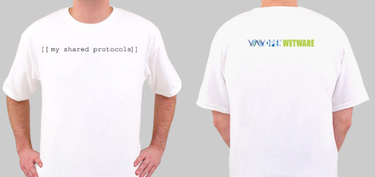
"My Shared Protocols"; 1 color front, 4 color back; $8.75/90
"Logo"; 4 color front, 0 color back; $7.68/90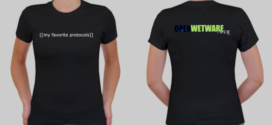
"My Favorite Protocols"; 1 color front, 4 color back; $11.86/90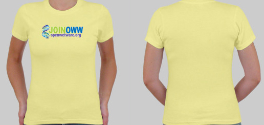
"Join OWW"; 4 color front, 0 color back; $10.75/90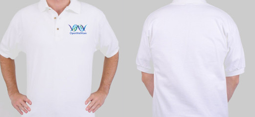
"Logo Polo"; 4 color front, 0 color back; $10.94/90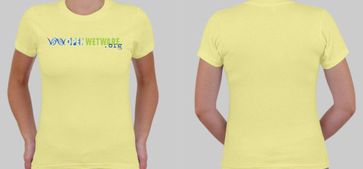
"Logo .org"; 4 color front, 0 color back; $10.75/90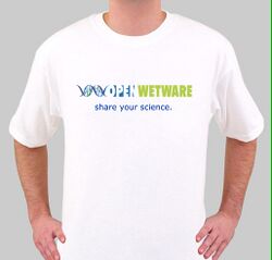
4 color front, 0 color back; $7.68/90


Discussion
- Jasonk 15:28, 25 September 2006 (EDT):Would it be too tough to do a colored shirt since the logo has so many colors in it? I like this by the way ;)
- Jennyn 10:06, 26 September 2006 (EDT): It wouldn't be tough at all. I tried doing this yesterday, but CustomInk shows the white in the background (in a really ugly way) but I'm sure if we submitted this, the artist that they have would be able to remove that. Will look into some other colors, though.
- Jasonk 12:42, 26 September 2006 (EDT): Nice! Do they have a polo-type shirt? Not sure how hard it would be to have the logo/text crammed into a small space like that though.
- Reshma 12:51, 26 September 2006 (EDT): I think the yellow tshirt color looks pretty good with the OWW logo colors. But I prefer the "standard" OWW logo with the .org addition (like on the black) to the "Join OWW" logo. I think the black tshirt looks pretty bad with the OWW logo colors. (I assume we are just ordering one kind of shirt?)
- Jennyn 17:01, 26 September 2006 (EDT): I just posted a possible design for a polo. I think anything more would look tacky. I completely agree with you, Reshma. Those colors do not look good on black. However, I like the front of the shirt, so many just putting "openwetware.org" on the back in white typewriter font might do the trick.
- BC 17:31, 26 September 2006 (EDT):I like these designs and agree with the comments above. I also like the original design below with the colored collar/sleeves. Could we get something similar from customink?
- Hartigan 21:00, 29 September 2006 (EDT):I think all the designs are very good and especially the original design below looks superb!!! I agree that the coloured logo on the black T-shirt is a little weird. Maybe a logo in grayscale would be more suitable in the black T-shirt.
Early T-Shirt Discussions
- Jennyn 14:47, 15 June 2006 (EDT): We should consider doing a collection of T-shirts like H-Lounge (ringtone start-up from MIT). That way, we can do Sri's awesome idea of the "[My Favorite Protocol]" shirt, and maybe put "openwetware.org" on the back or something. I'd love to get involved in this, also, by the way.
 I think the graphics that we have are cool, but more would be awesome!

- Jgritton 11:53, 17 July 2006 (EDT): This seems pretty easy to do. I made a mockup at cafepress of one possible design. It took about 2 minutes. Wikipedia has a store [1] with a design similar to the "[my favorite protocol]" mentioned above. We could possibly set something like the wikipedia store up and get a little bit of funds raised as well.
- --Johncumbers 17:55, 7 August 2006 (EDT) Nice one..
