OpenWetWare:Design/T-shirt: Difference between revisions
From OpenWetWare
Jump to navigationJump to search
John Cumbers (talk | contribs) |
|||
| Line 22: | Line 22: | ||
===Discussion=== | ===Discussion=== | ||
*[[User:Johncumbers|Johncumbers]] 13:15, 3 May 2007 (EDT) I Jenny, I love 2 and 4, but the thick border around the circle looks too much like a no entry sign I think. could you make the colours of the hands in 2 blend into the circle color, and then have the change in color at the top and bottom of the circle... if you get what I mean, e.g half green half blue. 4 is also great, but perhaps a lighter color for the circle or no fill perhaps, again because it looks too much like a stop sign to me. cheers.. very cool. | *[[User:Johncumbers|Johncumbers]] 13:15, 3 May 2007 (EDT) I Jenny, I love 2 and 4, but the thick border around the circle looks too much like a no entry sign I think. could you make the colours of the hands in 2 blend into the circle color, and then have the change in color at the top and bottom of the circle... if you get what I mean, e.g half green half blue. 4 is also great, but perhaps a lighter color for the circle or no fill perhaps, again because it looks too much like a stop sign to me. cheers.. very cool. | ||
*[[User:Lucks|Lucks]] 13:21, 3 May 2007 (EDT): I have to go with something like 1 with the double helix. That distinguishes OWW as having a biological focus. People might be confused with just the hands. (This is coming from an outreach point of view where we want to get our message out very clearly). Otherwise they look great! | |||
===oldish Discussion=== | ===oldish Discussion=== | ||
Revision as of 17:21, 3 May 2007
Possible T-Shirt Designs
- Jenny 12:53, 3 May 2007 (EDT): Click to zoom. T-shirt color can be changed, but after experimenting with colors, dark gray seemed most practical and looked best with the designs.
 Essentially the OWW sticker on the front of a t-shirt
 Handshake, "share your science"
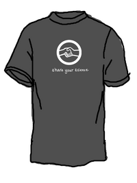 Possible back of the t-shirt
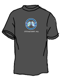 Possible front of t-shirt with logo


Prices based on quote from CustomInk. ($ea/if order 90)
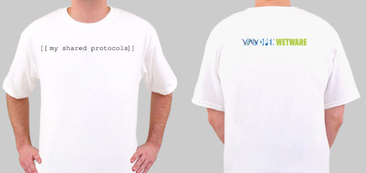
"My Shared Protocols"; 1 color front, 4 color back; $8.75/90
"Logo"; 4 color front, 0 color back; $7.68/90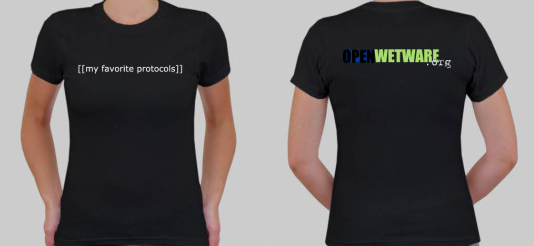
"My Favorite Protocols"; 1 color front, 4 color back; $11.86/90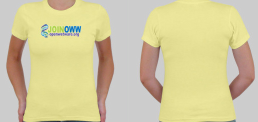
"Join OWW"; 4 color front, 0 color back; $10.75/90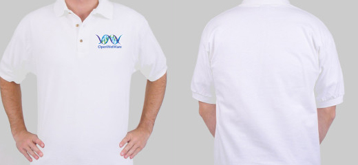
"Logo Polo"; 4 color front, 0 color back; $10.94/90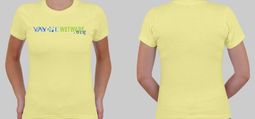
"Logo .org"; 4 color front, 0 color back; $10.75/90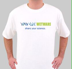
4 color front, 0 color back; $7.68/90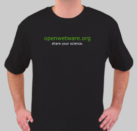
2 color front, 0 color back; $7.08/90


Discussion
- Johncumbers 13:15, 3 May 2007 (EDT) I Jenny, I love 2 and 4, but the thick border around the circle looks too much like a no entry sign I think. could you make the colours of the hands in 2 blend into the circle color, and then have the change in color at the top and bottom of the circle... if you get what I mean, e.g half green half blue. 4 is also great, but perhaps a lighter color for the circle or no fill perhaps, again because it looks too much like a stop sign to me. cheers.. very cool.
- Lucks 13:21, 3 May 2007 (EDT): I have to go with something like 1 with the double helix. That distinguishes OWW as having a biological focus. People might be confused with just the hands. (This is coming from an outreach point of view where we want to get our message out very clearly). Otherwise they look great!
oldish Discussion
- Jasonk 15:28, 25 September 2006 (EDT):Would it be too tough to do a colored shirt since the logo has so many colors in it? I like this by the way ;)
- Jennyn 10:06, 26 September 2006 (EDT): It wouldn't be tough at all. I tried doing this yesterday, but CustomInk shows the white in the background (in a really ugly way) but I'm sure if we submitted this, the artist that they have would be able to remove that. Will look into some other colors, though.
- Jasonk 12:42, 26 September 2006 (EDT): Nice! Do they have a polo-type shirt? Not sure how hard it would be to have the logo/text crammed into a small space like that though.
- Reshma 12:51, 26 September 2006 (EDT): I think the yellow tshirt color looks pretty good with the OWW logo colors. But I prefer the "standard" OWW logo with the .org addition (like on the black) to the "Join OWW" logo. I think the black tshirt looks pretty bad with the OWW logo colors. (I assume we are just ordering one kind of shirt?)
- Jennyn 17:01, 26 September 2006 (EDT): I just posted a possible design for a polo. I think anything more would look tacky. I completely agree with you, Reshma. Those colors do not look good on black. However, I like the front of the shirt, so many just putting "openwetware.org" on the back in white typewriter font might do the trick.
- BC 17:31, 26 September 2006 (EDT):I like these designs and agree with the comments above. I also like the original design below with the colored collar/sleeves. Could we get something similar from customink?
- Hartigan 21:00, 29 September 2006 (EDT):I think all the designs are very good and especially the original design below looks superb!!! I agree that the coloured logo on the black T-shirt is a little weird. Maybe a logo in grayscale would be more suitable on the black T-shirt.
- Hartigan 00:00, 3 October 2006 (EDT):This new design on the black T shirt (No 8) looks very cool!!!
Early T-Shirt Discussions
- Jennyn 14:47, 15 June 2006 (EDT): We should consider doing a collection of T-shirts like H-Lounge (ringtone start-up from MIT). That way, we can do Sri's awesome idea of the "[My Favorite Protocol]" shirt, and maybe put "openwetware.org" on the back or something. I'd love to get involved in this, also, by the way.
 I think the graphics that we have are cool, but more would be awesome!

- Jgritton 11:53, 17 July 2006 (EDT): This seems pretty easy to do. I made a mockup at cafepress of one possible design. It took about 2 minutes. Wikipedia has a store [1] with a design similar to the "[my favorite protocol]" mentioned above. We could possibly set something like the wikipedia store up and get a little bit of funds raised as well.
- --Johncumbers 17:55, 7 August 2006 (EDT) Nice one..
